
"Hello hockey fans, it's Ricky Mazella - the Voice of the Springfield College Pride" . . . well not quite. While what I just wrote was true, that's not what I'm here to talk about. I'm glad to be a part of the HCI family coming over from HJC. It was a privilege, but a better opportunity arose and it led me here, after parting ways by mutual consent. I'm really excited for my first post today! Though the only thing that could make it better is if the Ducks could start winning, as they're in a slump following a great start. Nonetheless, Caden and the gang have done a great job here and hopefully I can continue that strong tradition during my tenure here.
Enough about me, let's dig in!
NY Islanders {Caden}

As you can see, this is purely intended for the current contest at HJC to improve the "Gortons/Fishsticks" logo. Mine will be here soon, after it's up on HJC anyway. Pretty good for a paint job, I know. And it's simple. However, the rubric never lies. That's another thing - I hate grading concepts, so I have my own rubric to help me. In this case, it's not what I figured it would be, but that's why it's there. Upon further review, it is a 6 outta 10.
Calgary Flames {Steve Maurer}

Here is what I said when I had to review it on my final HJC post last week:
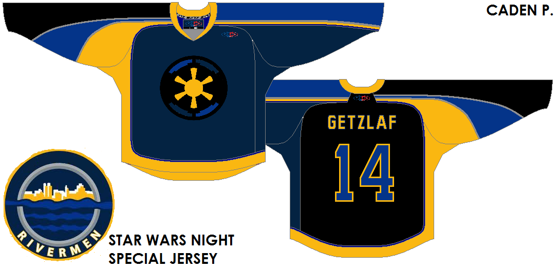
Evansville Rivermen (Star Wars night) {Caden}

Caden has really gone promo with his HCIHL team. Using the most recent Montreal All-Star Game template, he finds a way to keep it up. My biggest issue is that he is issuing a player that is on my team and one that I have franchise tagged. Secondly, this is the prime example of a typical promo gone wrong jersey. That's bad because he doesn't break a trend and it looks atrocious to me. As he continues to lose brownie points, may I make a note that this is a promo that I would never support because the other teams that have done so fail to do it properly. No hard feelings but it's one that's gotta go back to the drawing board. A 5 outta 10.
Speaking of my team, the Foxes of Skopje, they've had three guys who went on IR on the same day. The last is a co-captain who started the season there. After that, I don't have much to say other than we should have four wins so far and not three. In the mean time enjoy your weekend and happy hockey - a bientot.
-Ricky
*EDIT BY CADEN* I found HCI on the Wayback machine. The site has improved so much since then. to see what the site looked like on September 16th 2013, click here.
For those of you who aren't familiar of me or my work, I'm 21 (5/6) years old from suburban Buffalo, NY where I'm a fan of the Anaheim Ducks (before I saw any of the movie trilogy) and a fourth year sport management major at Springfield College in MA. I began my graphic design career after stumbling upon HJC (for the second time) and the old Icethetics (then the Tournament of Logos) in February of 2011. I then began my blog, Buffalo Nickel Graphics, on the 5th of May in 2012. My blog covers a variety of sports and templates. These include but aren't limited to curling and Australian football in sports as well as a transportation, dasher boards, and playing surfaces in templates. I encourage you to check those templates out and submit them here on HCI!
Enough about me, let's dig in!
NY Islanders {Caden}

As you can see, this is purely intended for the current contest at HJC to improve the "Gortons/Fishsticks" logo. Mine will be here soon, after it's up on HJC anyway. Pretty good for a paint job, I know. And it's simple. However, the rubric never lies. That's another thing - I hate grading concepts, so I have my own rubric to help me. In this case, it's not what I figured it would be, but that's why it's there. Upon further review, it is a 6 outta 10.
Calgary Flames {Steve Maurer}

Here is what I said when I had to review it on my final HJC post last week:
I feel that this could work with some minor changes. The striping could stay as is but a swap of colors may be an alternative.I'm surprised that the Cal-gary team hasn't done something similar just yet. Use solid red lettering for the NOB and the assistant's "A" as well. Then I'll be happy
What I know: The assistant's "A" was the primary in Atlanta.
What I learned: If using a red outline, larger is better and smaller should be solid in color.
What I learned: If using a red outline, larger is better and smaller should be solid in color.
What I want to know: why thin yellow jersey stripes separate the striping.
This one looks pretty good, but I'm on the fence of liking it or not; a 7.5 out of 10.
Nothing has changed in one week in this case.
Evansville Rivermen (Star Wars night) {Caden}
Caden has really gone promo with his HCIHL team. Using the most recent Montreal All-Star Game template, he finds a way to keep it up. My biggest issue is that he is issuing a player that is on my team and one that I have franchise tagged. Secondly, this is the prime example of a typical promo gone wrong jersey. That's bad because he doesn't break a trend and it looks atrocious to me. As he continues to lose brownie points, may I make a note that this is a promo that I would never support because the other teams that have done so fail to do it properly. No hard feelings but it's one that's gotta go back to the drawing board. A 5 outta 10.
Speaking of my team, the Foxes of Skopje, they've had three guys who went on IR on the same day. The last is a co-captain who started the season there. After that, I don't have much to say other than we should have four wins so far and not three. In the mean time enjoy your weekend and happy hockey - a bientot.
-Ricky
*EDIT BY CADEN* I found HCI on the Wayback machine. The site has improved so much since then. to see what the site looked like on September 16th 2013, click here.
So I like that you have a rubric. It's nice to have a standard to look at. The big problem I have is that this post doesn't talk about it. You say you hate grading concepts...why are you doing this then? You didn't tell us what you like or what you don't like on the first jersey. You tell us the rubric doesn't lie, but what is it telling you? If you tell the readers and designers what you think could work on, or suggestions to help make it better.
ReplyDeleteI'm not bashing, but I feel what you said about hate grading concepts, followed by not saying your opinion doesn't help a lot for a blog where you post about grading concepts. Fix that and this could be good.
Also, mind sharing your rubric so people know how you perceive different looks?
To prevent a conflict of interest, I don't actually go into detail about how the rubric works. As far as concept grading, it helps me look at a concept from a more technical point of view which helps me to recognize some of the obvious things that everyone else knows about concept submissions. Of every writer from HJC to date, I probably was the least knowledgeable on what makes a concept in general. When I spoke to Ryan of HJC before I left his blog, he said my critiques/ratings were generally meeting HJC expectations.
DeleteWith the first concept, I like it completely. However just because I like it doesn't mean that there aren't things that need fixing. That's what the grading has helped me with. If I had graded when I started without knowing anything at all (I at least did a little), I would have graded solely based on whether I liked the visual appeal or not instead of things like execution. Generally speaking, I have in the past made suggestions based on what my preferences are. And I frequently remind that these are totally suggestions that the creator has the right to ignore should they chose to do so.
I do truly appreciate your interest in my inner-workings, but I'm afraid that must (at least for now) remain confidential. Once I have become more experienced and gain a much better reputation, then it will certainly be a possibility. I'm sorry if that disappoints you, but I also realize that until I establish enough of a persona when I can actually do pretty much whatever I want that I probably shouldn't disclose that.
You'll notice that my blog isn't for me to critique but rather to focus on the positive. I hardly ever touch negative points unless I mention it in a private e-mail. At most I may make suggestions on my preferences even if I think it is practically perfect. But my blog isn't solely revolving around hockey uniforms either and what goes into one uniform isn't exactly the same as another. We also have non-related sports templates that can have sports-y themes added to them.