Showing posts with label Evansville Rivermen. Show all posts

Monday, March 24, 2014

Monday: Prepping for the Championship

The HCIHL playoff are on now! With the Rivermen trailing the Lynx, and the Foxes getting killed by the Stags. In the consolation ladder, which I didn't even know existed until I checked the scores yesterday, and I'm playing in it... My Express, are somehow still in the game against a team that knew that there was a consolation ladder, the Sabreswords. The way things look, this will be the last game in Altoona for the Express, and the last game in Skopje for the Foxes. Unless the Rivermen catch up, the Lynx will keep playing in Louisville, and after in the championship they will move to Las Vegas. Enough about that, now to an HCIHL team concept.

UPDATE BY CADEN! THE RIVERMEN ARE WINNING AGIAN, WHICH WE HAVE PRETTY MUCH THE WHOLE GAME!
_________________________________________________________________________________

Evansville Rivermen (Caden Patafie)
Caden shows us how his team's uniforms will look for the upcoming season, as of now they look like this. The new set will have a very original number font and be without any white in the striping. Like all of the released jerseys, except for the Pilots and the Bighorns, the Rivermen will have the Nike fake laces. The striping pattern's unique in the HCIHL although you lose the lighter blue on the dark jersey. YOU ALWAYS NEED TV NUMBERS!!!! Ok Caden already told us why it was tough for him to apply them, but you still should have them kids. The helmet is very pixelated, I'm not sure if you can fix that in pain though. Concept Rating 7.4/10

_________________________________________________________________________________

My Penn State team was able to beat Michigan on Thursday, a big feat for a team ranked 51st in the country, as Michigan was ranked 11th. Though in the next round, they lost to Wisconsin 2-1. If they would have won that game, they would have played Ohio State in the next round, as they upset Minnesota, who was ranked 1 in the nation.

Well that's all for today, hope to see everyone next Monday!

Note: Sorry this post is late, I must have forgotten to Schedule it on Blogger... ooops.

Friday, November 29, 2013

Friday: Blog Hopping

"Hello hockey fans, it's Ricky Mazella - the Voice of the Springfield College Pride" . . . well not quite. While what I just wrote was true, that's not what I'm here to talk about. I'm glad to be a part of the HCI family coming over from HJC. It was a privilege, but a better opportunity arose and it led me here, after parting ways by mutual consent. I'm really excited for my first post today! Though the only thing that could make it better is if the Ducks could start winning, as they're in a slump following a great start. Nonetheless, Caden and the gang have done a great job here and hopefully I can continue that strong tradition during my tenure here.

For those of you who aren't familiar of me or my work, I'm 21 (5/6) years old from suburban Buffalo, NY where I'm a fan of the Anaheim Ducks (before I saw any of the movie trilogy) and a fourth year sport management major at Springfield College in MA. I began my graphic design career after stumbling upon HJC (for the second time) and the old Icethetics (then the Tournament of Logos) in February of 2011. I then began my blog, Buffalo Nickel Graphics, on the 5th of May in 2012. My blog covers a variety of sports and templates. These include but aren't limited to curling and Australian football in sports as well as a transportation, dasher boards, and playing surfaces in templates. I encourage you to check those templates out and submit them here on HCI!

Enough about me, let's dig in!

NY Islanders {Caden}

As you can see, this is purely intended for the current contest at HJC to improve the "Gortons/Fishsticks" logo. Mine will be here soon, after it's up on HJC anyway. Pretty good for a paint job, I know. And it's simple. However, the rubric never lies. That's another thing - I hate grading concepts, so I have my own rubric to help me. In this case, it's not what I figured it would be, but that's why it's there. Upon further review, it is a 6 outta 10.

Calgary Flames {Steve Maurer}

Here is what I said when I had to review it on my final HJC post last week:

I feel that this could work with some minor changes. The striping could stay as is but a swap of colors may be an alternative.I'm surprised that the Cal-gary team hasn't done something similar just yet. Use solid red lettering for the NOB and the assistant's "A" as well. Then I'll be happy

What I know: The assistant's "A" was the primary in Atlanta.
What I learned: If using a red outline, larger is better and smaller should be solid in color.
What I want to know: why thin yellow jersey stripes separate the striping.
This one looks pretty good, but I'm on the fence of liking it or not; a 7.5 out of 10.

Nothing has changed in one week in this case.

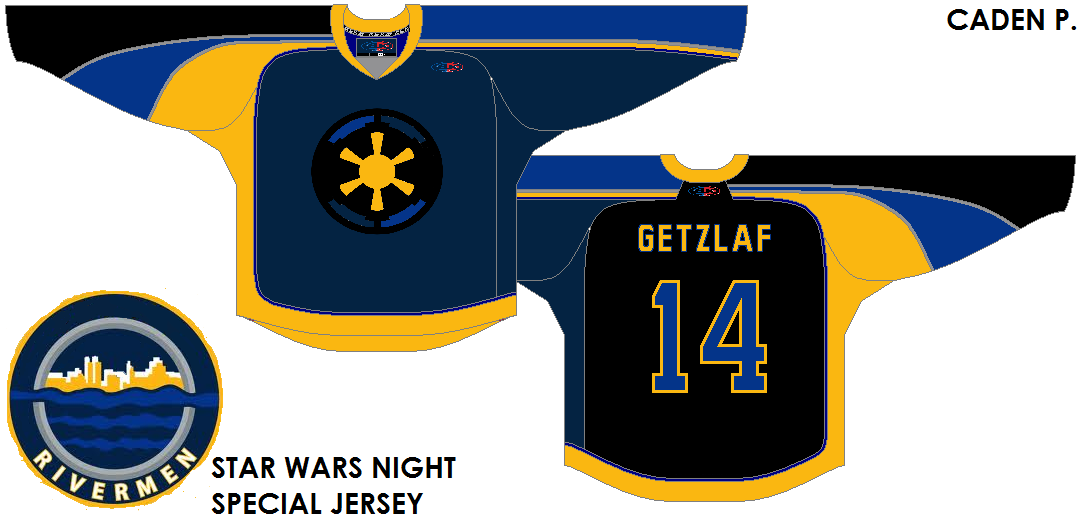
Evansville Rivermen (Star Wars night) {Caden}

Caden has really gone promo with his HCIHL team. Using the most recent Montreal All-Star Game template, he finds a way to keep it up. My biggest issue is that he is issuing a player that is on my team and one that I have franchise tagged. Secondly, this is the prime example of a typical promo gone wrong jersey. That's bad because he doesn't break a trend and it looks atrocious to me. As he continues to lose brownie points, may I make a note that this is a promo that I would never support because the other teams that have done so fail to do it properly. No hard feelings but it's one that's gotta go back to the drawing board.  A 5 outta 10.

Speaking of my team, the Foxes of Skopje, they've had three guys who went on IR on the same day. The last is a co-captain who started the season there. After that, I don't have much to say other than we should have four wins so far and not three. In the mean time enjoy your weekend and happy hockey - a bientot.


-Ricky


*EDIT BY CADEN* I found HCI on the Wayback machine. The site has improved so much since then. to see what the site looked like on September 16th 2013, click here.

Monday, November 11, 2013

Monday, Monday. Gotta get down on Monday!

Hello fellow concept fans! Caden here today on Veterans/Remembrance day.

 The Icemen have made a small uniform change which I thought I should mention here,

Before


After

Notice the addition of shoulder yokes. Tell me what you think of the change in the comments!

To the concepts!


London Sabreswords Special Event Alan John Herbert


This is a Specialty Jersey by AJH for his HCIHL team, The London Sabreswords. 

Yay:
The Font
The "Poppy" Colours
The Yoke Striping

Nay:
The Black Arm panels

Creativity Credit:
I like the Poppy right/top corner and the leaf in the "Sabresword". Very creative!


A solid concept that is classy for a specialty jersey! A 9.8/10


Evansville Rivermen Memorial Day Game Caden Patafie

This is a Specialty Jersey I made for my HCIHL team, The Evansville Rivermen

I made this jersey for the Rivs. Sort of self explanatory. Tell me what you think in the comments!


Before I go, I would like to thank all who have served or are serving in the American or Canadian Armed Forces. Keeping the press free so I can "review" jerseys like Buffalo's third.


Thanks for reading! (And if you serve, Thanks for serving!)

Caden

Thursday, November 7, 2013

Thursday. Sick day #1

Heyyyyyyyy! Caden here bringing you a late post today. All the concepts today I sneeze at! not because the're bad, but because I'm sick. Which is probably why the post is so late. To the *Cough Cough* Concepts!


Evansville Rivermen Caden P (Me)

To concide with league rules, I swiftified the Rivermen jersey. That is the only major change.


Team Sweden Caden (Me again!)

I made a very Nike (Used as an adjective) Sweden dark jersey. Even though it will just be a invert of the yellow jersey already released, I wanted to make a out of the box jersey.


Both of these concepts were bad and mine 'cause you guys won't send your concepts in!


Thanks for reading!


Caden


Thursday, October 24, 2013

Rivermen Extras!!! (Jake88)

Hello followers of this fine blog! I do say, I have some hockey jersey concepts for you today. I can hope that nobody has forgotten about the anniversary that is today. Yup, the 75th is upon us, only 25 posts to go until triple digits. I know that Caden is quite proud of the blog and I have to say I am too. In my opinion, the blog can only grow now, so lets make it happen! Send in your concepts, we'll grade them and tell you how you can improve! It's that easy!

_________________________________________________________________________ 
Evansville Rivermen (Matt McElroy)
Everyone remember the concept that Matt made for my Express? Well here is one made for the Rivermen of Evansville. I will grade this concept like I graded the Express one. First the logo. I like just about everything about it, it truly looks like a good fantasy hockey logo! In fact, the Rivermen should've used it on their new jerseys! Only one complaint. Why the three stars? From my research the three stars don't appear on Evansville's flag, nor Indiana's, it would make sense for a team in Tennessee (Nashville uses it in their secondary) so an explanation would be helpful. To the jerseys. One word. AMAZING. Again all except for one thing, again a small tiny thing. Put the shoulder patch on both shoulders. Speaking of the shoulder patch, I would like to see it not cut off, I see an anchor and hockey sticks but thats all. So if you could give me a full size image that would help me envision it better. Concept Rating 9.4/10

Evansville Rivermen (Jake88/Me)
Ok, I had a reason for not using Matt's logo, THE SKYLINE FEATURE! Yes, this was a fix of the design Caden showed us all on Tuesday. I saw the design a few days before that and this is what I showed him. He wanted the skyline on the hem like on his concept, but I thought it would be to much, so he went with his design. I really like how the final product looks and I wish that he would have made this as the official design. 

_________________________________________________________________________ 
So did you agree with Caden's opinion to make his design the official one? Just joking, I probably would have been angry if he used mine, and I don't know how Matt would have felt. Anyway I have made two more designs for my Big Ten redesign and I hope to show you one tomorrow. So, bye and have a great rest of your day!

*EDIT BY CADEN 

I have decided to let you guys vote on which rivs jersey to use for next season! Here is mine in case you forgot!

Wednesday, October 23, 2013

Post number 74

Hey guys. Justin here. This OFFICIALY marks the post before our 75th post on this blog!! I just wanna thank Jake and Caden for adding me on as a 3rd writer and we've still got a bit more to go until 100.


_______________________________________

Anaheim Ducks (Alan John Herbert)
I'm assuming this is from HJC's old Anaheim "Unused Colours" contest. I saw the "HERBERT" name on the back and I thought it was old Ducks goalie Guy Hebert's name. But then I saw the R in the name and turn out it was you last name, oh well. This is a nice jersey, using somewhat of a Flyers jersey design (ex: arm striping). The only thing I would change about this is the green number on the white jersey. Make the outline black and green and the inside orange and fill in that empty space behind the neck. it sticks out like a sore thumb, especially on the white jersey. Overall, good execution ann good concept as well.  9/10


Evansville Riverman (Caden Patafie)

When I first saw this, I thought it was an unfinished version of the jersey. Then I took a closer look. Hey, the logo's on the upper right chest! It's like a soccer jersey, almost. I don't mind a yellow-coloured kit (haha, soccer term there) but assuming if there is another team in the HCIHL with a yellowed coloured jersey, a white one would fit well. The cityline striping reminds me of the late 90s Coyotes jerseys. It would look cool if the striping went all around the jersey and on the arms. It would look really awkward when you have a player wearing these, celebrating a goal, arms in the air and seeing the cityline get cut off under the arms. And enlarge the logo! This ain't soccer. 8.5/10


75th post tomorrow!!
-Justin

Tuesday, October 22, 2013

Tuesday. 73, 2 more to go!

Hey everybody! Caden here to bring you today's post. I cant believe the blog went from this,


To this,


In less than 75 posts! Though I had some thoughts about a REbrand for the site, and had some ideas. All the credit goes to Matt McElroy for making it happen! He designed the logo and background for the site, Also a BIG thanks to Justin Sulpico and Jake88, who also had some great ideas! Nothing much left to say except the Flames are unveiling there third jersey soon!


To the concepts!


CCCP (Alan John Herbert)

This was a concept for the HJC "If the Soviets returned contest". I like the color balance on the white jersey but not on the red. I would have made the numbers white with a black outline and have no outline on the namebar. The one thing I would change with the white jersey is the red yoke. Just make it white! I would also take the striping off the pants.

Concept Rating 8.6/10


Evansville Rivermen (Caden Patafie {Me})


I'm not going to review this jersey because I designed it. The Evansville Rivermen have announced this to be an option for their new jersey for the 2014/2015 season. Tell us what you think in the comments! Justin can review it Wednesday.

As we near 75 posts of AMAZING readers, Thanks for reading!!!


PS. Our pageviews as of 1:02 PM CST 10/22/13

EntryPageviews
United States
2880
Canada
537
Indonesia
99
Serbia
43
Russia
28
China
19
Sweden
19
Germany
10
Ukraine
9
Denmark
7


Sunday, September 15, 2013

Sunday

Well. Not much to say. Preseason Hockey is BACK! To check out the results of the Anaheim Ducks Unused Colo(U)r Contest, which me and Jake both have entries for, check out Hockey Jersey Concepts.

PICK THE LYNX JERSEY! VOTING ENDS FRIDAY!


SPRINGFIELD SHARPSHOOTERS Jake88


I like the Sharpshooters jersey set in general, but I'm not a fan of the brown. I think black replacing the brown to make a "06 Flyersish" set would be sharp! I always like seeing helmets in jerseys especially if its a final draft for a team. I like the alternate but think the bottom of the back of the jersey is empty. Maybe move the numbers and the name bar down some and you would be spot on.

Jersey Rating 8.5/10

Buffalo Sabers Caden (Yes me!)

I made this Buffalo Sabers jersey incorporating design features from all the eras except the Black/Red era.

Template: BuffaSlug 
Logo: Original
Colors: Buffalo's new 3rd (Not really an era but I wanted something pointing to that)


The third Jersey is somewhat modeled after their current thirds
Tell me what you think in the comments!!!


Oulun Kärpät Jake88


I know nothing about international hockey! So I Google imaged the Kärpät and found 2 things. 1 they must have won the league championship a billion years in a row cause all I could find were Championship pics! 2, these jerseys a 500% better than what they have! 


None of the teams they were playing had great jerseys either! That doesn't mean these jerseys are perfect, just better. It doesn't seem like their league does the colored glove thing either. (for you readers in Canada, "Coloured")

I only have 4 critiques for this amazing set! 
\
1: The arm stripes cutting through the piping.
2: The shade of yellow on the logo being noticeably different that the shade of yellow in the striping.
3: No shoulder patch.
4. The numbers seem too small.

Change those and you would have a perfect set!

Concept Rating, 8.8/10

Evansville Rivermen

Even though it had already been leaked, The Rivermen ask me to do the unveiling and review of their jersey. Well here it is! I like it as an alternate. everything just goes together so perfectly! Except for the back. I would have raised the numbers some so they weren't touching the hem/back stripe. I think the wordmark is a little boring but again its good for an alternate! The main logo on the shoulders would look nice too.

Jersey Rating: 8.5/10

Also a hint to the 6th and final HCIHL team.
It will be a Canadian team, and will be in the same city as an NHL team.
Happy guessing!


Thanks for reading!

Caden


Tuesday, September 10, 2013

Tuesday. More Teasers

Hey Readers! I honestly don't know if anyone but me and Jake reads my post!


The Springfield Sharpshooters released a new jersey teaser today! It seems to show part of the main crest.


So I see from previous teasers that the back of the jersey is orange and the front is mostly black. We could have a buffaloish jersey on our hands! We could also be seeing 2 different jerseys! Mabey a home and an alternate.

The Evansville Rivermen also released a new teaser today. Even though they "accidently" leaked it on their twitter page. 


Not seeing much. Except the royal blue piping and the striped collar. Of course we all know what the jersey looks like so I don't know why I'm even putting these teasers on my post.


This is the Ducks Comp. Entry I made for HJC! I need you to go vote for it! it only takes 5 minutes and it would be helping me out a lot. You can pick your top 5 and depending how many of each place you got you get a certain number of points. You can vote Jake88's 2nd!!! :P Tell me what you think in the comments!


NHL training camp opens tomorrow! Hockey is just around the corner!


Monday, September 9, 2013

More HCIHL Drama

Welcome to the 37th post in HCI history! Does that mean anything? No! So today I bring you some HCIHL drama, and the Lokomotiv concept I promised on Saturday. 

---------------------------------------------------------------------------------------------------------------------

First the three teaser images provided by the Evansville Rivermen and the Springfield Sharpshooters, respectively.

2nd Picture in the Unveiling of the Rivermen 3rd Jersey

3rd Picture in the Unveiling of the Rivermen 3rd Jersey

3rd Image in the Sharpshooters Preview
Also for you Twitter users the @ERivermen (Evansville), @Hcihlmonachs (North Carolina), and the @AltoonaHC (Altoona), all have Twitter accounts. By the way, you can follow me @Jake88JC, Caden @CPatafie, the HCIHL @HCIHL, and this blog @HCIblog. Thank you in advance if you follow any of us.

Lokomotiv Yaroslavl (Jake88/Me)
Two days after the 2 year anniversary of the sad plane crash I bring you what I think Lokomotiv should be wearing. It is partially based on this concept which won COTW in 2012, which in turn is based on the striping in the logo. I tried to keep the font slightly rounded like in the logo too. You like, tell me in the comments!

Thanks for reading, and remember to send in your concepts too! 


Update
---------------------------------------------------------------------------------------------------------------------

The Evansville Rivermen accidently unveiled their 3rd jerseys last night via twitter. HCI gives us the report.

What do you think of the jersey? Do you like it? Is it bad? Tell us!


Sunday, September 8, 2013

Sunday (Very Late)

Sorry for the late post. Excelling Students program at school means extra homework and crap!
The 4th HCIHL team is the Seattle Sharpshooters! Like the Wild and Sabers, They are releasing jersey teasers. This is the 2nd one!

It looks like a good jersey! I will like to see how this turns out!


I drew up this Preds concept as a space filler! Tell me how you like it in the comments!


The Evansville Rivermen also released their first 3rd jersey teaser today! Every day there will be a new teaser and the full jersey will be released next Sunday! Stay tuned!

*UPDATE The whole Jersey was leaked on the Rivermen twitter page today! @ERivermen 
This is what they look like. The Rivermen contacted me after taking it down and said they will still do the teasers and unveiling on their twitter page! I will like to see how that plays out!


Alan John Herbert send us our guest concept for today! A London Knights concept! A solid concept with everything except that I doubt a OHL team could afford to buy extra pants and a third helmet just for an alternate uniform. I would also recolour the shoulder patch on the alternate to go with the colour scheme. maybe vintage white???

Concept Rating 9/10