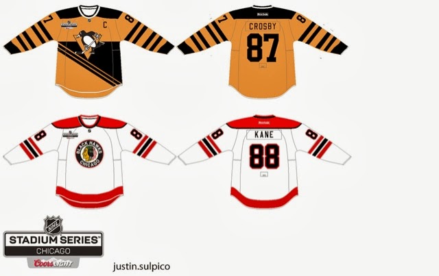
Monday, September 30, 2013

End of a Month

Hi everyone! Jake88 here. It's your favorite day of the week! Not Humpday and certainly Friday, it's MONDAY! The day where you go back to school or work, or both I guess, depending on your age. Today also marks the end of the month of September, marking the first *full* month of HCI, sure we had most of August, but this is the only full month. Also to be noted, is the Jersey of the Month contest, in which the HCI staff will decide on what jersey is worthy. I've been working on some Yakball concepts (two separate links), as they help get my mind off of hockey, and afterward help me create better concepts. If you would like to see some of them, check my personal blog. On to the concepts!


London Sabreswords (By Alan John Herbert)
The HCIHL's own London Sabreswords, are the team used in this concept. The artist featured in this concept is also the team manager. I like how Alan uses his own fonts for this concept, but I don't think that they necessarily go with this concept. I also would make the striping on the white jersey black, to go along with the green jersey. Do I really have a problem with this concept? No, but something, I don't know exactly what it is, isn't grabbing me. Concept Rating 7.7/10


Cross League Classic: Rochester Americans V.S. EC Düsseldorf (Jake88/Me)
For my second Cross League Classic game I feature a DEL team V.S. Rochester. On the Düsseldorf jersey I made a custom collar style that is like a shirt collar. If you'd like, you can download the template for that here, with credit of course. Other than that,I think both jerseys are pretty self-explanatory myself, so I will let you judge how they look.


Have a great week! And until I see you guys on Friday, Good-Bye!

*Edit By Caden*

The September Jersey of the Month winner is...


Jake88's Toronto Marlies Concept Set!!!

Sunday, September 29, 2013

Sunday, Dimanche.

Hello readers, Justin S. here. Your trusty weekend and hump-day writer. Hope you're making the most of the rest of your weekend. I can't believe the start of the season is coming SO FAST!!!!!!!!

Quickly, I want to touch base on the HCIHL and congratulate it on its first ever draft. If you don't know by now, the HCIHL is our very own fantasy hockey league. They are:

Evansville Rivermen
Louisville Lynx
Skopje Foxes
Altoona Express
London Sabreswords
Hamilton Stags

Concept time: These are just a bunch of random concepts plucked from my jersey folder on my computer.


Russia Olympic Redesign

All-Star Game 


Utica Comets


Enjoy the rest of your weekend!

-Justin

NOTE TO CADEN: I'm Justin S., not Justin P.

Saturday, September 28, 2013

Saturday, DRAFT DAY

Sup readers! The HCIHL 1st ever draft day is upon us! I'm pretty busy getting ready leauge stuff, and stuff for my team, the Evansville Rivermen. Since Justin didn't post about the HCIHL changes to get ready for the inaugranal season, I will bring you up to speed. The six teams and their GMs are,

Evansville Rivermen/ Me (Caden P.)
London (Ontario) Sabreswords/ Alan John Herbert
Louisville Lynx/ Kevin C.
Altoona Express/ Jake88
Hamilton Stag/ Matt McElroy
Skopje Lisici (Foxes)/ Ricky M.

These are the current team logos,

What is your opinion? Tell us in the Comments!


Evansville City Church Tourney Justin P.

Justin fixed my concept, and I am split 50/50. I like the improvements to the CFC and ONE LIFE jerseys, but I don't like the Crossroads and NPBC jerseys. The Crossroads jersey is ok, but at one point they acctullay had a hockey team and used a template similar to that one. I wanted a different, more modern fell to it. My problem with the NPBC jerseys is that the Double blue is the colo(u)r of there church and church logo. If you changed the orange to light blue you would have a great concept.

Concept Rating: 8.3/10


Thanks for reading!

Caden

Friday, September 27, 2013

Gateway to the Weekend

Hey guys the weekend is in full swing so lets start it with todays post! We have some HCIHL news, the Hamilton Stags team was announced yesterday. Here is their new Twitter page. Their logos and uniforms will be on this post too! Oh yeah, if you haven't noticed the same person who founded the Hamilton Stags made HCI a real logo and upgraded our Twitter page too! On to the concepts!

Hamilton Stags (By Matt McElroy)
Can I just say, beautiful logos and the best thing is that they are fully custom! Even the IceBorn template that Matt made is featured here! The square yokes look good and I even like the wheat jersey featured as an away, rather than white. I might make the number on the wheat jersey green (either shade). One thing I would do for both jerseys is add a stripe between the two stripes, so on the wheat jersey I would put a gold stripe between the two green stripes, and on the green jersey I would put a dark green stripe in between the wheat and gold striping. One other thing I don't understand is why the top of the socks on the wheat jersey are green. I like the rest of the jerseys and the color scheme is great! Rating 8.7/10

Evansville Church Hockey Tournament (By Caden)
Caden made some changes to his original Evansville Church Tourney concept. And personally I can't say I am a fan to the changes he's made. The first one stays the same, and the silver and gold one looks worse. I know that the "gold" is supposed to be green and I truly think that green and silver looks beautiful together but you need to change the shade of it. I really like the one in the top right corner, as the colors look great with that template. I also find it funny that the "poor church" has tons of adds! I would add some numbers and maybe a name for realism. Concept Rating 7.9/10

Thanks for reading and I we are lucky the HCIHL draft might be on Saturday! I personally can't wait! Go Express!

Thursday, September 26, 2013

Post "Hump Day" Blues

What's Up??? I am writing this post because I lovvveee you*! The HCIHL has added Ricky M. (HJC's Friday guy) and Matt McElroy as GMs and Matt will also be the HCIHL "League Advisor!" We might get a new Tuesday writer but that's still in the works! Since Jake and Justin came along and now possibly a new Tuesday writer, my blog writing work has gone down, but my blog Administrative work has gone up! Figuring out what jerseys will go on what post and now having to also keep up with what's sent in, requests for HCIHL expansion teams,and I even had one guy who wanted 5$ a post credited to his PayPal in order to write once every 2 weeks for us! That's why I have decided to promote Jake88 to assistant Admin! Meaning he will have more say in stuff like hiring new writers and such! This is the new writing schedule

S: Justin P.
M: Jake88
T: New Tuesday Writer
W: Justin P.
T: Caden P. (Yes me!)
F: Jake88
S: Caden P.


I have a few concepts for you today so getting started as quick as possible would we great! 


New York (Brooklyn) Islanders Caden P. (me)

I made this Islanders concept for there move to Brooklyn. The basic premise of my design was to recol(u)r everything to give the islanders a new image! I recolo(u)red the logo and kept the Island in the logo but made the colo(u)r similar to the background so it wont be the main focus. (They are in Brooklyn after all!) I also changed the black jersey to incorporate the victory stripes in a big manner. You can't let a dynasty like that go! Maybe for a team like Montreal but the Islanders SUCK!


Stadium Series Chicago/Pittsburgh Justin S.


The reason I like this set is because though the are old fashioned, these are completely new jersey designs! I think the era you are trying to capture with the Pens jersey would look better with the robopen logo! The back bottom looks empty but I'm not sure what I would do with that.
The Chicago one is ok, but I would make the hem stripe the same as the arm stripe. The stadium series logo is different and wouldn't have the cores logo on the jerseys. The NHL has a strict no corporate logos on jerseys aside from RBK. 

Concept Rating 9/10


Augsberger Panther Jake88

If only Jake would make North American jerseys... I don't really know much about European jerseys so my comments don't mean much if I judge this from a NHL perspective than I would say that the numbers are too far apart but I don't know if that's acceptable in the DEL which I presume the Panther are still in unless they moved. I like the concept but I can't call it good/bad because I just don't know!

Concept Rating 0/0 (I can't judge something I don't know about. I will research the KHL, DEL, and SlimLeaguea jerseys tomorrow and I will know more)


Thank for reading and I hope you get over these post Humpday blues!


Caden

Wednesday, September 25, 2013

New Canada Jerseys, (Not-so) New Writer

Hi, Everyone! (New) writer Justin here. I'd like to take a minute to post the Team Canada jerseys leaked late yesterday. 

They're really nice, I just don't like the assymetrical sleeves and monotone collars, makes it look empty. I haven't got any instruction from Caden or Jake on what concepts to post so i'll just post some of my own.


Anaheim Ducks Redesign.


 I straightened out the "swoosh" striping on their current jerseys, recoloured them and added duck wings on the shoulders like what the Oregon Ducks football team usually does.


Abbotsford Heat

For the primary jerseys, I took inspiration from the Flames 90s jerseys for the striping. The alternate jersey is basically an edge-ified version of the Atlanta Flames jerseys. Props to Jake for using it as inspiration in his new "Cross-League Classic" series.


New York Stadium Series
The Devils and Rangers jerseys are simply previously worn jerseys. The Islanders jersey is using the dreaded "vintage white" seen in so many outdoor games. The barberpole striping is taken from the Vancouver Canucks Millionaires jersey.


Columbus Blue Jackets (De-edge series) 


This jersey from my currently active Rbk De-edge series has not been featured on HJC yet. So consider this an HCI EXCLUSIVE!!!!! They're just the pre-edge Jackets jerseys with the Star logo plastered on the front.

That concludes this post. Stay tuned for tomorrows post. Have a good day.

-Justin

Tuesday, September 24, 2013

Internet Up; Views Down

Ok, if you saw the semi-drama that went on with Caden accidently taking his admin. privileges away, it's been fixed. Sadly after my family got Verizon for Internet, it go's down on the first day and stayed like that for about a day, so now I am lucky to have it up and write this post. Sadly our page view dropped drastically and I hope this can boost them. On to the one concept I made for today!

Cross League Classic: Abbotsford Heat V.S. TPS Turku (Jake88/Me)


Ok, this is my new project, something I like to call the Cross League Classic, it will feature AHL teams playing European teams. The first game in my series is the Heat of Abbotsford, fellow writer Justin's hometown, playing TPS Turku of the SM-Liiga, newly named Liiga (National League). The Heat will play in Atlanta Flames style jerseys, the logo is the Atlanta Flames logo, the idea came from Justin. Also since Reebok keeps making squared off yokes, put that in the stitching pattern. The TPS jersey adds yoke striping and cuffs too their already classic jersey style. I think I did pretty good with it and am happy with how it turned out. 

Note:
I think for the whole series I will do 5 or 6 matches, any suggestions for teams? EDIT: Probably will do six, so three games will be held in North America, and three in Europe.

Ok guys another day another post. Bye and have a great day!  


*EDIT BY CADEN* 

Sorry for all the drama readers!!! I took my admin privs away by accident!!!


Monday, September 23, 2013

Monday. Post Number 50!!!

Hey! It's Caden, Happy 50th Post!!! I wonder who will write post #100??? I'm happy to announce the "hiring" of our new Sunday/Wednesday Writer Justin!


FYI this is the writing schedule

S Justin
M Caden
T Jake
W Justin
T  Caden
F Jake
S Caden


Tampereen Ilves Jake88
I really like the design and overall feel of the Jersey. I think the collar goes perfectly with the jersey and the stripes go well with the logo. I think the center black stripe in the chest stripe gets lost in the dark green. I would have made it white! I like the concept though and it looks better than there current sets! 

Concept Rating: 9/10


Evansville Icemen Caden P.

I made these jerseys for the Evansville Icemen! Don't Say A word about the font, but tell me what you think in the comments!

Anaheim Ducks Jake88

I know these jerseys were on the site already, But it was on Jake's post and I never got to review it!
I like the concept, but I don't like the bronze being used in the logo but nowhere else. I also don't like the NOB cutting into the piping. I like the 3rd except the bronze in the logo, again! 
Concept Rating: 8.55/10


The HCIHL announced on twitter that Alan John Herbert Joins the HCIHL as a GM of the *NEW London SaberSwords! Welcome Alan!


Thanks for reading the 50th HCI post!!!


Caden!

Sunday, September 22, 2013

Sunday With a New Writer

EDIT BY JAKE88:
For some reason Blogger will not send Justin an invite so I must post this for him. Note: All writing other than this edit is by Justin. Now to his post.


Hey guys, i’m Justin. The “mystery” guest writer that Caden mentioned
yesterday. I’ll be helping him and Jake here on HCI by posting on

Sundays and Wednesdays. I got into jersey concepts earlier this summer

after looking at HJC (hockey jersey concepts) and Icethetics. It also
got me into the actual jerseys and, therefore, I have a growing jersey
collection in my closet. In addition to jerseys and such, i’m an admin
on Hockey Memes on Facebook (facebook.com/hockeymemes101) show some
hockey love and give it a like.

BRIEF BIO: Let it be known that I am a HUGE Canucks fan, being from
the Vancouver area. I actually don’t live in Vancouver but in a suburb
called Abbotsford, yes, the home of the AHL’s Heat. I’ve just entered
the 9th grade and, because the Heat are in my town, i’m thinking of
having a volunteer “job” within their organization like stickboy,
waterboy, towelboy, music player, ice shoveler, goal horn player,
basically anything game-ops related. Anyhow, TO THE CONCEPTS.

Caden gave me specific instructions to review 3 jersey concepts. So
I’ve decided to review 2 of Jake’s jerseys and 1 of my own. (Sorry
Caden!)


Sibir Novosibirsk (KHL) by Jake88

What really catches me the first time I see this is how identical
these jerseys are to the 90s Winnipeg Jets jerseys. I managed to find
pictures of the club’s current jerseys, and Jake’s concept is nothing
but a bit of a tweak. I like the home coloured sleeves on the away
jersey and the addition of a bottom stripe on both jerseys. The
removal of the bottom stripe has butchered numerous jerseys over the
years. (i.e. Maple Leafs 07-10 unis). One suggestion I can make is
adding their primary “HC” logo to the jerseys on the front, if not, as
a shoulder patch. Their primary logo looks similar to the Lethbridge
Hurricanes logos, I must say. Final score: 9/10


CSKA Moscow (KHL) by Jake88

I have to say, what’s up with Jake and European teams? Most of his
concepts are from teams across the Atlantic. I’m thinking he dislikes
all those ads that make their jerseys cluttered and messy. Once again,
this jersey mimics the style of an NHL team, this time, the Montreal
Canadiens. Moscow’s real-life jerseys have the chest stripe move down
to the bottom of the jersey and the yokes are square. Jake moves the
chest stripe up, rounds the shoulder yokes and spaces out the thick
band between the little outer bands. My suggestion here is to add a
bottom stripe like what the Canadiens do. (Home jersey: one stripe,
half white, half blue. Away jersey: one stripe, one-third red, white
and blue) Final score: 8.5/10


2014 Heritage Classic (NHL) by ME.

This concept got a 9/10 rating and a “Concept-of-the-week” (COTW)
nomination over at HJC from the writer that reviewed it. Sadly, it
didn’t get enough votes to get onto the voting list. The jerseys are
recolored versions of jerseys worn previously by each team. The
Vancouver jersey is a blue version of their 40th Anniversary jerseys
from the 2010-11 season and the Ottawa jersey is a “heritage white”
version of their current alternates.


There it is, my first post on HCI and the 49th post overall on HCI.
Some quick “self-advertising”, don’t forget to check out my Facebook
page, Hockey Memes (facebook.com/hockeymemes101). Have a great rest of
your weekend guys, 50th post tomorrow!


-Justin

ONE MORE EDIT BY JAKE88: 
Can I just say how much easier it is to actually write the posts and not copy and paste. Yes, you heard me right. For some reason blogger wouldn't put the images in the right place so I had to go all HTML with it, and I'm not nearly as talented with that as some people. So bye and have a good rest of your day! 

Saturday, September 21, 2013

Saturday

Hey Guys! Whats up? I have a few jerseys for today so lets get started!


Based off your comments and the votes in the poll, We are happy to announce the Louisville Lynx jerseys!!!
Tell me what you think in the comments!


This concept sent in by Steve should be on Icethetics Freak out Friday! It is one of the worst jerseys I've ever seen and THANK DOG these are just concepts on the worst concept website in the world! These are 10 times as bad as the Buffalo Sabers new 3rds and I would move to Pluto if these ever became a reality! Not to hurt you're feelings Steve but I just don't like them!

                                                               Concept Rating 3.9/10


This is an ad I made for the Evansville Icemen just because i wanted to do some artwork and didn't have any jersey ideas. Give me critiques on how to make it better in thew comments.


You may notice the HCIHL "drama" on twitter and the fact that one team hasn't been revealed yet! Monday we will start another week of voting on two colour schemes for the NEWEST HCIHL team!


Tomorrow we will have a Guest writer! I won't tell you who it is so come back and read Tomorrow!

                                   50th post will be on Monday!

Thanks for reading!
Caden


Friday, September 20, 2013

The Friday After the 13th

It's been a week since we had to steer clear of black cat and walking under ladders. Not much happening in hockey so lets get to the concepts!

Evansville City Church Hockey Tournament (Caden)
First I have to say GET SOME NEW FONTS! I don't mean to criticize my Admin. but the serif font needs to go. I understand the black helmet and advertisements. The colored namebar looks surprisingly good on the blue jersey, and so does the stiping. The logos don't look good, but since they are church logos, meaning to portray the Cross in different ways, they aren't that bad, but maybe add a hockey stick blade to the end of the cross. I like the choice of a tie-up collar for both jerseys, too. About the white jersey, I hate the two common metallic (gold and silver) together and it could use a hem stripe. If the gold and silver colors are to stay I would put a white stripe in between the two. Lastly there shouldn't be an NHL logo in the collar and on the tag inside the collar. Concept Rating: 7.8/10

Since obviously just two teams can't be in a tournament I would like to see more teams (if you can find their respective logos). 

I wish I had a concept to share with you guys but my concept bank is extremely low. I have one I'm saving for the 50th post and thats all. I am not really feeling that inspired so it might be awhile until I make some new material. On that note, have a great rest of your day and bye!

Update
---------------------------------------------------------------------------------------------------------------------

Hey guys! I have a update for everyone. Check the @HCIHLmonarchs twitter. Interesting right. The @AltoonaHC (Altoona Express) asked about it about an hour ago causing the attention of the blog. Here is the tweet that the Monarchs responded with.

Ok something needs to be explained. I hope to get more information as it comes. Until then later...

Thursday, September 19, 2013

Thursday


 Yo my peoples! Whatcha rockin homespice?!? How Marvelous of you to commit yourself to the viewing and enjoyment of this web page. Lets get started!!!


PICK THE LYNX JERSEY! VOTING ENDS TOMORROW!\


This was my Ducks Comp entry! Unfortunately I didn't win, but whatever! I made this with the Abbotsford Heat Template. Tell me what you think in the comments! I always like when people other than Jake comment! It makes me feel warm inside! even though its still 80o F outside and I'm warm anyway...


I kept all Jake88's European jerseys up my sleeve in case I needed them. I do now! Comon Guys! Send in your concepts! 
I like this concept, but is pretty much the same as what the currently wear! Except for the awesome striping.
I don't get the logo or what it means, but I think that it's so simple... IT'S GREAT! Kind of like the RoboPen logo from Pittsburgh's '90s days! Its hard to see the shoulder patch. Is it a wordmark or another ad or what?
I like the striping so much, This jersey (even though its basically the same as what they wear now) Will get a 8.5/10 from me!


Remember, We have writer and HCIHL GM spots available!


TTYL! And thanks for reading!

Caden (Your FAVORITE writer!)


Wednesday, September 18, 2013

45th Post in HCI History

Hey guys, you know what today is, right? HHHHHHUUUUUUUUMMMMMMPPPPPP DDDDDDDAAAAAAYYYY!!!!!!! I hope through all of that you do now. Today we have my usual one concept plan, but today I can show you my USSR jersey concept, since it was on HJC today. I don't really have anything left to say so ON TO THE CONCEPTS!


PICK THE LYNX JERSEYS! VOTING ENDS FRIDAY!

St. John's Icecaps (Jake88/Me)
Ok, first I think (I forget who said on HJC, but someone did before me) that AHL teams should build off the parent club's design but not copy it. For me the perfect example of that is the Wilkes-Barre/Scranton Penguins as they don't exactly copy the Pens jerseys, but add red and build off of it. EDIT: Forgot, AHL teams like Hersey and Rochester can keep their looks since they are established; that's one of my other AHL likings. So if they aren't established (15 years at least) they should take after the parent club, but not copy. Back to the unedited post. Sadly, even though the Icecaps have an excellent logo the jerseys are just Winnipeg copies, which isn't bad but isn't original. I tried to make these original, or at least different, than other Reebok messes which live in the AHL. I kept the yoke like on the Jets, and the grey collar insert like on the Jets, too. I think it talks for itself.

USSR Contest Jersey (Jake88/Me)
For this one I made for the USSR contest on HJC. I'll start with the home and away. The point in the striping is suppose to resemble the star in the logo which I made. The same is with the hem stripe. The number font is like the script, rounded. On to the third. I kept the diamonds that have always doned the Soviets jerseys. On arm striping I added another diamond to complete the look. On the home and away I put a "hanger effect" like thing with 19 (Star) 22, the year the USSR was founded. 

If you are wondering about the title, just think, HCI has 5 more posts to the big five O! Fittingly the guy who started this site, Caden, gets to write the 50th post! As always thanks for reading and bye! 

*EDIT BY CADEN*

The only reason this site is nearing 50 posts is because YOU guys send in jerseys! KEEP IT UP, and have a nice day!

Tuesday, September 17, 2013

Tuesday

Well, Preseason hockey is in full swing and I'm super excited! There is a writers spot available to write an either Tuesdays or Wednesdays for HCI! Email us to apply! We also have HCIHL GM spots available! Lets just go ahead and start now then!


Pick the LYNX jersey! Voting ends Friday!


Saginaw Spirit Alan John Herbert

Alan John Herbert Brings us a Spirit Concept which is OK, but not better than their currents. I think it is a good idea I just aren't a fan of the piping. The arms on the white jersey aren't my favorite either. Also remember that the OHL uses white jerseys at home the first half of the season. I like the choice of the number font. It fits really well with the Spirit image! 

Concept Rating 7.8/10


Evansville Icemen Caden P.


I made this Jersey as a Alternate/Specialty Jersey for the ECHL affiliate of the Columbus Blue Jackets, The Evansville Icemen. It is basically a Columbus jersey with Evansville and Springfield patches on the shoulders. 
Tell me what you think!


Soviet Union Caden P.


 I made this jersey for the Return of the Soviet Union comp on HJC. I made the concept based off the old Chicago Winter Classic jerseys with different colours. I tried to incorporate the classic "Red Army" feel and also have a new look to the jerseys! Catch the "Somethingov" Miracle Reference. The Red helmets are also based off the 1980 Miracle on ice Olympic game. Tell me what you think in the comments.


17 days till my favorite team, The Evansville Icemen start Training Camp! I play the part of head stickboy for the team so I'm off the charts excited 

Thanks for Reading, Readers!


Caden


Monday, September 16, 2013

Well I Suppose This is a Title... (Monday)

Well, today's your favorite day of the week, MONDAY! I have a crap load of homework and as much as I hate to rely on study halls, I have to write this post and make my Soviet Returns Entry on HJC. Yes, I am putting this ahead of my homework, FEEL HAPPY! Well I will give you a concept by my as usual and nothing else, except for my hate of the dreaded day we English speakers call Monday.

Seattle Thunderbirds (Jake88/Me) 
The Seattle Thunderbirds are a team in the WHL now but many people would like them in the NHL. I am one of those people, but with their history in the WHL I think that a name change would be in store. Either way Seattle should have a NHL and both Florida and Phoenix shouldn't, I mean check out this picture of a Florida game from yesterday. Ok now to the concept. I like the Thunderbirds 3rd jersey, so I tried to make a white one like it. It didn't translate well into a dark jersey, so I made a completely different, classic style, dark jersey. I also went in a different direction with the hem stripe and added UCLA striping to the yoke. It's really nothing special, but since I made it I don't mind it.

Here is the logo I made for HJC USSR contest, too.
I think you can see my inspiration on this and it's kind of cool, I hope to show you the jerseys that go along with it on HJC tomorrow or Wednesday.   

Read HJC, read Icethetics, read HCI... read HCI again. And again, and again, and again. And if you do you will be thanked five times by me. Don't know what I'm talking about?

Thanks for reading!

Now you do, and bye!

Sunday, September 15, 2013

Sunday

Well. Not much to say. Preseason Hockey is BACK! To check out the results of the Anaheim Ducks Unused Colo(U)r Contest, which me and Jake both have entries for, check out Hockey Jersey Concepts.

PICK THE LYNX JERSEY! VOTING ENDS FRIDAY!


SPRINGFIELD SHARPSHOOTERS Jake88


I like the Sharpshooters jersey set in general, but I'm not a fan of the brown. I think black replacing the brown to make a "06 Flyersish" set would be sharp! I always like seeing helmets in jerseys especially if its a final draft for a team. I like the alternate but think the bottom of the back of the jersey is empty. Maybe move the numbers and the name bar down some and you would be spot on.

Jersey Rating 8.5/10

Buffalo Sabers Caden (Yes me!)

I made this Buffalo Sabers jersey incorporating design features from all the eras except the Black/Red era.

Template: BuffaSlug 
Logo: Original
Colors: Buffalo's new 3rd (Not really an era but I wanted something pointing to that)


The third Jersey is somewhat modeled after their current thirds
Tell me what you think in the comments!!!


Oulun Kärpät Jake88


I know nothing about international hockey! So I Google imaged the Kärpät and found 2 things. 1 they must have won the league championship a billion years in a row cause all I could find were Championship pics! 2, these jerseys a 500% better than what they have! 


None of the teams they were playing had great jerseys either! That doesn't mean these jerseys are perfect, just better. It doesn't seem like their league does the colored glove thing either. (for you readers in Canada, "Coloured")

I only have 4 critiques for this amazing set! 
\
1: The arm stripes cutting through the piping.
2: The shade of yellow on the logo being noticeably different that the shade of yellow in the striping.
3: No shoulder patch.
4. The numbers seem too small.

Change those and you would have a perfect set!

Concept Rating, 8.8/10

Evansville Rivermen

Even though it had already been leaked, The Rivermen ask me to do the unveiling and review of their jersey. Well here it is! I like it as an alternate. everything just goes together so perfectly! Except for the back. I would have raised the numbers some so they weren't touching the hem/back stripe. I think the wordmark is a little boring but again its good for an alternate! The main logo on the shoulders would look nice too.

Jersey Rating: 8.5/10

Also a hint to the 6th and final HCIHL team.
It will be a Canadian team, and will be in the same city as an NHL team.
Happy guessing!


Thanks for reading!

Caden