Tuesday, December 31, 2013

Tuesday: Toronto Stadiums (Plus the last post of 2013)

Hey HCI readers! Caden here for the 1st of 2 times this week. We don't have a large number of concepts for today, but there will always be more if you send them in. We will post any (appropriate, non offensive) concept sent in. hockeyconceptideas@gmail.com! We will soon start a new contest, we will keep you posted.


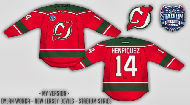
New York/New Jersey Staidum Series [Ricky Mazella]

What I like: There is a bunch of color in all the jerseys. It looks classic yet modern. 

The odd color socks for the Rangers jerseys. It is a nice way to balance the color of the jerseys without adding too many stripes or making them thicker.

The Non Crome Logos. The crome logos are too gimmicky for the NHL. There are better ways to make a modern jersey than crome logos.

The reversed tied collars. It is a classic twist to a modern idea.


What I don't like: The logo on the Rangers jersey. The Rangers always need to have a wordmark on the front of their jersey. They're the Rangers, it's their thing.

Even though I like the color in the jerseys, It would be almost impossible to tell red apart from orange on the ice or on TV.

The weird things on the front of the helmets. Crome logos would be a fine thing for the helmets if you still wanted to include them.


This concept was very creative and had some good ideas. I would sort out a few kinks in the design.


Toronto Maple Leafs [Matt McElroy]

What I like: The fact that you didn't change the jerseys too much. The Leafs are untouchable. Not to be touched.

The odd color collar. It looks good as always. If it wasn't there, the tops of the jerseys would be boring.

The logo. It looks just as good as the current. If you try to change an "untouchable" team, you've accomplished a lot to be just as good, if not better. Even though it isn't your own logo, it looks good.


What I don't like: The non exestant pants stripe. It would look nice to put a rotated version of the home jersey stripe on the pants with the logo as well.

The non exestant helmet logo. It's not a big deal, but it would look better with something there. 

Nothing to do with this concept, but IceBorn gloves would add some depth to all of the concepts.


A good concept, but not better than the currents. A 7/10


Did you enjoy the concepts today? Was I unfair to the artists? Starting a conversation in the comments adds a whole new aspect to the post. See ya Later!


~Caden

Monday, December 30, 2013

Monday, Monday

So what's happening on your Monday? At my house it's pretty relaxed, and that's why I didn't prewrite this post. I just got a new laptop, Windows 8, of course (still learning how to work it), and though I haven't set up all of my files yet, nor downloaded Paint.net (the program I use for all of my concepts) I can still write this post! Now for your weekly HCIHL scores.
You can always check scores and stats at HCIHL.Blogspot.com
 
Altoona Express 176.9 - London (ON) Sabreswords 81.1
Evansville Rivermen 180.3 - Skopje Lisici (Foxes) 112
Hamilton Stags 193.3 - Louisville Lynx 135.2
 
Now on to your regularly scheduled concepts....
 
___________________________________________________________________________________
 
Columbus Blue Jackets (Matt W.)
One of hockey concept world's many Matts brings us a very unique Columbus concept that I'm indifferent on. I actually kinda like the Blue Jackets jerseys now (don't shoot!), and I don't know if I'd like this. Right now the striping looks a bit minor league-ish or too much like Anaheim. I'm guessing that the stars on the cuffs are centered, but the way you have it now there would be two of them. The more and more I look at the concept though, I like it. My suggestions (and this is with all of the concepts that include the Ohio flag like this) is to put some blue in the striping (on the white jersey). I'd put it right above the striping and end it at the stitching. Concept Rating: 7.7/10
 
Stadium Series LA (By Ricky M.)
 Friday's writer Ricky gives the first concept of his new mini series with LA. With the winter classic coming up, we will see the first colored game for a long time, with the last one being with LA's yellow jerseys. I really like the lack of chrome on the logos, but I can't say I like the old shield logo for LA, though I do welcome Purple back greatly. The under arm mesh looks too Nike for me, and the numbers on LA especially would be waaaaaayyyyyy too dark to see. I would like some Purple in LA's striping and some bronze in Anaheim's. The helmets are very odd, and other than the U of Michigan's helmet striping, I don't think I've seen anything like it. Concept Rating 6.5/10 (ANA 7.1/10) (LA 5.9/10)
 
___________________________________________________________________________________
 
Another post another day, goodbye and see you on Wednesday!


Sunday, December 29, 2013

Sunday: Middle of Peg

Hello everyone I'm Alan, I'll get elbow to my head, so you don't have to. Welcome to the Sunday edition of HCI. Today it's all Winnipeg Jets post, two from me, and one from Matt. Let's get jetting shall we.

Winnipeg Jets Concept [by me]
This is my Winnipeg Jets Concept from 2012, the logo of the jet with the word mark in front of the jet is made by me, the jersey I try to mix with two Reebok edge cookie cutter design by using the Blue Jackets current set, and the Flyers old Reebok set. The colors is navy, royal blue, and red on the jerseys.

Winnipeg Jets Concept (NHLuniform.com version) [by me]
 It's pretty much the same as the one above only made some tweaks just to fit this template.

 Winnipeg Jets Concept [by Matthew M.]
Up points: The design may be almost the same as the team's current set, but using red instead of powder blue is a smart move! It's well balanced the stripes is neat.
Down points: Red nameplate, and red numbers on the white kinda over doing it. Lastly the red pants looks unfitting to the jerseys to me.
My Suggestion: Make the nameplate on the white blue, make the numbers blue with red trim, and lastly make the pants blue with red and white stripes.

Well that's today post! If you all want to know who won the Creighton Blue Jays contest you'll have to wait for this week for the result. Until then, I'm Alan, I'll get elbow to my head, so you don't have to.

Saturday, December 28, 2013

Saturday: Going West!

Hello I'm Alan, I'll get elbow to my head, so you don't have to. I had an good Christmas, only got one jersey this year, and that's the Team Canada Olympics white jersey, but I did got some goodies along the way. I got Team Canada hat, the Quebec Nordiques T-shirt, Quebec Nordiques hooded sweater, and a Winnipeg Jets shirt, and track pants.

Creighton Comp Voting ends "TONIGHT" at "11:59pm"

Yes indeed Christmas may have passed, but it ain't over yet. We got New Years to go through, but for now on to the concepts.

Edmonton Oilers Concept [Matthew M.]
Up points: Nice design on the jerseys, using the tie collar is O.k. Lastly the stripes on both arms, and hem is well patterned.
Down points: No yoke on the white jersey looks empty to me, and orange numbers looks fine but only if it's used only on the dark, not on the white.
My Suggestion: Add the yoke on the white, and also on the white make the orange numbers blue.

Vancouver Canucks Concept [by Justin S.]
Up points: An classic De-Edge look really fits this team nicely. The use of green on the jersey is right on.
Down Points: The "Vancouver" word mark made it busy, and there's an trademark dot beside the logo. The TV numbers is white with blue trim on a white stripes with green trim makes it unreadable.
My Suggestion: Remove the "Vancouver" word mark logo, and add green trim around the logo. Make the TV numbers green, or blue.


Well that's today's Post be here tomorrow for the Sunday post by me. Until then, I'm Alan, I'll get elbow to my head, so you don't have to.

Friday, December 27, 2013

Friday: Back in Banditland

While I'm excited for the start of box lacrosse season tomorrow night, I have hockey business (like this post) to tend to. But if you ever get to go to a game, I recommend it - especially in Buffalo or Colorado who have the best fans in their respective divisions. I'll be going tomorrow night and I prepared some concepts for that (you'll know where to find them). I am also in the process of getting stadium series jerseys underway with the new template. Those will be here sooner rather than later.

Creighton competition ballot closes S-a-t-u-r-d-a-y night!

2014 HCIHL Frozen Face-off
Submitted by: Matt McElroy

Boy would I like to have my team participate in this if it is continued. Matt here gives us different shades of blue and gold for the Rivermen, which now look more like team Sweden, but it looks good - much better than at least the current alternate which to me appears bland for an alternate. Now the Stags on the other hand find disfavor with me. It's not because they are well ahead in the league. It's not because they're from Hamilton, and it's certainly not because Matt is a Ducks fan (correct me if I'm wrong). It's that wordmark most of all, but also the mismatching amount of stripes and the odd pants stripe. Even the number font doesn't look like it should be on a jersey.
I do like the color, but most of it doesn't make sense. If it weren't his team, it would be easier to say 'I wonder what Matt McElroy would do' but we can't do that. I honestly have no suggestions as to how to fix it. I really want to so that we can say that there is hope. Speaking of hope, that's Matt as he is good at making things better whether he gives someone input or changes it himself. I may not like that one much but it has potential and the Evansville kit looks sharp.


Submitted by: Matt McElroy
Let's move onto another of Matt's objet d'art. This time he takes us to the Rock we know better as the Prudential Center. I think this would look even better in the green the team used to use, but this is a very good start. A double yoke outline and tri-stripe design really highlight the other elements really well. The only thing that might need immediate attention is the helmet, which should be red because I feel it blends in too much with the yoke. They would be green in the case of that color being used over black. Still, nicely done.

Creighton competition ballot closes S-a-t-u-r-d-a-y night!

Before I go, it's time to do something that I forgot to tell you about with the chaos of exams and whatnot. The Ricky Points System (RPS) has arrived! {applause, please} Glad it didn't show up yet, because I made changes appropriately to make it more suitable. The criteria are as follows:
  • 10 - Receives a perfect score from the old rubric. (it's really hard to do, that's why it 's worth so much)
  • 4 - Hand-drawn/heavily genetically altered work (of premium quality, not low grade)
  • 2 - "Ricky-esque" in design (not that I like concepts that look like mine - I'm pretty tacky with my wardrobe after all)
  • 1 - Personal preference

* * * Negative points will be added as the converse of the above {except 2 point rating which is replaced with unoriginality and 4 point rating which is poor in electronic graphic quality only}. However, you cannot be in the negative or at zero upon receiving negative points. Contest winners are subject to points (6,7,8 - cum laude, magna cum laude, and summa cum laude) if they reach a minimum on the rubric - provided I have not yet surveyed that concept. * * *

Now let's get caught up, shall we? Matt McElroy's Columbus concept from  two weeks ago almost cracked the the safe with the rubric missing by 4 points. However, the RPS point he earned was primarily the result of the boldness of that concept. Not including execution, any person can get at least one personal preference point for getting a perfect score in a particular category (boldness/conservativeness {whichever it leans towards}, color, impression/appearance, originality, and presentation {I'm big with food presentation, so I include it}). I would award Matt (again) at least one point for the Evansville uniform, but it is only part of a concept and is therefore not eligible. Many others have come close, but only one has succeeded. Enjoy your (for now) lone point as you can lose it and others can gain ahead. Make friendly competition of it if you want or something, the points really don't matter. This is not a concept or concept artist rating either. Just sporadic points being dispersed around. If necessary, just shoot comments or questions around in the comments section - remember, it's in good fun. With that, I bid you a good weekend and happy hockey!

-Ricky

Thursday, December 26, 2013

Thursday. Post Christmas Blues

On this, the day after Jesus' birthday, the day after bearded stalker (Santa) gives you love gifts. THE DAY AFTER CHRISTMAS, I am currently feeling the post holiday blues. Speaking of blues, we have a Blues concept today, That means you have to keep reading. But not before your reminders

Creighton Comp Voting ends SATURDAY


London (ON) SabreSwords [Matt MC.]

Like: 
The way the arms are done. The black looks really good on the green jersey.
The gold accents. It looks nice the way you incorporated gold into the color scheme.
The black equipment. It would be cool to add gloves to the IceBorn template.
The tie down collar. It's good for a team with a classic design.


Dislike:
The lack of black on the white jersey. It's not completely gone, but there isn't much.
The logo. The current one is simple and clean. This one's too busy. Might work as an alternate or shoulder patch.

Could Care Less:
The color scheme. It would be nice to not have a color used by the local Major Junior team. 


Buffalo Sabres Alternate Jeremy Roney
Before anything else I must say ALWAYS PUT YPUR NAME OR SOME SORT OF ID ON YOUR CONCEPT! Anyone could take this, put their name on it and send it to HJC and take credit for it. Hockey Concepts are art. An artist always signs his work.

Like:
The Red/Black color scheme was brought back. I always wished the Sabers would have a black or red alternate jersey.
The numbers on the front. I hate them in the Sabe's current set. But it works for such a modern jersey.
The side panels. Again I DESPISE them. But this is the 1% of the time it works.

Dislike:
The logo. I would have put the current Sabers logo (recolored) on the front of the jersey and put the crossed swords logo on the shoulders. The "Goat Head" needs to die.
Speaking of shoulders, They would look better black.

Could Care Less:
The "Buffalo" wordmark. It might look better small and above the logo. But it would be a lateral move.


Like:
The double blue design. The Blues don't look good in just one of their two shades of blue. There is a good balance on the home jersey.
The stripe on the pants. It always looks good to have a multicolored pants stripe on the pants while avoiding piping. (The Penguins messed that up)
The thick number outlines. It just looks good. That's more of a matter of opinion though.
The socks stripes. It would have been so easy to make it look bad. It looks classic yet modern.

Dislike:
The away jersey's lack of light blue. As I mentioned the light blue MADE the home jersey. 
The Blue helmet with the away jersey. If you had a blue yoke on the jersey the helmet would tie in and look good. But it doesn't.
The numbers seem small. Mabye it's just the font.

Could Care Less:
The Tie Down Collar.


Well, Did these concepts cheer you up a little from your post holiday blues? Would you be more cheered if you saw your own concepts up here? Just send em in! hockeyconceptideas@gmail.com
And be sure to check out these blogs!

~Caden


Wednesday, December 25, 2013

Wednesday: Your Presents Include...

It's Christmas day, and I wanted to try something a bit different...
I wanted to use a William Butala esque rating system that I thought would be fun for Christmas. The way that I decided to do this is through hockey team Christmas card/greetings. Well I know that you all are dying to see what type of ratings I do so we should get to it. But first your one reminder...

 Creighton Comp Voting ends this Saturday Dec 28

_________________________________________________________________________________

Philadelphia Flyers (By Jeremy R.)
Jeremy starts us out with a Flyers sweater that isn't that bad. He kinda fixes the problems that were on the original edge jersey (angled arm stripes, nothing on the hem, ect...). He replaces it with arm piping and pretty much fill in the blank arm stripes that, in this case aren't bad. I think that the captains patch should have an orange outline, and the number on the front shouldn't be there. I also like the collar. On an execution note one of the TV numbers on the back view is missing. I also find the pit stains unnecessary.

I give this one the rating of Philly's rival team, and my personal favorite team, the Penguins. This concept in my opinion isn't as good as their currents, but tries to be (like any concept). The Pens video tries to be like this (awesome) Blackhawks video, but doesn't really do it. Concept Rating 7.5/10

London Sabreswords Christmas Game (By Alan H.)
Our own writer Alan, gives us this nice Christmas game concept for his HCIHL team that I like. :The striping is pretty nice, but I kinda reminds me of this Lithuanian jersey (don't ask why). I'd have to see how the side panels would look in a game, because it's so different, but it works. The logo is great and the jersey is good for one time use. I don't have any problems with it at all.

I give this one the rating of the Virden Oil Capitals, wait who's that? They are a team playing in the MJHL in Virden, Manitoba. Like this concept the video is very festive and it's well done, especially for a junior team. Concept Rating 9/10

_________________________________________________________________________________

Well that's it for today. Sorry about the late post, but hey I'm sure Santa's late sometimes too. Bye and Happy Holidays!

Tuesday, December 24, 2013

Tuesday: Christmas Eve mix up


Colorado Avalanche [Dylan Wonka]

Dylan's concept is very similar to one I saw from Alan on Buffalo nickel graphics, but it was sent in before Alan's was up. I like the blue as the main color. The mountian striping on the yoke looks subtle. Which is good. The slanted striping looks modern, but actually works. Unlike the Staidum jerseys. I'm not a fan of the grey. That's the only thing I would change. Dylan hit the nail on the head here! A 9.6/10


New Jersey Devils Staidum [Dylan Wonka]
Wonka's second of the day consist of a Staidum concept. I like this concept, but ai see the reason behind the long numbers. Also as a one off the Crome logos are cool! I like the way you reversed the hem striping with the arm stripes, and I like the way they go all the way around. The straight tv numbers are fine. I don't really care either way. I would add the crome logo, stretch the numbers, and add a green outline around the letters on the name. Satan would approve. A 8.9/10

Welcome! Caden here from North Carolina! Well! Do you like going straight into the concepts? I wanted to try something different. Do you want to see your own concepts up here? Send em in! hockeyconceptideas@gmail.com


Blue Jays Comp. Vote Now!!!!!!!!!!

Have a Merry Christmas, Happy Hanukkah, Happy Kwanza, Happy Decemberween, Happy whatever Holiday you're celebrate. Caden is out!


Monday, December 23, 2013

Monday: Without School is so Much Better II

So, Christmas Vacation's pretty good, eh? Well I know 2 weeks off is pretty good for me. Well I'm Jake, I'll get the elbow to my head, so you don't have to.

Wait, what?

_________________________________________________________________________________

Carolina Hurricanes (By Matt Mc.)
Matt's Iceborn-NHL series continues with Carolina. 

Like- 
Number font
Hurricane striping returns
Equipment

Dislike-
Sock Striping doesn't match the jersey
Black name on red jersey
Away Yoke doesn't continue to the name bar (like it does on the currents)

Could Care Less-
Logo (interchangeable with the current)
Grey Collar insert

Concept Rating 8/10

Vancouver Whitecaps MLS (By Justin S.)
Justin gives us a NHL to MLS crossover concept that features the Vancouver Whitecaps

Like-
Colors
Striping Pattern
Number Font
Advertisements

Dislike-
Lack of White in striping

Could Care Less-
Arched name
Laced Collar

Concept Rating 8.3/10

Anaheim Ducks (By Matt Mc.)
Matt's second concept of the day features the Ducks of Anaheim.

Like-
Striping Pattern
Logo 
Equipment
Fonts
The Orange jersey in general

Dislike-
Lack of gold/bronze on the white jersey
Lack of color on the white

Could Care less-
Helmet logos
Collar

Concept Rating 7.5/10
_________________________________________________________________________________

That's it for today, until next time. 

One last thing, expect something a bit different for Wednesday...

Sunday, December 22, 2013

Sunday: The crazy week begins

Hello I'm Alan, I'll get elbow to my head, so you don't have to. Well if you all didn't send your entry to the Blue Jays contest, I'm sorry it's too late to send it because we are now on the voting round right now, just click on the Blue Jays Comp for info. But that doesn't mean you have to stop sending your concepts in just send them to hockeyconceptideas@gmail.com.

Here are the last batch of of the Blue Jays entries

Ricky M.

Alan H.


 Creighton Comp Voting ends this Saturday Dec 28

Last night I went to Wheatley for an hockey game it was fun to watch an Jr.C league game, the Sharks won the game, and may I say they have the best locker room that opens before they hit the ice.


With that out of the way, on to the concepts

Los Angeles Kings concept [by Matthew M.]
Up points: Nice idea of bringing back the purple, and gold back. The logo is well tweaked to the mix of classic and modern. It maybe the same template as the team's current white uniform, but with different collar on both of these jersey gives it more better look.
Down points: Nothing much say any bad about this one.
My Suggestion: The only thing is add purple trim around the logo on the gold jersey, that's all. 

Indy Fuel concept [by Caden P.]
 Up points: Good idea on using the checker stripes to give it a little fitting theme to the team. Using red as the team's main color followed by yellow and black.
Down points: The numbers on the back, and the small numbers on the front is standard block, while the TV numbers is SF Piezolectric, it doesn't really fit the jersey. The yellow collar looks O.K. on the dark jersey, but yellow collar on the white looks plain to me.
My Suggestion: Fix the fonts on the numbers, so they can be on the same page, the only thing that you can get away with two different fonts is nameplates. Add trim(s) to the collars to give some life to it. Lastly add the team's secondary logo on the shoulder.

Florida Panthers concept [by Matthew M.]
Up points: The design on the jerseys are well made. using the navy blue trim on the numbers for both home and road is an good move. Lastly red as the team's main color fit this team in a good way!
Down points: The front logo looks good, but it's only work on an alternate jersey to me. The road looks like it has less red on it to me.
My Suggestion: Put the full body panther with the broken hockey stick on these jerseys. On the road switch the navy blue and red stripes and it'll be complete.


Wheatley Sharks OHA Great Lakes Jr C Jerseys Concept [by me]
This is the Wheatly Sharks OHA Great Lakes Jr C Jerseys Concept. It’s pretty much a recolored Worcester Sharks concept just to fit the teams theme, their main crest is their own just add outer lines around the crest, the colors I gave them is navy blue, royal blue, red, and silver, and of course like most of junior C teams have a Canadian Flag on their yokes. This is what the team currently wearing right now.


Belleville Bulls OHL concept [by me]

This Concept I kept it simple made only 3 stripes on the hem, the wrist cuffs, socks, and V-neck those 3 stripes represent decades, over 30 years that this club been around, the main crest is their old crest they use since the beginning and they still use them for both their dark, and 3rd while their white jersey they got that cartoon bull, back to the concept the main crest is indeed the old bull just add trim around the crest and "Boom!" my Belleville Bulls concept.

Well that's today post. What do you think of my  Wheatley Sharks and/or my Belleville Bulls concept?

Until then Merry Christmas, Happy Hanukkahs, Happy Kwanza, Happy Decemberween, Happy whatever Holiday you're celebrate.  I'm Alan, I'll get elbow to my head, so you don't have to.

Saturday, December 21, 2013

Saturday: 3 way dance

Hello I'm Alan, I'll get elbow to my head, so you don't have to.

Blue Jays Comp entries due "TONIGHT!"
By Jake88

Last week was head to head of Stadium Series concepts. Today I decide to raise the bar up with "3 way dance!" That's right! I got 3 alternate concepts here to see which one is the best! Let's get going shall we.

Carolina Hurricanes alternate concept [by Dylan W.]
Up points: Nice style on the hem stripe. The logos is an good choice to use. Two stripes on the collar is thumbs up from me.
Down points: The arm stripes doesn't have the same treatment as the hem. Good choice of number fonts, but on the back two 4s is too close together to my mind.
My Suggestion: Give the arm stripes the same treatment as the hem stripe, and space out the back numbers a little bit apart.

Dallas Stars alternate concept [by Jake88]
Up points: Using the state logo on the front is a good move. Adding trim on the numbers is an good idea.
Down points: The jersey is good, but it has that minor vibe to it. The only silver I see is on the logo and not anywhere else. The trims on the numbers looks like it blend together that is hard to see.
My Suggestion: Add some silver to the jersey to give it more life to it. Change the black, and green trim on the numbers to green and silver. 

Chicago Blackhawks alternate concept [by Jeremy R.]
 Up Points: This looks classy and nice. Love the arm stripes. The yokes stripes maybe weird, but well placed. Numbers and nameplates are classic and well untouchable.
Down points: The hem looks too plain to me without any black stripes to it. No ID to know who made this, and could potentially be stolen by someone else.
My Suggestion: Give the hem the same treatment as the arm stripes. Add your ID with it, ether your name, your nickname, etc.

The Winner: All three are really matched both ups, and downs. But in the end Jeremy's Blackhawks alternate concept takes the victory today, despite no ID with the concept, but it's an very good concept no doubt about it.

Well that's today's post, tonight I'm off to Wheatley, Ontario to watch some Jr C game between the home team the Wheatley Sharks taking on the Wallaceburg Lakers, It'll be fun for me, and maybe hopefully they sell any game worn jerseys there for me to buy to add to my jerseys collection.
Until then I'm Alan, I'll get elbow to my head, so you don't have to.

Friday, December 20, 2013

Friday: Deja Who?

For one thing, we know all of these artists as writers of the blog at some point in time. Another thing we know is that Jake88's concept was from a series he did a few months ago.

Creighton Comp entries due S-a-t-u-r-d-a-y night!

Tampereen Ilves
Submitted by: Jake88
This particular one I remember, but not whether it was one I reviewed at HJC. I think it was the day after one of them, but I'm not 100% certain. I like this idea, but I'm not exactly sure how the logo is supposed to look like a lynx . . . but it's passable I guess, definitely not on Jake88. As many of you may have figured out by now, I love when he is able to fill out his glove template in multi-color. Everything, and I mean everything matches. The only thing that I might do revolves around the pants and helmet switch the color of one of those items to black and I'll be okay. You can even do the helmet for one uniform and the pants for the other.

Edmonton Oilers
Submitted by: Caden Patafie

To be honest, I'm intrigued with this. While I don't like the lack of an accent color (on the logo for sure), I do like that the logo includes the traditional Oilers word-mark inside the oil drop. The font itself is okay, but I don't know if the Blues/Predators template is what I'd use for this. Definitely add at least one accent color like a white or even the copper and/or red from the Bettman era stripe days.The piping helps a lot here, but only because of the other placement of orange in the jersey. You can keep this template if it can be made look at least decent with a minimum of one accent color, then I'm cool with it. Otherwise, ditch it for maybe Philly's template.

Washington Capitals
Submitted by: Justin Sulpico

This says traditional black and gold Caps all over it. This uniform was only ever produced in black. The black was introduced as an alternate for 1997/98 and got promoted to full time road set in 2000/01 and switches to home for 2005/06 with the post-lockout era beginning. The idea and the execution are spot on. These have been slightly changed to Justin's liking compared to the jersey the black version of this replaced. I like the black numbers better than the white from the actual one, but as much as I like the hem striping and its spacing, I think that the white between the black and gold should be removed thus making the hem slightly shorter.

Creighton Comp entries due S-a-t-u-r-d-a-y night!

In the mean-time, I was in Philadelphia this past week for the NCAA Division I men's soccer championship. There I went to the Phillies team store - the only one of the three open. The last three days have recapped my trip and yesterday goes more in depth on the uniform apparel at the shop. But more importantly and in other news, Teemu Selanne is back on the score sheet! His first goal in I think 25 or so games. I leave you with this lovely holiday reminder from Sabres p-x-p man Rick Jeanneret: "'Tis the season, fa-la-la-la-la-la-LaFontaine!"

-Ricky

Thursday, December 19, 2013

Thursday: How much Fuel to get to Europe?

Hey HCI readers! Caden here from Wheeling WV. Yes I know your saying "Wait! Isn't Caden from Evansville?" Well I am, But I traveled with the Icemen (ECHL) as an assistant to the Equipment Manager and then I will meet up with my family and we will drive south to my grandmother's for Christmas. Being away from home won't stop me from bringing you today's concept selection. If you ever want to have your concepts featured on HCI, Email them to hockeyconceptideas@gmail.com. We post every concept sent in!* So, Here we go!


Blue Jays Comp entries due Saturday!


TPS Turku [Jake88]

Jake88 is back to his "euromaster" ways, which I like. Even though its so easy to make better uniforms than European teams, since 90% of them suck!

What I like: I like the monochromatic colo(u)r scheme. It really fits the team. The Caps template looks modern, which I like. The piping in this case, actually isn't bad! 

What I don't like: The logo. I know it's the teams current logo recolored but it looks like a basketball logo. The TV numbers (For new readers who might not know, The arm numbers are sometimes called TV numbers since they originated for TV use) seem a bit to large. The pants/sock stripes seem weird with 3 stripes. The number font seems to classic for such a modern jersey. I would use this

What I would do: Make the pants/sock stripes one solid bar (If the jersey wasn't monocrome it would be better with 3), shrink the TV numbers by about 8%. Small change but it would make a big difference. I would also change the font to something more modern to fit the modern feel of the jersey.

Turkomazing idea! A couple changes would really help. A 7.9/10


Indy Fuel [Matt McElroy]
McElroy's Fuel Contest entry tied with mine for 2nd, and uses the checkered flag pattern much more subtly. 

What I Like: The subtle use of the checkered pattern looks good here. If only I had thought of that! The font works well. I even don't mind the mis-matching colo(u)rs for the number/NOB on the red jersey. The black pants look spectacular with the 2 stripes.


What I don't like: The white jersey's striping could use some black. I also don't care for red helmets for any team. Even if they match the jersey. There's a reason why MontrĂ©al wears blue! The yellow numbers on the white jersey.


What I would do: Change the red helmet to black. You might want to throw a logo sticker on there as well. Make the bottoms of the jersey/arms black on the white jersey so it inverts the red one. Make the numbers on the white jersey black instead of yellow and add a yellow outline.


A nice jersey. The pit crew needs to make a couple improvements before the green flag can wave. A 8.3/10


Evansville Rivermen [Matt McElroy]

Matt MC's 2nd concept of the day not only gives the Rivermen a different jersey design. But a new logo as well.


What I like: The fact that you made your own logo. Making logos is my weak point. That's a nice, sweet, simple logo. The lack of white jersey. My personal opinion is the more color, the better it looks on the ice and on TV. Not with all occasions. But most. I like the double outline on the blue jersey numbers. It looks classy to add to a modern jersey. Nice touch. I do wish I could see what the shoulder patch was in a full size picture. It looks pretty cool. 

What I don't like: The white pants stripe. White isn't featured prominently on much of the design, but its front and center on the pants. Both the crest and shoulder logo seem a bit too big, and I don't like that it's only on one shoulder.

What I would do: Change the pants stripe to yellow, and make the logos a bit smaller. I would add the shoulder patch on the other shoulder as well.

Perfect Idea! A couple barges (barges are famous in Evansville for being a nusince to boaters) need to  move. A 8.5/10


Did you like my simple way of reviewing jerseys today? Was I fair with my reviews? Is there a different rating system you want me to try instead of the typical Out/10 way? Are you a new HCI reader? Are you intrested in getting a HCIHL team for next season? Just leave a comment! We love to hear comments from the readers about how we can improve!

Until next Tuesday (Christmas eve), this is Caden saying, Peace out!


Wednesday, December 18, 2013

Wednesday: Nothing Special

Welcome to a regular HCI post! No College Classic stuff, no HCIHL scores, and no contest winners to announce. Sounds fun right? But you can be the next contest winner by submitting an entry into the Creighton Bluejays comp.! Now that's fun!

Also I suggest you check out the new HCIHL website. You can click here, or to get to it easier click on the HCIHL tab. We've been posting a lot of news lately so I suggest you read some of it. But enough about that, on to the concepts!

 Creighton Bluejays Comp. Entries Due Saturday 

By Caden P.
By Justin S.
_________________________________________________________________________________

Dallas Stars 3rd (By Jeremy R.) 
Jeremy starts us out with an "unmarked concept", but seriously putting your name on your concept is really important. Everyday *thousands of concepts are stolen other concept artists.
*Number may be exaggerated just a little... 

Anyway, I can't say I truly like the concept that much. I see where Jeremy is coming from, with the arm striping from the white jersey, and hem from the green. But I really don't like the rest. The green numbers would be impossible to see from a distance, same with the name. Make those white, with a green outline. Also I don't prefer the green pit stains or piping. The way I'd fix this is put the hem striping as the arm striping, take out the piping/pit stains, and fix the number situation. As an execution errors go,the T.V. numbers are too small, and the black in the logo is different from the black on the jersey. Concept Rating 6.4/10 Not bad, just not for me.

Buffalo Sabres  (By Matt Mc.)
Matt provides us with a nice Sabres concept that doesn't fall out of favor with me. The striping is new and interesting, but the white part doesn't show up well on the yellow jersey, I'd find a way to fix that. The number font doesn't really fit the rest of the jersey if you ask me, but isn't horrible. The square yoke, though something Reebok would do, isn't something I prefer, rounded would fit. Though Matt's whole series he's been using dark helmets for white jerseys, which I don't mind here, but I thought I'd point it out. Concept Rating 8.2/10 Make those small changes and a 9/10 is in your future.


Pittsburgh Penguins Matching Stadium Series Jersey (By Brian B.)
Brian gives us a jersey to match the one the Pens just came out with. It fixes all the Stadium Series problems such as the chrome logo, weird TV numbers, and elongated back numbers. I didn't include the hem in there because I personally don't mind the hem, and I think that you should have it here too. either that or curve the stripe to get it to follow the hem like the Stadium Series jerseys. The only other problem that I have here is the collar insert, they keep it gold for a reason (in reference to Pittsburgh's golden triangle [also seen in the logo]). Concept Rating 8.5/10 I'd love to see my Pens wear both of those jerseys full time (minus the Chrome logo, ect...), but with those small fixes, I'd have one in my closet pretty fast!

_________________________________________________________________________________

Did you like to today's 3 concepts? Do you wish there was four? You can make four happen by sending a concept in! It's quick and easy! So get to your email provider right now and send your concept to HockeyConceptIdeas@gmail.com. I won't let you read anymore of this post because I know how important it is to send in those concepts, so bye and come back soon!