Tuesday, August 26, 2014

"Mocking HJC"


Hey guys! Caden Patafie here, the new Tuesday writer for Hockey Jersey Concepts! Big thanks to Ryan for giving me this opportunity to write for HJC, as it’s been a dream of mine ever since I started reading the blog. Though I was a big fan of Phil Beck and his perspective on life, I'm happy to give you mine.


If you haven’t seen I’m sure you've seen the new Saint Louis Blues jerseys, but if you haven’t, here you go!


I’m so glad they got rid of the piping, the hem stripes look amazing, and it’s just an all-around turn for the better. They also kept the alternate status-quo.

Here are your friendly HJC reminders!!!
COTW Aug 18-24 vote (ends Friday @ 11:59pm Eastern)
HJC Writer applications (due Friday @ 11:59pm Eastern)
Grand Rapids Griffins Competition (ends August 31st)

If you haven’t sent your Griffins Comp entry in, you should! I did, what do you have to lose? You have an opportunity to have your jersey worn by an AHL Team! How cool would that be? 


Ryan Haslett (HJC) Anaheim Ducks


Good: I'm a big fan of the added orange. Orange isn't used that much in the NHL, so it adds some uniqueness to the jersey. The white yoke is fresh and new, and again, isn't widely used. Your execution is spot on. The only problem is a loose pixel on the front hem on the inside of the jersey. Which can be easily fixed

Bad: The yoke stripe crowds the shoulder patch, I would move the stripe down a few pixels. The "D" logo doesn't work. There isn't any bronze on the jersey so it looks out of place? Have you tried using the oval goalie mask logo? It might look good?

Final Rating: 8.5/10


Chris Redford Miami Dolphins Crossover

Good: Football crossovers aren't super common, so it's a nice refreshing change. Miami was a good team to pick, if not solely for the colors.

Bad: Though the idea could've worked, it didn't. This looks like a practice jersey. Some stripes would help take this concept a long way. The shoulder patches and TV numbers are upside down. It's an easy fix but it makes the jersey look a lot better. Put your name or ID on the concept. That way nobody can take credit for your design.

Final Rating: 4/10 (Keep making concepts. You will have a COTW winner in no time!)


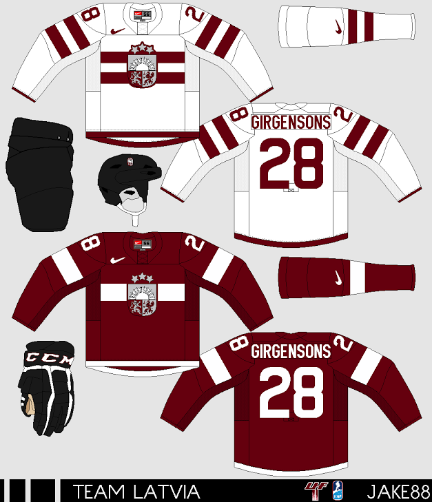
John Roberts HC Lev Praha (KHL)

Good: First off, the execution on this is off the charts! Helmet logos, pants logos. Its looks so well presented and professional. Jake88's glove and helmet templates looks nice as well. I like the hem stripes. The coloured yoke and hem on the white jersey look sweet as well. (Kudos for adding the KHL logo to the collar insert and tags)

Bad: The logo is slightly large. I really, REALLY do not like the yoke stripes. They look almost cartoony and out of place. Again, put your name or ID on the concept.

Final Rating 9.5/10 and a COTW Nom from me!


Kirk Sandford San Jose Sharks
Good: Thank you for adding hem stripes. I hope the jerseys don't become too heavy. The return of grey is nice as well.

Bad: As Ryan has stated in a previous HJC update, and many writers have mentioned as well, ABCD and 2 numbers that follow each other are lazy, put Burns or Couture or Hertl or somebody. You need to cut all the extra bottom space out from below the actual jerseys, it makes it look unfinished. The white between the grey and black stripes blends too much with the grey. Put. Your. Name. Or. ID. On. Your. Concept!

Alan Johnson Anaheim Ducks

Good: The Colour is balanced well. Execution is good. Thank you for putting a real name and number on the jersey. The old Mighty Ducks logo fits well with the template...

Bad: ... which is exactly what it is. Though the concept doesn't look bad, it's just a template concept. It's the Ducks old road jersey with Mighty Ducks colours. It's nothing new. Presentation is ok, but not spectacular. It seems really bland. Maybe you could brighten it up by PUTTING YOUR NAME OR ID ON THE CONCEPT!

Final Rating 6.5/10 (Work on the execution and you'll be up to a 7.5 at least)


Well, Thanks for letting me come into your computer today, and every Tuesday! Be sure to vote!, and Leave a COTW Nomination in the comments! Who knows? You may be the one to nominate the COTY winner! Now how cool would that be? (Deja Vu much?)

Later!


Sunday, June 1, 2014

25K views, Instagram, and a new beginning. Good Bye Readers :'(

       Hey HCI readers! Caden here ONE LAST TIME as I bring you the final HCI post. Wow, it's been a while since iv'e written a post, and since I wrote the first one, I'm writing the last one. What a ride it's been! Thanks for staying with us through the ups and downs, as we were committed to be one of the best hockey blogs out there. Obviously that didn't happen, bu we still reached 25,000 views. So THANK YOU.


       Since we couldn't compete with the excellence of Hockey Jersey Concepts or the popularity of Icethetics, It was a tough decision, but the HCI Board of Directors voted unanimously to shut the blog down. We decided that we wanted to deliver a good product, and many of the staff didn't have time for full blown posts anymore. Still, we wanted to keep HCI alive, and wanted to continue posting concepts, on a new playing field, one that hasn't been tried or tested. Enter Instagram. A few weeks ago, The HCI Directors decided to shut the main website down, and make a concept Instagram page. We decided we would have time for that, and we didn't have to compete/ripoff anyone.

Even though we wont have new blog posts, Me, Jake Miller, And Ricky Mazella will be posting twice a day on the NEW Hockey Concept Ideas. Our new setup hosted on Instagram and not blogger allows us to showcase concepts in a neat, orderly fashion, without having long cumbersome blog posts to distract you. It also has a better following feature than when we were hosted on Blogger as now people can view HCI submitted concepts as part of a group, or by themselves.

So yeah, go to THIS LINK TO CHECK US OUT!!!, and set up an account and follow us, since unfortunately Instagram doest allow us to see pageviews, as Blogger did.

And one last time, Thanks for Reading!


~Caden


Click here to see our NEW PAGE

Saturday, May 31, 2014

So long from me.

Hello Everyone, Alan here for my "Last Saturday Post!" Here on HCI. Now I'm never one of those people that post a long story on goodbyes, but I'm giving a shot. It's been a great ride for me from November 8, 2013 that began my time with this blogger page. I had some ups, downs, lefts, rights, ins, and outs. In the end I put every critiquing I put on this site. Now it's no more, now HCI is on Instagram! Even thou I'm not part of it, but that doesn't mean you shouldn't stop support them they got good guys doing their posts twice a day.
As I continue on with this I would like to give my thanks to two guys that were the reason why HCI came to light.

To Caden for giving me a kick in the butt to do a better job of posting my critiquing, and made me realize that there is more to it then just critiquing, I thank you for having me be part of HCI, and good luck on HCI Instagram.

Jake, you are bread, and butter of HCI, you work your butt off to keep this page going as much as Caden does, you have my respect for what you do, and hope you have a better ride over on Instagram.

As for the rest, I thank Ricky, Joey, and Justin for being a part of this great site, and put their dedication.

Well it's been a ride. Hopefully everyone has had a good time reading this site, as for me well I'll still be around just on my site for now. I thank you all and goodbye


~AJH


CLICK HERE TO CHECK OUT THE NEW INSTAGRAMS WHOOO!

Friday, May 30, 2014

. . . Thank You and Good Night, Elvis Has Left the Building!

It is with regret that we must for the moment leave you from the Blogger-sphere. Thank you for allowing me onto your screens over the past six months. It has been wonderful to have your support of HCI during that span and beyond. We all have appreciated it very much and hope you keep submitting to the blog's e-mail, which will be accepting submissions for our new Instagram page. My blog BNG can fill your reading pleasure, but also you can find other blogs at my site as well. Please make your final purchases and proceed to the checkout counters.


Remember, this is not goodbye for us here at HCI but rather the start of the next chapter. We still have our new Instagram account and who knows - we may be posting here again regularly. But only time will tell. "Stay calm, be brave, wait for the signs."

With Highest Regards,

-Richard F. (Ricky) Mazella II
Proud Founder and Owner of Buffalo Nickel Graphics

Tuesday, May 27, 2014

Ayy!

Caden here! Check out the NEW HCI! JUST CLICK HERE!


Thanks. 3 more goodbye posts are coming on this site, so stay tuned! Friday, Saturday, And a final post Sunday! Don't miss it!


~Caden

Saturday, May 24, 2014

Saturday: A IIHF concept made me

Hi everyone, Alan here for another Saturday post here on HCI. Due to me working at my job today, I won't be able to review a concept today, so for the first time in a long time I'm posting a concept made by me right here! This is a IIHF concept. The country is Liechtenstein, now this country doesn't have a good hockey history, but I decide to make a concept of what if Liechtenstein was part of IIHF, let's check it out shall we.

Simple concept the stripes is base on the country's flag. The logo I made has the letter "L" with red, and blue stripes, with the crown to go with all base on once again the country's flag. Numbers are the Ottawa Senators current fonts, and nameplate Anaheim Ducks fonts with only one trim.

Well that's my last post of concept made by me. Hopefully I'll have a concept made by someone else next Saturday, until then later.

Friday, May 23, 2014

Friday: Six Months Gone By

Those aforementioned changes in previous posts by various HCI writers are indeed coming. While we can't give the green light yet, I would like to reflect on the last half a year of blogging for HCI (which began six months ago this coming Thursday as well as today being the blog's 250th post. I also failed to mention that last week was my first full year of writing for any blog as I had started writing for HJC the day after (Saturday the 17th, but last year). Even though I had left HJC on November 22nd, Caden and the staff welcomed me with open arms and I started the following week here. I even got to celebrate my birthday by writing a post (rather than reading one). Twenty-seven posts (and weeks) later, I'm still here to promote the good will of the blog. While I don't know how long this format will keep up, it is likely you will hear from someone soon.

Philadelphia Flyers

Submitted by: Bradley DeBode

Let's in the mean-time discuss how ingenious this concept from Bradley is! Not the best one ever necessarily, but certainly creative and authentic. Another black uniform is certainly doable but I would like to see the alternate roundel in place of the Flyers logo. Because this is an alternate, I would like to see orange numbers with white rather than the current white with orange. If we're going to go with the nameplate, go orange there while keeping the black font. Finally either switch the striping color layout or the number color layout to match the other along the sleeves. Personally I'd prefer changing the numbers to match the striping. Still not a bad idea here though.

Happy 250th post!

I'm really looking forward to the future of HCI, I hope you do to. You all have been waiting a fairly long time for it, and while I can't be sure of when it will be, I can tell you it will be drastic. In the mean time, considering the post count in recent weeks, BNG is picking up. Head on over to fill your need - just keep checking in here considering the changes to come.

-Ricky

Saturday, May 17, 2014

Saturday: Alan's Playoffs picks: Round 3 picks, and round 2 reviews

Hi everyone Alan here for your Saturday here on HCI. As we now know that round 2 is in the books, so before my round 3 picks, I'm going to review round 2.

Eastern Conference
Boston [A1] vs. Montreal [A3]
My Pick: Bruins over the Habs 4-3
The Result: Habs beat the Bruins 4-3
I knew this series will go all the way, but didn't expect the Bruins fall apart that bad!


Pittsburgh [M1] vs. NY Rangers [M2]
My Pick: Pens over the Rangers 4-2
The Result: Rangers beats the Pens 4-3
My reaction, nuff said.


Western Conference
 Minnesota [WC1] vs. Chicago [C3]
My Pick:  Chi beat wild 4-1
The Result: Hawks beat the Wild 4-2
I did hope for a quick 5 games, but the Wild got other plans to push them to a sixth game that ended in overtime.


Anaheim [P1] vs. LA [P3]
My Pick: Ducks over the Kings 4-2
The Result: The Kings "L.A. Kinged" the Ducks 4-3
I can't, I just can't believed the Ducks fell apart that bad to the Kings, just can't believe it.


To the Conference Finals

Eastern
NY Rangers [M2] vs. Montreal [A3]
NYR: Thanks for taking not only the series from the Pens, but also take my points too.
Mon: I have to say I never thought that this team would be back in the conference finals for the first time since 2010, but here we are.
Overall: These two teams really push themselves to game 7, but the question is, how much they got left in the tank for game 7 in this series?
My Pick: Rangers over the Habs 4-3

Western
Chicago [C3] vs. LA [P3]
Chi: They got this far from all those six games series, can they slay one more dragon to go on to the Stanley Cup finals?
LA: The Kings took down the Ducks, can they take down the Hawks?
Overall: Tough call on this one, but I'm taking the Hawks.
My Pick: Hawks over the Kings 4-2

Well that's my picks, hope you all will enjoy round 3 til then later.

Friday, May 16, 2014

Friday: From Purple Eagles to Foxes and Back

The official announcement came and went fairly quickly and without much if any detail several months back. The HCIHL's Skopje Foxes have split into two teams with one facet staying in Macedonia in the upstart Balkan Hockey League and the other moving to Buffalo who will represent the franchise in the HCIHL. The official announcement of their home venue(s) were selected as the regular home will be at Niagara University's Dwyer Arena and having select games held at the yet to be completed HarborCenter in the downtown area, the new hockey home of Canisius College (who previously played at Buffalo State College's arena.

The Ice

The boards

End to End (TV broadcast)

This is what is expected in the coming months . . . The new uniforms have been well prepared, and had been officially released on the team's page on the league website. While many of you may have noticed that I have decided the team not use the primary logo on the uniforms, I wanted to use logos that actually look like they belong on a uniform. But I am excited to see the next season of the league with all the other changes about it. Landrov Air will also be the official league airline, servicing all team destinations (notice their main sponsorship section along the boards). That will have to be it from me for now, but it's time to #PaintItOrange so I leave you with one final word for the weekend: quack!

-Ricky

Saturday, May 10, 2014

Saturday: Two concepts shocker!

Hello everybody, Alan here at HCI with for the first time in a long time this post featuring "TWO" concepts. I'm so pumped up for this one, let's not waste time and get this post going.

Team Netherlands concept [by Jake88]
Up points: The stripes on the arms, socks, and angled stripes on the front of the jerseys is cleverly well put together. The logo is the best to my mind, one of those logos that can be use for any international tournament, including the Olympics!
Down points: The collar (you know what I'm talking about.) All the equipments (except the helmet) are black and I felt like it didn't fit well with the jerseys.
My Suggestion: Make the pants orange with two stripes like the jersey's stripes, the gloves orange with some white to it.

Quebec Nordiques concept [by Jake 88]
Up points: For a relocated team this is the best way to debut with! Using the logo made by Tyler Roger as main crest for the jerseys gives it a complete feel to it. Using the fleur-de-lis logo on the hem and the shoulder designed by Derschwigg really gives the modern era of the Nords the edge. Lastly like the stripes on the arms, and under the yoke in front.
Down point: The number fonts is alright but on the dark jersey I felt like it should be white instead of lighter shade of nordic blue as the main color on the numbers.
My Suggestion: Read the down points.

Well Saturday is in the books, hope you all enjoy the rest of the weekend, til then later. 

Friday, May 9, 2014

Friday: Land of the Other Rising Sun

No concepts, not a problem. Happy to write you again this fine Friday. I pulled something out of the BNG archives a midst my Ducks beating the Kings last night. As we go forward, I am glad to give the concept a polishing off from about seventeen months or so ago. This was before I knew about the goings of how this arena thing would work in Skopje.


So the big thing is that the logo is actually discolored and I had a difficult time brightening it. As for the arena, the exterior was only to cover the already existing ice which is adjacent to the actual arena. Not only that but they did have an open air dome put over it. Fine. As for the actual jerseys, I adjusted to the area of competition and used the KHL inspired template.

What's wrong with this picture? This is old, not yours, and a review of my own work. Please, I beg you to send in your work! Now I know that we've slowed down here a bit, but for me it's the joy of someone finding my work on a site is ecstatic. I would hope you feel the same. Until (probably) the next round of the playoffs, happy hockey and wish your mothers a hearty Happy Mom's Day.

-Ricky

Wednesday, May 7, 2014

Wednesday: Round 2

Hello everybody, and welcome to HCI.

If you haven't watched any Montreal vs Boston games, you should. The B's making amazing comebacks, (reminds me of game 7 against the Leafs last year) Montreal utilizing all of their lines - it's great hockey! Plus, a rivalry between the two teams! It sucks that Boston fans made racist comments towards P.K. Subban - classless. It just makes the Bruins look bad, and could set a little bit of a fire under the Canadiens - plus, Subban will score even more!

On to the concepts:

Oh, there aren't any right now - don't want this to happen? Send some in! :)


Thanks for reading my post! See ya next time.

Saturday, May 3, 2014

Saturday: Alan's Round 2 Playoff picks, plus Round 1 review

Hi everyone, Alan here on HCI. I got no concept this week, but I do have my NHL playoff picks round 2, now I know the 2nd round already started, but why not? Enjoy my Round 2 picks. But first I got my round 1 review. Let's get to it.

Eastern Conference
Boston [A1] vs. Detroit [WC2]
 My Pick: Bruins over the Wings 4-1
The Result: Bruins over the Wings 4-1
"Called it!" I knew that the Bruins have their way and keep their "A" game up, and keep the Wings from pulling an upset in this series. 

Tampa Bay [A2] vs. Montreal [A3]
My Pick: Habs over the Lightning 4-3
The Result: Habs sweeps the Lightning 4-0
I thought this was going all the way, but the way the first 3 games played this one was going to be a sweeper, until game 4 and Tampa gave it all they had, but in the end the Habs seal the deal, and moving on to the 2nd round.

Pittsburgh [M1] vs. Columbus [WC1]
My Pick: Pens over CBJ 4-3
The Result: Pens over CBJ 4-2
I'm hoping for this series would go all the way to 7, but the Blue Jackets just ran out of gas in game 6, but at least they put on a good series. For now the Pens are going to the 2nd round.

NY Rangers [M2] vs Philadelphia [M3]
My Pick: NYR over the Flyers 4-2
The Result: NYR over the Flyers 4-3
I thought the Rangers got game 6 in the bag, but the Flyers seem to put all of whats left in their tank in game 6. In the end they ran out of gas, and time to beat the Rangers. New York is going to Round 2.


Western Conference
Colorado [C1] vs. Minnesota [WC1]
My Pick: Aves over the Wild 4-1
The Result: Wild beat Aves 4-3
It was bad enough that the Wild drag on all the way to game 7, but also beating the Aves in overtime to go on to the 2nd round. Thanks a lot Wild.

St.Louis  [C2] vs. Chicago [C3]
My Pick: Hawks over the Blues 4-2
The Result: Hawks over the Blues 4-2
Right on the money! Just like last year the Hawks gave the Blues a butt whooping after being down 2 games to none. Round 2 look out the Hawks are back!

Anaheim [P1] vs. Dallas [WC2]
My Pick: Ducks over Stars 4-0
The Result: Ducks over Stars 4-2
I called for a sweeper, but the Stars somehow seem to give the Ducks a hard time in ending their season. In the end the Ducks are going to Round 2.

San Jose [P2] vs. LA [P3]
My Pick: LA over SJS 4-2
The Result: LA beat SJS 4-3
At first I thought the Sharks was going to bust my playoff bracket, but thank god the Kings came back and beat them.

Well here's my Round 2 picks

Eastern Conference
Boston [A1] vs. Montreal [A3]
Bos: The Bruins took out the Wings in five games as I call for it, the quicker the series the Bruins finish, the more tougher they get.
Mon: The Habs surprised me by sweeping Tampa in 4 games, now they are rested and ready for the Bruins.
Overall: Sadly the Bruins got this series, but Montreal will make them work for it.
My Pick: Bruins over the Habs 4-3

Pittsburgh [M1] vs. NY Rangers [M2]
Pit: The Pens had trouble with their game play, hopefully they fix their problems wisely.
NYR: The Rangers came out of game 7 so it'll be hard for them to be ready for this round.
Overall: If the Pens play their cards right, they got this series.
My Pick: Pens over the Rangers 4-2


Western Conference
 Minnesota [WC1] vs. Chicago [C3]
Min: The Wild slayed the Avalanche dragon, can they do it again with the Hawks?
Chi: Chicago is still standing, but for how long?
Overall: Wild is in the 2nd round, but this one will be a short for them.
My Pick:  Chi beat wild 4-1

Anaheim [P1] vs. LA [P3]
Ana: Hopefully the Ducks learn their lesson in keeping their "A" game up.
LA: Came back from a 3-0 to take the series, and move on to the 2nd round.
Overall: LA may came back from 3-0, but the Ducks got this series in the bag.
My Pick: Ducks over the Kings 4-2

Well that's my NHL playoffs review and picks. Hope you all enjoy round 2 of the NHL playoffs, until then later.

Friday, May 2, 2014

Friday: The Lighthouse is Working

Second round ahoy, HCI readers! One game is in the books and what a doozie it was. The Canadiens won it in two overtimes and took the first lead of the series. My Ducks go at it tomorrow, while the remaining two series start tonight. Until then, let's view a concept.

New York Islanders
Submission by: DDragon60 Studios (Phil Beck)

Phil has brought us a home and road of the first ever Islanders alternate (which was orange) and my gosh does it look gorgeous. If the alternate were brought back, c'est magnefique! The rest of the equipment and uniform look very solid to boot. I really appreciate that the Stadium Series logo is no more then a shoulder patch logo here.

While I'd love to stay and chat, it imply cannot be. Until next time, I bid you good hockey!

-Ricky

Wednesday, April 30, 2014

Wednesday: Playoff Hockey? Great!

Hello everyone, and welcome to HCI!
It's been an eventful week for me so far, as my Babcia (Great Grandmother, Polish) passed away because of cancer. :( Although, she lived a very long life, as she was 100 years old! She told a story that when she was a little girl, she was in a refugee camp - and a bomb was flying her way...an opposing (I think) soldier was either trying to push her into the bomb, or probably to get her out of the way. The soldier was struck and she was able to escape.

____________________________________________________

Playoff hockey has been great so far, but it's too bad that so many good teams get eliminated in the first round. Like St.Louis, and the loser of LA vs SJ.


Now on to the concepts:


Justin S. - Calgary Flames


Justin is here with a Flames concept! The home and away jerseys remind me of the old flames jerseys! The colours of the striping is good, instead of using the old Calgary alt logo, you could recolour the main Flames logo. I just don't really like that alt Flames logo. The alternate has the beloved (to me anyways) arm striping, although the random red stripe just before the TV numbers, and the yellow and black caution stripes I don't like. They should be changed to maybe solid yellow or white? Pretty good concept from Justin!


I recently made a Toronto Maple Leafs logo, (in production of my Heritage Classic HABS VS LEAFS concept) so here it is! I traced a real maple leaf and I think it turned out pretty well.


That's all for this post...thanks for reading!

Saturday, April 26, 2014

Saturday: A German concept, and a rant.

Hello everyone, Alan here for another Saturday edition of HCI. I got one concept today for the first time in two weeks, but first, I got a quick rant. 
Last week I did my playoffs picks and let just say that one series that I though it would go all the way to 7 games with the Habs beating the Lightning, well the Habs did beat the Lightning, but only in 4 games, mainly because Tampa didn't really show up, Their main goalie is hurt, and their main star Stamkos is not at his 100%, witch means the Habs pretty much got their way in this series.

Now on to the concept.

Team Germany Concept [by Jake88]
Up points: The white jersey is well designed nicely, the stripes are brilliantly place at the right spots on both jerseys. The main logo is simple, but fits well with them jerseys.
Down points: The white sock isn't really right with black on the top of the sock. The number fonts is alright, but it looks plain to me without trims around it. Nameplate fonts is good but it's too big to me.
My suggestion: Either remove the big black on top of the white sock, or move it to the bottom of the sock. Add trims around the numbers.


Well that's Saturday. Hope you all enjoy the rest of the weekend, til then later.

Friday, April 25, 2014

Friday: Like a Well Oiled Duck

Glad to be writing you today, Ricky Mazella here for another HCI Friday! The Lightning are out, the Kings stave off elimination, and everything else is relatively entertaining. But we have some entertaining concepts too - let's have a look see, shall we?

Anaheim Ducks
Submission by: Jake88

Jake starts us off with one of the most graceful Ducks concepts I've ever seen. That's pretty good given the lack of use of this crest logo. This could still use a face-lift, but it will do just fine. The numbers are a tad large all around, and the hem needs to be fixed up tremendously - I'd rather it match the arm stripes than the yoke. While the pants are what is regularly used, I've never been a fan of it's thin stripe.  Otherwise - It's the same old song.

Edmonton Oilers
Submission by: Alan John Herbert

This was a concept inspired by a contest over at HJC. This is one of the best I saw in that contest. It makes a lot of sense too - the curvature says it all. I have many times tried to patch together such a concept and it just never happened, this is somewhat something I had in mind. I wouldn't mind seeing a little orange in here, but that was changed from copper in the original color scheme to this logo set.

Another HCI installment in the books means time to get back to playoff hockey. Whichever your team is, relax and enjoy the great quality of hockey to come!

-Ricky

Monday, April 21, 2014

Monday: De Pens

No I don't have a long write up about how my team lost after having a 3-1 lead in double O.T., or how we can't score on powerplays, I just have a concept for them.

After missing my last two posts I couldn't comment on our HCIHL, so now I will.
The Rivs pulled it out against the Stags and won the first Patafie cup, and their GM, was Caden Patafie... Coincidence?... Yeah probably.

The Lynx held onto the 3rd place spot through most of that series (I think) but the Foxes came back to win.

In the second consolation game, the my Express, now the Bighorns, pulled it out and won. And in the end, I somehow made Alan's Sabreswords lose two of their Regular season games they had already won, and the Express came in 5th. (See Season Standings)

_________________________________________________________________________________

Pittsburgh Penguins (V. Contreas)
V. brings us this Pens concept. Believe me, I am all for the return of athletic gold, and dropping Vegas. Do I think Mario's ever gonna do it, No, but someone must have (for the better) swayed his opinion for the new rumored alternate. THANK YOU, for using the correct logo from that time period, not the new one, nor the Pigeon. I like everything about this concept but two things. 1. Silver. No silver or gray, or anything relating to that 90's alternate (which isn't bad, for it's time, but it needs to stay in the past). and 2. The striping order. If you turned the gray into white this would be fine, but the gray stripe, as it is now, is in the middle of the sleeve stripes and the top (outer) of the hem. It just looks sloppy. Concept Rating 7.5/10, the exclusion of gray would help so much.

_________________________________________________________________________________

Ok then, hope you liked todays post, first concept in a while.

Saturday, April 19, 2014

Saturday: Alan's Playoffs picks

Hi everyone, Alan here for your another Saturday post here on HCI. No concept today sadly, but I got my perdition of who going to win their 1st round of this year NHL playoffs, now I know it already started but hey might as well, let's go.

Eastern Conference
Boston [A1] vs. Detroit [WC2]
Boston: The Presidents Trophy winner is more ready then ever, heck Iggy played like he is in mid 20's, primed and scoring like crazy, some players are in their "A" game.
Detroit: The Wings are in the playoffs for the 23rd year in a row, just barely with some key players injured yet they're here.
 Overall: Bruins will have the edge on this one.
My Pick: Bruins over the Wings 4-1


Tampa Bay [A2] vs. Montreal [A3]
TBL: Last year they missed the playoffs, this year they're in the top 3 of the Atlantic division, what's makes it more surprising they did most of this season without Steve Stamkos and the the team took a risk and traded Martin St.Louis to the Rangers for Ryan Callahan, so far it's pretty well a winner for the Lightning.
Montreal: The Habs had their ups, and downs this season but in the end their in. The players were playing their "A" game, mainly Price who is playing like he's in the Olympics! The Habs are the only Canadian team that is in the playoffs.
Overall: One of these teams have what it takes to go to the second round no ifs, or buts about it.
My Pick: Habs over the Lightning 4-3


Pittsburgh [M1] vs. Columbus [WC1]
Pittsburgh: Just like last year the Pens played well in this season to be number 1 in their division.
Columbus: Well deserving to be in the playoffs, they got players who are at their "A" game, and the number 1 cop playing like he played last season that got him the Vezina trophy!
Overall: I don't see Columbus moving on to the 2nd round, but I do see this series going all the way!
My Pick: Pens over CBJ 4-3


NY Rangers [M2] vs Philadelphia [M3]
NYR: Got ousted in the semis, but this year they got some good players, good enough to hopefully go all the way to the finals.
Philly: Last year they played bad, this year they put their heads back in the game and made it to this year playoffs.
Overall: The way these two teams played this season in 2 to 2 season series ,it could go 7 games, but I got a feeling it won't be a 7 games.
My Pick: NYR over the Flyers 4-2


Western Conference
Colorado [C1] vs. Minnesota [WC1]
Colorado: After taking a big downfall from previous season, the team did some fixing with some good draft picks, trades, even the staffs, and here you go the team is back in the playoffs.
Minnesota: For the 2nd year in a row the Wild are in the playoffs, nothing to say about it.
Overall: Wild got in the playoffs, but the Avalanche got this one.
My Pick: Aves over the Wild 4-1


St.Louis  [C2] vs. Chicago [C3]
St.Louis: The Blues got game this season, but do they got what it take?
Chicago: Last year Stanley Cup champions are here and ready to defend their title.
Overall: The blues maybe better then the Hawks division wise, but in the playoffs it's a whole different story.
My Pick: Hawks over the Blues 4-2


Anaheim [P1] vs. Dallas [WC2]
Ducks: The team is determent to go all the way and win the cup.
Stars: For the first time since 2007-08 season they are back in the playoffs.
Overall: The Stars may have returned back to the playoffs, but the Ducks will make a quick series out of this.
My Pick: Ducks over Stars 4-0


San Jose [P2] vs. LA [P3]
SJS: The Sharks had a good season, over 100 pts this season is good enough to in the top 3 in their division.
LA: The Kings played very well this season, nuff said.
Overall: Battle in Cali one will rise, one will choke.
My Pick: LA over SJS 4-2


Well that's my picks for round 1! What's your perdition? Who will move on to the 2nd round? Who will go all the way? Who knows we will have to sit back and enjoy the playoffs, until then later.

Friday, April 18, 2014

Friday: Cup Runneth Over

There isn't really much to talk about other than playoff hockey at this point in time. That's all I'm going to discuss. My picks are in and you'll get tot see them right now.


Not to sound biased but yes I did pull for my Ducks. But I guarantee that it won't be a walk in the park. I am looking forward to seeing more after the last couple of days worth of games! Sayonara.

-Ricky

Wednesday, April 16, 2014

Wednesday: Playoffs!

Hello, HCI Readers!
It's the most wonderful tiiiiiiiiiiiiiiiimmmeee oofff the yeeearrr! PLAYOFF TIME!

My team isn't in contention (blew it) but I'm rooting for Boston. I hope the Jackets and the Avalanche do well, they deserve it.
I'll most likely be following Boston VS Detroit, Chicago VS St.Louis, Montreal VS Tampa, Anaheim vs Dal- you know what? I'm gonna try to watch at least one game from each series. (Maybe :P)

Now on to the concepts:

Indiana 500's - Jake Miller and Caden Patafie


I remember seeing this concept on another site - very good. I am a NASCAR fan/overall racing fan and I like the idea behind this concept. The striping is great, and I like the little swoosh/curve on it. I wish that this concept had a tire somewhere, but then again - it might conflict with Detroit's logo.Wonder what it would look like to have a bit of the collar orange...plus, I wish that the socks included red. I really have no big complaints about this concept, really solid. Nice job, boys.

That's all for this post, make sure to come back tomorrow!

Saturday, April 12, 2014

Saturday: Ying and Yang

Hi everyone, Alan here for another Saturday post here on HCI. Did you all miss me? I do! Today no concept, but that doesn't mean I can do some reviews, here are two alternates that I will review them, one from the WHL, the other from the NHL, one that is good, and the other that is ugly. Let's get to it!

Buffalo Sabres Alternate Jersey
 During the team's 40th Anniversary season they had that to me could have been one of the best alternate jersey the team ever wore, until after the 2011-12 season the higher ups decide to ditch it, and bring in a new alternate. So let me get this straight, we went from a good alternate, to this horrible alternate. When I saw the first image that is yellow, I thought it's going to be all yellow jersey, then the logo, at that time I thought it's going to be a good alternate jersey just like the team last alternate. But comes some more images until the leak and believe me this was a disaster of a jersey. First of all the idea of cape style could of work but with both numbers, and nameplate fonts ruins it for me. Arm stripes are terrible, nuff said. I see some white on the jersey, but I don't feel it live up what it suppose to. The collar is O.K. but could of done better. Lastly the captain, and alternate captain with two swords could be the only thing that is cool, but on this it's bad.
So overall I hope the Sabres put this jersey out of it misery.
   My Recommendation: Buy it at a thrift store!


Calgary Hitmen Alternate Jersey
 This jersey is base on the team's first ever set! I got to say despite there is pink on this jersey, but the pink color is well tame, it's like they added to give it an eye popper effect, and it work pretty good. The arms is good, nice use of the flame detail on it. The hem is plain but simply put together. The colors beside the pink the grey, and black work together very well. I like how they use the team's first logo as a shoulder patch, followed by the team's anniversary patch. The only two things I got with it's the TV numbers being black intend of white, and second the fonts now I know it's good and all, but I felt like they didn't need it. If they change the fonts to a standard block that is white with pink trim around it on both the back, and on the sleeves, make the flame stripe in the arms go a little higher.
Overall best alternate jersey the team got, and who knows maybe we can see these as the team's main dark jersey set intend of the team's current dark jersey.
My Recommendation: Buy it at full price, it's well worth it!


Well that's my reviews on two alternate jerseys, I know I'm little late in posting this, but well worth it. Until then later.

Friday, April 11, 2014

Friday: Sports Talk Radio Coming to HCI?

Howdy do? I have no concepts for you but wanted to post something. It isn't sports related but is a one off hint as to what might or might not come next. My college radio station just purchased soundproofing and I helped put it up yesterday. What posters/art/etc . . . would you put in the gaps?

Left Side                                Right Side

Middle

We're going to spruce it up, but imagine if it was exclusively hockey. What would you want to see in it? Just something to think about

-Ricky

Thursday, April 10, 2014

Thursday, not in the mood.

Hey. While I am writing this post. I've had a lot of personal issues, and apologize if the post isn't as good as it normally is. I have a bunch of freakin awful ideas for changes to the blog, but we might just keep it status-quoe. I'm sorry. I'm just... Alright, concept...

Dylan Wonka LA Kings
This would be a pretty good alternate for the Kings,and even though it's a throwback, it is an original design! So kudos for that.

Like,
I like the purple color. It is the color associated with royal, so it just works for the Kings. I also like the including of white. Look sweet as well. Yoke stripes look cool. 

Dislike,
I'm not really a fan of the yellow namebar, white with a gold outline would look better. I would've used the LA ligature from the staidum series as a shoulder patch on one side, and the crown logo on another.


Thanks for reading. See you Tuesday...

-Caden

Tuesday, April 8, 2014

Tuesday. Hint to our changes, "AllSport Sports Drink"

Hello readers! Ok, so I've changed my mind about all of my changes, and me and Jake primarily, with help from the other writers, are trying to come up with ideas, and I think I have something. So stay tuned! Hint, AllSport Sports Drink!


Joey Fryd Modern Toronto Arenas?
I'm not sure what this concept is for, A revival of the Arena's, or (probably) a fuaxback for the Leafs. I'm going to say it's a Leaf fuaxback, because of the number 81 and the A (Kessel). 

Design: The Leafs haven't worn anything like this, Ever! I appreciate the creativity.
I'm not a huge fan of the "swoopyness" of the whole design. It would look really good as a Sharks jersey. I would have added a shoulder patch, not sure what, but something.

Execution/Presentation: Good job blurring out the background. Many times the backgrounds on concept art is distracting, which is why I appricate the simple consistency of Icethetics. 

The TV numbers are too small, and I think we could get a better look at things if we saw a back to the concept too.


Hey, thanks for reading! New stuff coming soon! 


Caden

Saturday, April 5, 2014

Saturday: Changes in HCI-Town

Hello everyone, Joey here! If you saw Caden's post a few days ago, there will be a name change to HCI; more options for concepts (rinks, sticks, etc). I think that all of the staff members are looking forward to the new changes! We are still trying to think of a new name, but in the meantime - why don't YOU; the readers - send in some ideas for the new HCI? Overall, these changes will benefit our site!

Lately, I've been getting into hockey more than I ever was! I have to thank the Chicago Blackhawks for beating the Columbus Blue Jackets!! Now, the Leafs' playoff hopes are still alive! Toronto plays Winnipeg tonight!

My favourites to win the cup are:

St. Louis Blues
Boston Bruins
Chicago Blackhawks

I honestly think that the Blue Jackets' will do surprisingly well, as they have in the regular season.
What are your predictions for the playoffs this year?

Now on to the concepts:

Las Vegas Lynx - Matt McElroy (with Kevin Cottrell)


Now we have another HCIHL concept! The Las Vegas Lynx - if this team was in the NHL, I would
definitely love these jerseys! Although, this is on the Nike Swift Olympic Template. I can see those pinstripes in the logo and the jersey, and they look pretty cool. The blue and grey colours mix well, and for a modern team with a modern logo, the striping pattern looks well. I wish the pants either didn't have striping, or have the striping that is on the socks/jersey. That shoulder patch is pretty cool, but I'm not sure if it is a custom made logo or not. The main logo reminds me too much of Tom & Jerry - if it was a bit "meaner-looking" I think that it could work well. Overall, pretty good jersey for the HCIHL! I like it!


Thanks for reading, and stay tuned for some beneficial modifications here at HCI!

-EDIT BY CADEN- Sorry for the mistakes. Joey didn't know that Matt made the logo. Kevin sent me the jersey, but I'm not exactly sure who made it.


Friday, April 4, 2014

Friday: King of the World

Back in action for the first Friday in the month of April. It's "the magic of Ricky Mazella" according to yesterday's tweet from HCI's official account. Let's begin the weekend off with a bang, starting right now!


Dylan gives us a slice of retro-modernism. With everything current about the jersey elements, there isn't much to be surprised about (though I must say ditch the Bettman stripes). However, he brings back yellow to be reintroduced to the color scheme. There is also a lot more white featured on this jersey (et al). I don't think I like seeing that much white, but bringing the gold back takes a good step back towards the past but forward in the right direction.


Speaking of kings, the "King of New York" once again has become a pivotal point in my life. I had another jersey come in earlier this week. It is my first in the sport of basketball. Why am I posting about a basketball jersey? Well for one thing it would make a good hockey spin-off, but I am a jersey enthusiast in general. My favorite team, a player with all of his 18 seasons for that team, it's one of the few exceptions I make for purchases. This was a jersey that had almost completely alluded me for several years. I came across one for $10 (opening bid) but didn't have a Paypal account and my neighbor freshman year (last name Miller) saw me looking at it and I told him to try for it. He got it at that opening bid. Three years later and $30 more expensive with free shipping both times, I am home.

Another HCI post down. Meanwhile I'm having a much better round so far in HCIHL play (not that the consolation match mean's anything). Well I hope that the last few games of the regular season are as exciting as you hope - QUACK!

-Ricky

Wednesday, April 2, 2014

Wednesday: One Wednesday only!

Hi everyone Alan here! Let me explain a long story short. Joey got homework, ask me to fill in for him, so we made a deal, the end! So that means I'm doing today's post while Joey takes care of this Saturday post, so hopefully no ain't too heartbroken (or too ticked off) let's get to some concept shall we.

 Team Latvia Concept [Jake88]
Up points: The main logo on the front of the jersey fits the team very well. On the white it has two maroon stripes on just both the arms, the socks, and the chest it's good and not over the top. The colored one only got one stripe, but look classy to my cup of tea. Lastly good choice of fonts on both nameplate, and numbers.
Down points: Those stupid fake collars, I hate them. The equipments are all black, the only maroon colors I see is the trim around the "CCM" logo, and the shield logo on the helmet, it just doesn't fit well with the concept to me.
My Suggestion: Add at least some more maroon color to the equipments to fit with the jerseys.

Well that's Wednesday post for you all, be here tomorrow for your regular writers post until this Saturday as Joey will post one for me. Lastly I got a video from the good old YouTube! It's a Buffalo Sabre player receiving a wrong helmet! Until then, later.


Tuesday, April 1, 2014

Tuesday, Change from a vending machine!

Howdy do HCI Family? First off I'm glad you are still reading this blog, even though we aren't doing as much of the concept thing preparing for our big change. Also, me and Jake, With the help of a couple other people, decided to make a change that will much betterify HCI.

Another change, The name!!! Yup! We won't be called Hockey Concept Ideas for long! The HCI Staff still isn't sure what the name is going to be, but we will let you know when we create one. Don't worry, I will set up a redirect to the new URL.

Writers! We might get some new writers, maybe not. I'm going to try to shuffle around the schedule to try to do what works best for everyone.

Material! The concepts won't be the main feature of the site. What we are going to do, is have an Icethetics'esque design blog, but feature more "behind the scenes design". What I mean is, Instead of doing Jerseys and logos like Icethetics, We can do more like, Locker room stuff, Team tracksuits, Practice jerseys, Designs on non team stuff, like sticks and skates... ETC.

More to come on the changes! TTYL!


~Caden


Monday, March 31, 2014

Monday: No Upsets Here!

Well we have a championship game! The Rivermen will be playing the Stags in the final! Well it will be a good game to say the least! With the Lynx and Foxes losing, they will play in the Winners Consolation Ladder, and the Express and Sabreswords keep playing in the Consolation Ladder. 
Before we go any farther, I want to say that I made the worst possible GM decision I could yesterday. To have a better shot at winning the game with +10 goalie points, I went out and signed Karri Ramo, since none of my goalies were starting. Now Ramo let in 6 goals that night to the Sens, making him a -11.5. In final score of the Sabreswords game, I lost by 9.7 points. In the end, if I hadn't signed Ramo, I would have won. 

These are the HCIHL Scores.

1 Hamilton Stags 426.4 - 4 Skopje Lisici 329.9
2 Evansville Rivermen 416.8 - 3 Louisville Lynx 356.5
5 London Sabreswords 289 - 6 Altoona Express 279.3

_________________________________________________________________________________

Pitt Panthers (Nick S.)
Right Now Pitt only has an ACHA team, but not an Div. 1 team, in fact the only colleges in PA that have teams are Robert Morris (Pittsburgh), Penn State (State College), and Mercyhurst (Erie). In my opinion Temple or someother east Pennsylvanian university should get a team, but that's for another time. I've never liked how Pitt uses black in their branding, and, even though I don't like it, I wish it was on the Blue jersey. Right now the way you don't have enough contrast compared to the white jersey. I've also never liked how that collar looks when it is colored in, one thing that Nike got right (not coloring in that style of color). I would also use a Block style of font to match the wordmark. 7.3/10

_________________________________________________________________________________

Well that's it for today, looking forward to the HCIHL playoffs and championships, and I hope you are too!

Saturday, March 29, 2014

Saturday: Capping it off

Hi you all, Alan here for your last Saturday of March here on HCI! Well early this week I'm working and me and my workmate were yapping about hockey because his two sons played hockey years ago, and he told me that rumors said that the NHL is in talks of upping the draft lottery from the top 3 to a top 5. I understand that, and I feel this could be true too, let's look at it this way there have been many NHL teams tanking, like not even trying to win the last couple of games in getting higher picks, so with that I think this was bound to happened in a big way, if this becomes true news then I'm on board!

Enough random hockey rant, let's get to the concept.

Washington Capitals alternate jersey concept [by K14]
Up points: Bringing back the teams 90's colors, to even bringing back the teams old shoulder patch is a plus with me! I admit I don't like the Caps Secondary logo, but with black, bronze, and with blue in the background it fits nicely! Using the tie down collar is a nice touch. The arms and the hem stripes make this concept complete.
Down point: the numbers is hard to see with just bronze with both blue, and black trims togrther.
My suggestion: Either replace the bronze number with white, or replace the blue trim around the numbers with white.

Well that's Saturday for you all! Before I go, I got a video from the world of YouTube! Hope you all enjoy 14 minutes of goalies losing their minds. Until then later.

Friday, March 28, 2014

Friday: I Still Haven't Found What I'm Looking For

Big injuries, the longest shootout of the year, and everything in between, it sure has been one heck of a week in the NHL. Ricky here for yet another chat here at HCI and well, I never thought of two things: that the Sabres would be bad enough to get the first pick in the draft lottery and that Edmonton can do it again and still not make the playoffs. Forgive me if I seem to be in a little sour mood today, my Foxes are being trounced by 150 points or so to the league leaders - to think we beat them earlier in the season. Enough of my shortcomings, lets talk about concepts that we don't actually have!

Courtesy of : imgur.com via WGR 550 Buffalo
We don't have any concepts, which is disheartening, but I thought I'd share this cool jersey diagram/timeline that someone working the WGR 550 AM (Buffalo) Facebook page found on Imgur. I think it is one of the most clever things ever produced because everything is on one image. I imagine it was a lot of work, so I have to give the person credit for their patience. This also looks like something I would try to do, but didn't think of before. If you want a version to zoom into, go to GR's (slang station name) Facebook page, then click photos and click on the attached  link and you should be allowed to zoom in.

No concepts, no problem. However, that doesn't mean the staff and I can keep this up forever. We really love seeing the creativity that you all have. The specific design style you have. And above all, the faith you have in HCI in general. We are very thankful that you are a part of our HCI family and the best way to let us know that is by your contributions. As far has a jump start to your designs and who sees them, I refer to the New York state lottery slogan, "hey, you never know."

-Ricky