Showing posts with label Springfield Sharpshooters. Show all posts

Sunday, September 15, 2013

Sunday

Well. Not much to say. Preseason Hockey is BACK! To check out the results of the Anaheim Ducks Unused Colo(U)r Contest, which me and Jake both have entries for, check out Hockey Jersey Concepts.

PICK THE LYNX JERSEY! VOTING ENDS FRIDAY!


SPRINGFIELD SHARPSHOOTERS Jake88


I like the Sharpshooters jersey set in general, but I'm not a fan of the brown. I think black replacing the brown to make a "06 Flyersish" set would be sharp! I always like seeing helmets in jerseys especially if its a final draft for a team. I like the alternate but think the bottom of the back of the jersey is empty. Maybe move the numbers and the name bar down some and you would be spot on.

Jersey Rating 8.5/10

Buffalo Sabers Caden (Yes me!)

I made this Buffalo Sabers jersey incorporating design features from all the eras except the Black/Red era.

Template: BuffaSlug 
Logo: Original
Colors: Buffalo's new 3rd (Not really an era but I wanted something pointing to that)


The third Jersey is somewhat modeled after their current thirds
Tell me what you think in the comments!!!


Oulun Kärpät Jake88


I know nothing about international hockey! So I Google imaged the Kärpät and found 2 things. 1 they must have won the league championship a billion years in a row cause all I could find were Championship pics! 2, these jerseys a 500% better than what they have! 


None of the teams they were playing had great jerseys either! That doesn't mean these jerseys are perfect, just better. It doesn't seem like their league does the colored glove thing either. (for you readers in Canada, "Coloured")

I only have 4 critiques for this amazing set! 
\
1: The arm stripes cutting through the piping.
2: The shade of yellow on the logo being noticeably different that the shade of yellow in the striping.
3: No shoulder patch.
4. The numbers seem too small.

Change those and you would have a perfect set!

Concept Rating, 8.8/10

Evansville Rivermen

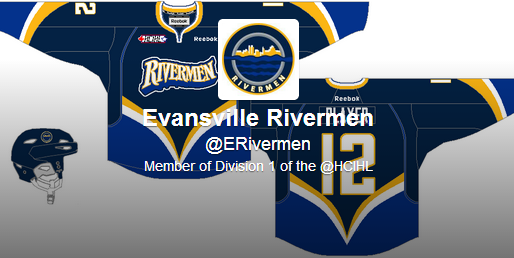
Even though it had already been leaked, The Rivermen ask me to do the unveiling and review of their jersey. Well here it is! I like it as an alternate. everything just goes together so perfectly! Except for the back. I would have raised the numbers some so they weren't touching the hem/back stripe. I think the wordmark is a little boring but again its good for an alternate! The main logo on the shoulders would look nice too.

Jersey Rating: 8.5/10

Also a hint to the 6th and final HCIHL team.
It will be a Canadian team, and will be in the same city as an NHL team.
Happy guessing!


Thanks for reading!

Caden


Saturday, September 14, 2013

Relaxed and Ready to Go

Hey guys! (I know there is more than one of you since we had 74 views just today). If you saw my latest tweet, you should know that I my first game today and personally and I couldn't be more excited! It's a beautiful day in my neck of the woods, too and it's very relaxing to just listen to the birds as I write this post. Today I will tell you why I designed the Sharpshooters logos and jerseys the way I did and one concept by me.

Springfield Sharpshooters (Jake88/Me)
Ok, after looking at the wordmark logo you can see my intention for the primary. I also gave them a classic style alternate to go along with the "S" logo. To add to it on the away collar I outlined it for a "different" style look. To be honest, I really don't know much about Springfield, Ohio at all, hence the Dell, Coke, and Bic advertisements on the rink (the others are businesses in Springfield). Do you like the logos and jerseys I came up with? Don't be afraid to tell me! I will always appreciate your comments and advice.

Slovan Bratislava (Jake88/Me)
If you remember another one of my Tweets I complained that my brother deleted all the progress I had on a jersey. Well this is the one I had to do twice! A lot of people say that Slovans logo is like the Robo-Pen logo that the Pittsburgh Penguins had in the 90's (which Slovans logo was obviously based off the Robo-Pen). So I based the jerseys off the 90's Pens jerseys. Makes sense right? The jerseys them self are unique in their own way. Again if you have a problem with these just tell me, I love to hear from you guys!

Thanks for reading, I hope the rest of your day is fantastic, and now I will sign out. 

Friday, September 13, 2013

Friday the 13th

Hey Reader! All 1 of you! Sorry for the late post. NHL preseason Is. One. Day. Away!  
to the concepts!

to thTo the concepts!


This is my Staidum Series Chicago concept I made! What do you think? 
Tell me in the comments!


 I like the Owen Sound jersey for Alan John Herbert's OHL redesign series! I would have used a different font for the back though. A alternate jersey and a 2nd white helmet would be nice too!

Concept Rating 9/10


Which jersey do you like better?!?  The top one is Lynx1 the bottom is Lynx2 Vote in the poll to decide the new jersey for the Louisville Lynx!


The Springfield Sharpshooters unveiled there jerseys and logos at the same time! I will let Jake tell you about them tomorrow and i will review them Sunday or Monday.


Speaking of Jake he brings us a great Marlies Concept, I like every aspect of these jerseys! Its just so well executed and designed! I would have put a Marlies logo on the helmet instead of the ML logo. I would like the Maple Leafs in these! (with a different logo of course!)

Concept Rating a perfect 10/10! (a first on HCI)


T

Tuesday, September 10, 2013

Tuesday. More Teasers

Hey Readers! I honestly don't know if anyone but me and Jake reads my post!


The Springfield Sharpshooters released a new jersey teaser today! It seems to show part of the main crest.


So I see from previous teasers that the back of the jersey is orange and the front is mostly black. We could have a buffaloish jersey on our hands! We could also be seeing 2 different jerseys! Mabey a home and an alternate.

The Evansville Rivermen also released a new teaser today. Even though they "accidently" leaked it on their twitter page. 


Not seeing much. Except the royal blue piping and the striped collar. Of course we all know what the jersey looks like so I don't know why I'm even putting these teasers on my post.


This is the Ducks Comp. Entry I made for HJC! I need you to go vote for it! it only takes 5 minutes and it would be helping me out a lot. You can pick your top 5 and depending how many of each place you got you get a certain number of points. You can vote Jake88's 2nd!!! :P Tell me what you think in the comments!


NHL training camp opens tomorrow! Hockey is just around the corner!


Monday, September 9, 2013

More HCIHL Drama

Welcome to the 37th post in HCI history! Does that mean anything? No! So today I bring you some HCIHL drama, and the Lokomotiv concept I promised on Saturday. 

---------------------------------------------------------------------------------------------------------------------

First the three teaser images provided by the Evansville Rivermen and the Springfield Sharpshooters, respectively.

2nd Picture in the Unveiling of the Rivermen 3rd Jersey

3rd Picture in the Unveiling of the Rivermen 3rd Jersey

3rd Image in the Sharpshooters Preview
Also for you Twitter users the @ERivermen (Evansville), @Hcihlmonachs (North Carolina), and the @AltoonaHC (Altoona), all have Twitter accounts. By the way, you can follow me @Jake88JC, Caden @CPatafie, the HCIHL @HCIHL, and this blog @HCIblog. Thank you in advance if you follow any of us.

Lokomotiv Yaroslavl (Jake88/Me)
Two days after the 2 year anniversary of the sad plane crash I bring you what I think Lokomotiv should be wearing. It is partially based on this concept which won COTW in 2012, which in turn is based on the striping in the logo. I tried to keep the font slightly rounded like in the logo too. You like, tell me in the comments!

Thanks for reading, and remember to send in your concepts too! 


Update
---------------------------------------------------------------------------------------------------------------------

The Evansville Rivermen accidently unveiled their 3rd jerseys last night via twitter. HCI gives us the report.

What do you think of the jersey? Do you like it? Is it bad? Tell us!


Sunday, September 8, 2013

Sunday (Very Late)

Sorry for the late post. Excelling Students program at school means extra homework and crap!
The 4th HCIHL team is the Seattle Sharpshooters! Like the Wild and Sabers, They are releasing jersey teasers. This is the 2nd one!

It looks like a good jersey! I will like to see how this turns out!


I drew up this Preds concept as a space filler! Tell me how you like it in the comments!


The Evansville Rivermen also released their first 3rd jersey teaser today! Every day there will be a new teaser and the full jersey will be released next Sunday! Stay tuned!

*UPDATE The whole Jersey was leaked on the Rivermen twitter page today! @ERivermen 
This is what they look like. The Rivermen contacted me after taking it down and said they will still do the teasers and unveiling on their twitter page! I will like to see how that plays out!


Alan John Herbert send us our guest concept for today! A London Knights concept! A solid concept with everything except that I doubt a OHL team could afford to buy extra pants and a third helmet just for an alternate uniform. I would also recolour the shoulder patch on the alternate to go with the colour scheme. maybe vintage white???

Concept Rating 9/10


Saturday, September 7, 2013

HCIHL Update

Rather than add a second update to the "Nike Strikes Again!" post I give you the fourth HCIHL team the Springfield (Ohio) Sharpshooters, teasers! Yes the big unveiling will be on Friday the 13th. For now I give you a teaser of a logo.