Showing posts with label Winter Classic. Show all posts

Saturday, March 1, 2014

Saturday: My Top 11 NHL Outdoor game jerseys

Hi everyone, Alan here for your not just Saturday, not only it's post number 201, it's also the first day of march here on Hockey Concept Ideas. Today is the Stadium Series game between Pittsburgh, and Chicago. Also tomorrow is the Heritage Classic game with Ottawa taking on Vancouver to wrap up this year outdoor games. Today I decide to not to post any concepts, but rank all the outdoor jerseys that was showcase this year, from Winter Classic, to Stadium Series, to the Heritage Classic. Now sit back and enjoy I give you "The Top 11 2014 NHL Outdoor game jerseys." Let's not waste time and get going.

11. Anaheim Ducks
Picture Credit: The (unofficial) NHL Uniform Database
The idea of Anaheim Ducks in orange jersey was always in many fans mind, and every concept artist desire, and dream to be for real. But this one is "NIGHTMARE!" Chromed logo, one thin hem stripe with thick side panel, half stripes on the arms, and tilted TV numbers. The only thing good from this disaster jersey is the "OC" shoulder patch, and that's all.

10. New York Islanders
Picture Credit: The (unofficial) NHL Uniform Database
Despite of just the "NY" chromed logo, the nameplate, stretched numbers in the back, tilted numbers, white yoke, and just one hem stripe. This one got an good collar, and the arm stripe is pretty much tamed, not the best, but better then the Ducks.

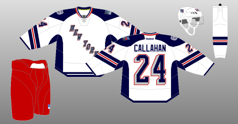
9. New York Rangers
Picture Credit: The (unofficial) NHL Uniform Database
This one was an disappointment for me, stretched numbers in the back, tilted numbers, one hem stripe, and thick side panel. The arm stripe is messed up in an bad way. The collar, yoke, and the "New York" word mark logo makes up for an not so good jersey that got that "Lady Liberty" feel to it.

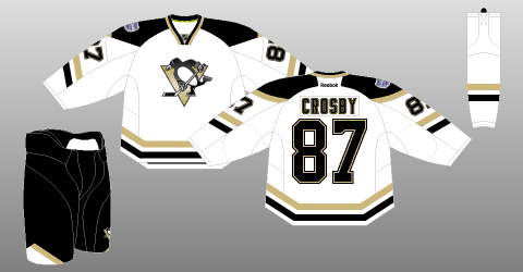
8. Pittsburgh Penguins
Picture Credit: The (unofficial) NHL Uniform Database
This one maybe like the others, but it's better then the team's current set. I like the stripes on both arms, and hem. An small vegas gold on the back of the yoke could have gone all the way to the front of the yoke. Finally using the Oilers collar is an good call! Overall: It just an SS jersey, but fix it more and it could be the next set for the team.

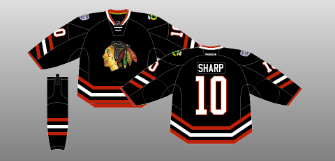
7. Chicago Blackhawks
Picture Credit: The (unofficial) NHL Uniform Database
This had everything going, but fell short, stretched numbers in the back, chromed logo, and tilted numbers. But at lease they have hem stripes on it. Overall: If it weren't for stretched numbers in the back, chromed logo, and tilted numbers. This one would be the team's future 3rd.

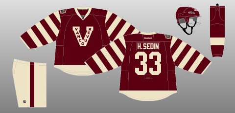
6. Vancouver Canucks
Picture Credit: The (unofficial) NHL Uniform Database
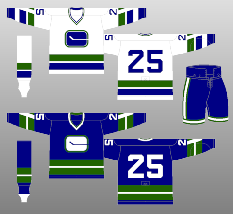
Last year this was worn by the Canucks, on March 2 the team will wear it again. The jersey is alright but I felt like they should wear their first jersey from the beginning, and cream pants "Not a big fan!" Nothing too much to say about it, moving on.

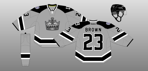
5. Los Angeles Kings
Picture Credit: The (unofficial) NHL Uniform Database
Out of all Stadium Series jerseys, this team is one of my favorite! The chromed logo really fit this jersey nicely. Grey as the team's main color on this jersey is really an eye catcher. I got nothing to say about this, despite of the tilted TV numbers, this one is an solid SS jersey.

4. Detroit Red Wings
Picture Credit: The (unofficial) NHL Uniform Database
Classic, and nostalgia. The stripes are wisely place, straight nameplate is fine with me, numbers are classy, and the logo pure classic. The downer is the word mark above the logo make it busy, and vintage white, really? Overall: Good WC jersey but two things kept it away from the top 3.

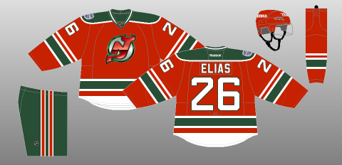
3. New Jersey Devils
Picture Credit: The (unofficial) NHL Uniform Database
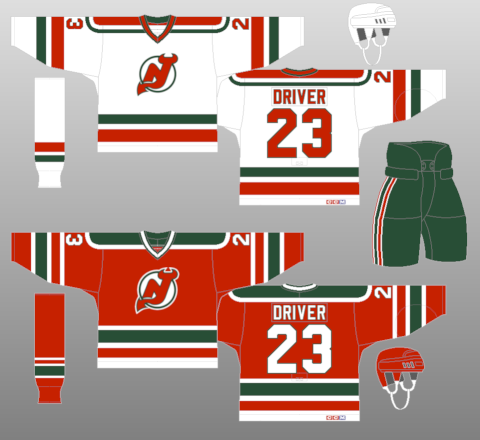
Originally the logo was suppose to be chromed, but at the game it didn't happen witch I respects them, and also I'm glad that this team did not followed the other teams in using the terrible jersey design that give jersey collectors an eye sore. Base on the team's first ever set. Overall: Very classic jersey, favorable, and why haven't the team promote it to full time 3rd?

2. Toronto Maple Leafs
Picture Credit: The (unofficial) NHL Uniform Database
 Stripes, stripes, stripes everywhere on this jersey! Despite I hate this team, but you got to give them credit they know how to present classic jerseys nicely. Overall: Nice WC jersey from an team I hate.

And the Number 1 of my top 11 NHL Outdoor games jersey is.....

1. Ottawa Senators
Picture Credit: The (unofficial) NHL Uniform Database
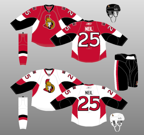
I'm going off the record and say that I hate vintage white, such a overrated colored, but this one was used very well done to my taste. An vintage white version of the team's current 3rd jersey. Nice stripes that is well balanced that is simple but great. Overall: Vintage white or true white make it full time road along with the current 3rd as home to replaced the team's current set.

And that's my top 11 NHL Outdoor games jerseys. What you think? It is fair, unfair? Witch one you think should be number 1?
Well that's today post, hope you all enjoy the weekend as for me let's just say I got family reunion to go to. Lastly before I go, I just received my additional jerseys from St.John Newfoundland and Labrador, the AHL's St.John's IceCaps jersey set, both home, road, and alternate. With the additional of the 2014 AHL All-Star game puck, so it's a good haul for me and worth the price tag. Until then see you all next Saturday your normal post by me yours truly, later.

P.S. here's the picture of my IceCaps jerseys

Tuesday, January 21, 2014

Tuesday. I might be mutated, nobody knows.

Oi jack! Caden's here again from Beautiful* (*Not Really because we don't have water because the chemicals from West Virginia came all the way down the river to here and the whole town smells like 2 year old licorice mixed with dead fish...) Evansville Indiana! I think the writers pick is a cool idea for a concept, it shows (no matter the rating) what the best concept is. Speaking of concepts, get to it shall we?

*EDIT BY CADEN* Ok, So it ends up we can drink our water, I wrote the intro on Sunday where everyone was making a big deal about it.


Winnipeg Jets [Dallas Kirkpatrick]
  Ah, I like this concept, but this is almost exactly what I invisioned the Fapitals wearing! Take off the front numbers and change the logo and you have a good Caps concept. Take off the front numbers and you have a good Jets concept. Either way the front numbers have to go. Also, would the Phoenix Coyotes let the Jets use the old logo? Or is it not even their decision, but the NHL's? Not sure, but something to look into when you're planning an event.


Colorado Avalance [Robb Clarke]
Although the Colorado state colors would be good colors for a minor league team, the Avs have good colors already, and I wouldn't change them. I do like the idea of a blue jersey for the Avalance. Maybe blue with maroon and black as secondary colors? The block font is fine, but I would have used the Av's current font. The concept as a whole is fine, but nothing says Colorado (other than the colors) or Avalance. I would take the good elements from this jersey and create a new design.

*2ND EDIT BY CADEN* A Heritage Jersey! The sense this makes is great! I thought it was an alternate which I didn't like. But as a jersey giving homage to the Rockies it's cool. 


After careful thought I have decided to give my writers pick nomination for this post to neither Robb's Avalance concept. I thought it better than Dallas's.


~Caden

Monday, January 13, 2014

Monday: Lack of News

Well we to be in a pretty long period of time with out any jersey unveilings, I'm sure it's been worse, but with the Olympics days away and half the teams (Switzerland and Sweden officially, Norway, Slovenia, and Austria) haven't unveiled their respective jerseys yet. As we wait for these to come out, you can read the two new Altoona Express articles on HCIHL.blogspot.com or click on the HCIHL tab on the tab bar. We will definitely be starting a new comp soon, so be ready for that.

____________________________________________________________________________________
 
Team Canada (By Mat R.)
Mat is been making some pretty good concepts lately and this is no exception. I don't really like how the leaf doesn't finish on the back of the jersey, because it should continue onto the back. Also I don't know about it, but I might add a colored in collar. I also think that the numbers don't really need the two outlines, it would fit more with the logo if they didn't. Concept Rating 8/10
 
2016 Winter Classic Detroit V.S. Colorado (Justin S.)
                              
Well I actually see where Justin is coming from with the Detroit striping. I don't think that they've ever used it in their existence, but it was on their 2009 Winter Classic socks. I also think that Justin is referencing the proposed Nordiques jersey design that they would have worn if think didn't move. I think I'll start with Detroit first. I really liked this years Winter Classic number font, and I think it would good here, using the logos and fonts, other than that nice job. Colorado is... different. I don't think that the numbers would be difficult to see in that shade. Though I like amount of blue used, I think that more burgundy and less silver would look good. One execution note, there are no TV numbers on the Detroit jersey. Concept Rating 8.4/10
 
___________________________________________________________________________________
 
Well that's it for today, see you on Saturday!


Thursday, September 26, 2013

Post "Hump Day" Blues

What's Up??? I am writing this post because I lovvveee you*! The HCIHL has added Ricky M. (HJC's Friday guy) and Matt McElroy as GMs and Matt will also be the HCIHL "League Advisor!" We might get a new Tuesday writer but that's still in the works! Since Jake and Justin came along and now possibly a new Tuesday writer, my blog writing work has gone down, but my blog Administrative work has gone up! Figuring out what jerseys will go on what post and now having to also keep up with what's sent in, requests for HCIHL expansion teams,and I even had one guy who wanted 5$ a post credited to his PayPal in order to write once every 2 weeks for us! That's why I have decided to promote Jake88 to assistant Admin! Meaning he will have more say in stuff like hiring new writers and such! This is the new writing schedule

S: Justin P.
M: Jake88
T: New Tuesday Writer
W: Justin P.
T: Caden P. (Yes me!)
F: Jake88
S: Caden P.


I have a few concepts for you today so getting started as quick as possible would we great! 


New York (Brooklyn) Islanders Caden P. (me)

I made this Islanders concept for there move to Brooklyn. The basic premise of my design was to recol(u)r everything to give the islanders a new image! I recolo(u)red the logo and kept the Island in the logo but made the colo(u)r similar to the background so it wont be the main focus. (They are in Brooklyn after all!) I also changed the black jersey to incorporate the victory stripes in a big manner. You can't let a dynasty like that go! Maybe for a team like Montreal but the Islanders SUCK!


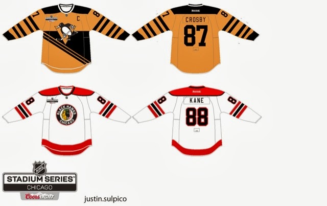
Stadium Series Chicago/Pittsburgh Justin S.


The reason I like this set is because though the are old fashioned, these are completely new jersey designs! I think the era you are trying to capture with the Pens jersey would look better with the robopen logo! The back bottom looks empty but I'm not sure what I would do with that.
The Chicago one is ok, but I would make the hem stripe the same as the arm stripe. The stadium series logo is different and wouldn't have the cores logo on the jerseys. The NHL has a strict no corporate logos on jerseys aside from RBK. 

Concept Rating 9/10


Augsberger Panther Jake88

If only Jake would make North American jerseys... I don't really know much about European jerseys so my comments don't mean much if I judge this from a NHL perspective than I would say that the numbers are too far apart but I don't know if that's acceptable in the DEL which I presume the Panther are still in unless they moved. I like the concept but I can't call it good/bad because I just don't know!

Concept Rating 0/0 (I can't judge something I don't know about. I will research the KHL, DEL, and SlimLeaguea jerseys tomorrow and I will know more)


Thank for reading and I hope you get over these post Humpday blues!


Caden