
What's Up??? I am writing this post because I lovvveee you*! The HCIHL has added Ricky M. (HJC's Friday guy) and Matt McElroy as GMs and Matt will also be the HCIHL "League Advisor!" We might get a new Tuesday writer but that's still in the works! Since Jake and Justin came along and now possibly a new Tuesday writer, my blog writing work has gone down, but my blog Administrative work has gone up! Figuring out what jerseys will go on what post and now having to also keep up with what's sent in, requests for HCIHL expansion teams,and I even had one guy who wanted 5$ a post credited to his PayPal in order to write once every 2 weeks for us! That's why I have decided to promote Jake88 to assistant Admin! Meaning he will have more say in stuff like hiring new writers and such! This is the new writing schedule
S: Justin P.
M: Jake88
T: New Tuesday Writer
W: Justin P.
T: Caden P. (Yes me!)
F: Jake88
S: Caden P.
I have a few concepts for you today so getting started as quick as possible would we great!
New York (Brooklyn) Islanders Caden P. (me)

I made this Islanders concept for there move to Brooklyn. The basic premise of my design was to recol(u)r everything to give the islanders a new image! I recolo(u)red the logo and kept the Island in the logo but made the colo(u)r similar to the background so it wont be the main focus. (They are in Brooklyn after all!) I also changed the black jersey to incorporate the victory stripes in a big manner. You can't let a dynasty like that go! Maybe for a team like Montreal but the Islanders SUCK!
Stadium Series Chicago/Pittsburgh Justin S.
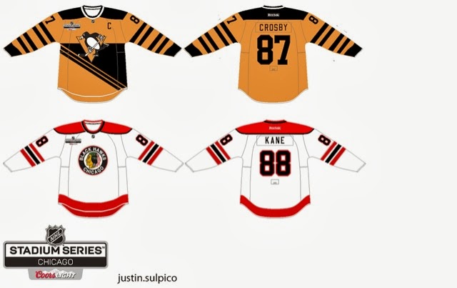
The reason I like this set is because though the are old fashioned, these are completely new jersey designs! I think the era you are trying to capture with the Pens jersey would look better with the robopen logo! The back bottom looks empty but I'm not sure what I would do with that.
The Chicago one is ok, but I would make the hem stripe the same as the arm stripe. The stadium series logo is different and wouldn't have the cores logo on the jerseys. The NHL has a strict no corporate logos on jerseys aside from RBK.
Concept Rating 9/10
Augsberger Panther Jake88

If only Jake would make North American jerseys... I don't really know much about European jerseys so my comments don't mean much if I judge this from a NHL perspective than I would say that the numbers are too far apart but I don't know if that's acceptable in the DEL which I presume the Panther are still in unless they moved. I like the concept but I can't call it good/bad because I just don't know!
Concept Rating 0/0 (I can't judge something I don't know about. I will research the KHL, DEL, and SlimLeaguea jerseys tomorrow and I will know more)
Thank for reading and I hope you get over these post Humpday blues!
Caden
Caden, the reason the old Stadium Series logo is on the jerseys is because I made that concept before the official logo was released.
ReplyDeleteI see!
DeleteThat Penguins one is out of the box but it makes a lot of sense
ReplyDelete