Showing posts with label Indy Fuel. Show all posts

Sunday, December 22, 2013

Sunday: The crazy week begins

Hello I'm Alan, I'll get elbow to my head, so you don't have to. Well if you all didn't send your entry to the Blue Jays contest, I'm sorry it's too late to send it because we are now on the voting round right now, just click on the Blue Jays Comp for info. But that doesn't mean you have to stop sending your concepts in just send them to hockeyconceptideas@gmail.com.

Here are the last batch of of the Blue Jays entries

Ricky M.

Alan H.


 Creighton Comp Voting ends this Saturday Dec 28

Last night I went to Wheatley for an hockey game it was fun to watch an Jr.C league game, the Sharks won the game, and may I say they have the best locker room that opens before they hit the ice.


With that out of the way, on to the concepts

Los Angeles Kings concept [by Matthew M.]
Up points: Nice idea of bringing back the purple, and gold back. The logo is well tweaked to the mix of classic and modern. It maybe the same template as the team's current white uniform, but with different collar on both of these jersey gives it more better look.
Down points: Nothing much say any bad about this one.
My Suggestion: The only thing is add purple trim around the logo on the gold jersey, that's all. 

Indy Fuel concept [by Caden P.]
 Up points: Good idea on using the checker stripes to give it a little fitting theme to the team. Using red as the team's main color followed by yellow and black.
Down points: The numbers on the back, and the small numbers on the front is standard block, while the TV numbers is SF Piezolectric, it doesn't really fit the jersey. The yellow collar looks O.K. on the dark jersey, but yellow collar on the white looks plain to me.
My Suggestion: Fix the fonts on the numbers, so they can be on the same page, the only thing that you can get away with two different fonts is nameplates. Add trim(s) to the collars to give some life to it. Lastly add the team's secondary logo on the shoulder.

Florida Panthers concept [by Matthew M.]
Up points: The design on the jerseys are well made. using the navy blue trim on the numbers for both home and road is an good move. Lastly red as the team's main color fit this team in a good way!
Down points: The front logo looks good, but it's only work on an alternate jersey to me. The road looks like it has less red on it to me.
My Suggestion: Put the full body panther with the broken hockey stick on these jerseys. On the road switch the navy blue and red stripes and it'll be complete.


Wheatley Sharks OHA Great Lakes Jr C Jerseys Concept [by me]
This is the Wheatly Sharks OHA Great Lakes Jr C Jerseys Concept. It’s pretty much a recolored Worcester Sharks concept just to fit the teams theme, their main crest is their own just add outer lines around the crest, the colors I gave them is navy blue, royal blue, red, and silver, and of course like most of junior C teams have a Canadian Flag on their yokes. This is what the team currently wearing right now.


Belleville Bulls OHL concept [by me]

This Concept I kept it simple made only 3 stripes on the hem, the wrist cuffs, socks, and V-neck those 3 stripes represent decades, over 30 years that this club been around, the main crest is their old crest they use since the beginning and they still use them for both their dark, and 3rd while their white jersey they got that cartoon bull, back to the concept the main crest is indeed the old bull just add trim around the crest and "Boom!" my Belleville Bulls concept.

Well that's today post. What do you think of my  Wheatley Sharks and/or my Belleville Bulls concept?

Until then Merry Christmas, Happy Hanukkahs, Happy Kwanza, Happy Decemberween, Happy whatever Holiday you're celebrate.  I'm Alan, I'll get elbow to my head, so you don't have to.

Thursday, December 19, 2013

Thursday: How much Fuel to get to Europe?

Hey HCI readers! Caden here from Wheeling WV. Yes I know your saying "Wait! Isn't Caden from Evansville?" Well I am, But I traveled with the Icemen (ECHL) as an assistant to the Equipment Manager and then I will meet up with my family and we will drive south to my grandmother's for Christmas. Being away from home won't stop me from bringing you today's concept selection. If you ever want to have your concepts featured on HCI, Email them to hockeyconceptideas@gmail.com. We post every concept sent in!* So, Here we go!


Blue Jays Comp entries due Saturday!


TPS Turku [Jake88]

Jake88 is back to his "euromaster" ways, which I like. Even though its so easy to make better uniforms than European teams, since 90% of them suck!

What I like: I like the monochromatic colo(u)r scheme. It really fits the team. The Caps template looks modern, which I like. The piping in this case, actually isn't bad! 

What I don't like: The logo. I know it's the teams current logo recolored but it looks like a basketball logo. The TV numbers (For new readers who might not know, The arm numbers are sometimes called TV numbers since they originated for TV use) seem a bit to large. The pants/sock stripes seem weird with 3 stripes. The number font seems to classic for such a modern jersey. I would use this

What I would do: Make the pants/sock stripes one solid bar (If the jersey wasn't monocrome it would be better with 3), shrink the TV numbers by about 8%. Small change but it would make a big difference. I would also change the font to something more modern to fit the modern feel of the jersey.

Turkomazing idea! A couple changes would really help. A 7.9/10


Indy Fuel [Matt McElroy]
McElroy's Fuel Contest entry tied with mine for 2nd, and uses the checkered flag pattern much more subtly. 

What I Like: The subtle use of the checkered pattern looks good here. If only I had thought of that! The font works well. I even don't mind the mis-matching colo(u)rs for the number/NOB on the red jersey. The black pants look spectacular with the 2 stripes.


What I don't like: The white jersey's striping could use some black. I also don't care for red helmets for any team. Even if they match the jersey. There's a reason why MontrĂ©al wears blue! The yellow numbers on the white jersey.


What I would do: Change the red helmet to black. You might want to throw a logo sticker on there as well. Make the bottoms of the jersey/arms black on the white jersey so it inverts the red one. Make the numbers on the white jersey black instead of yellow and add a yellow outline.


A nice jersey. The pit crew needs to make a couple improvements before the green flag can wave. A 8.3/10


Evansville Rivermen [Matt McElroy]

Matt MC's 2nd concept of the day not only gives the Rivermen a different jersey design. But a new logo as well.


What I like: The fact that you made your own logo. Making logos is my weak point. That's a nice, sweet, simple logo. The lack of white jersey. My personal opinion is the more color, the better it looks on the ice and on TV. Not with all occasions. But most. I like the double outline on the blue jersey numbers. It looks classy to add to a modern jersey. Nice touch. I do wish I could see what the shoulder patch was in a full size picture. It looks pretty cool. 

What I don't like: The white pants stripe. White isn't featured prominently on much of the design, but its front and center on the pants. Both the crest and shoulder logo seem a bit too big, and I don't like that it's only on one shoulder.

What I would do: Change the pants stripe to yellow, and make the logos a bit smaller. I would add the shoulder patch on the other shoulder as well.

Perfect Idea! A couple barges (barges are famous in Evansville for being a nusince to boaters) need to  move. A 8.5/10


Did you like my simple way of reviewing jerseys today? Was I fair with my reviews? Is there a different rating system you want me to try instead of the typical Out/10 way? Are you a new HCI reader? Are you intrested in getting a HCIHL team for next season? Just leave a comment! We love to hear comments from the readers about how we can improve!

Until next Tuesday (Christmas eve), this is Caden saying, Peace out!


Monday, December 16, 2013

College Classic Monday

Hello and welcome to a very special post. We've been seeing an onslaught of outdoor designs lately, with the Lake Erie Monsters and the Rochester Americans playing in the first outdoor game of the year, and my Pens unveiling their Stadium Series jersey, which I will get a Jokinen one of. In fact I'll post some pics of it when I get one (probably in January). As you can tell I like it, though if all the jersey are going to look something like that, creativity as you can see isn't high. My favorite part of it is the yoke.


Well anyway, this post is dedicated to all the college designs that have come in of late. And speaking of college designs! We have a new competition! Click here for more info.


Blue Jays Comp entries due Saturday!


But first, our HCIHL scores.

Hamilton Stags 171.6 - Skopje Lisici 106.9
Evansville Rivermen 199.6 - Altoona Express 170.3
Louisville Lynx 198.9- London Sabreswords 136.1

I know all of you are dying to see the concepts so here they are!

_________________________________________________________________________________

Apple Cup (By Justin S.)
Justin starts us out with a nice event that he calls the Apple Cup, taking place it Washington, between two Washington teams. I like that it uses the very underused Under Armour template. Lets start out with the Huskies one. I love the colors and the logo choice was good. I like the striping but I feel that there should be some white in it, since there is some in the logo and numbers. I don't think that the shoulder patches are necessary, since the yoke striping is there. For the Cougars one, grey is an interesting choice, but I think it works. The wordmark looks good on a jersey, and it matches the striping and number outlines. I'm not sure about the name in red I'd make it white with a red outline. Concept Rating 7.9/10 (U of Wash. 8/10) (Wash State 7.8/10)

The Game (By Dylan W.)
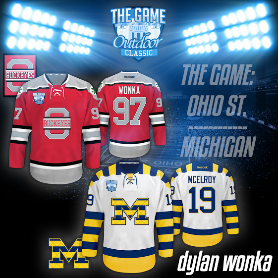
Dylan gives us a great presentation with these, but we couldn't put it all on the blog, so check out his Sportslogos.net thread, it shows you everything from the tickets to in game mechindice. I like both logos, though I think Ohio State's should have a larger outline. The yokes are done well and so is the striping. I also like the Wonka V.S. McElroy bit that appeared on both of your concepts. I don't really have any complants so to the rating. Concept Rating 8.7/10 (Ohio State 8.9/10) (Michigan 8.5/10)

Hockey at Heinz (By Jake88/Me)
This was my entry into the competition. For Pitt, I did some yoke striping and arm striping that matches, while using a classic esque logo and font. For Syracuse I made an orange jersey (their name is the Orange could they have made it any easier?) with simple striping that doubles on the socks, a classic feature that I've always liked. For both jerseys, I lowered the numbers and put a patch in it's place.

_________________________________________________________________________________

The final part of this special post is even more special, we have the Fuel Comp. results in and here they are!

And your winner...


Congrats to Alan on his win, and I hope to see you next post!

Friday, December 6, 2013

Friday: Phoenix Revisited (Oh Goodness Me, Not That!)

A hearty high-ho to you this Friday! We've had a lot of outdoor jerseys unveiled within the past week or so and the Vancouver ones in particular are very appealing. I'm practically disappointed that Jake88 was literally spot on with his rendition of the Ducks Stadium Series uniform. It's for one reason: chrome. While I do like the chrome logo itself, it doesn't belong on a jersey. Remove the chrome and I'm 90% happy. But in my line of vision I see bright skies ahead in the use of two alternates for the Ducks.

INDY FUEL COMP ENTRIES DUE SATURDAY


INDY FUEL COMP ENTRIES DUE SATURDAY

And now, I am going to add my own personal touch to the Friday posts here on out. I will be introducing the Ricky Points system probably for next weeks post (they're kind of like brownie points) and have nothing to do with grading a concept. I'd share how it works, but I'm debating if they should have some sort of value or if it should be like Whose Line is It Anyway? "where the points don't matter" at all.


AK Bars Kazan
Submitted by: Jake88
 Typical Kazan name. FC Rubin Kazan of the Russian Premier League sounds way too similar. However, there also aren't too much different from the current uniforms, which uses a red-and-black era Sabres cut with some additional design. I also see that Alexander Burmistrov actually wears number 69 with them, but that means nothing in a concept. This is similar only in terms of color orientation. Speaking of color, it's well distributed. This is almost a complete Atlanta Thrashers template, it appears to be a mix of two different templates, but I could be mistaken. I'm glad that multicolored pants aren't an option here, otherwise we might end up with something for Australian football's Fremantle Dockers before they went purple haze looking. I would like to see a red version of this set so I can compare it to the green, but I think the green would be my preference since the red one is only in my imagination right now.

Bili Tygri Liberec
Submitted by: Jake88
Well the good start here is that there is striping across the crest. I'm (generally speaking) a fan of that. I don't mind it splitting at the numbers, but if you do that, I would prefer it to be flat and boxy - conformed to the numbers - as opposed to round and matching the crest logo. With double outlines on numbers the same thing, they generally work for me, this is no exception. This number style (with outline) reminds me of Tampa Bay/modern-day affiliate Syracuse Crunch except without the silver. It's distinctive enough that I don't think anyone might make a connection unless someone pointed it out as I just did.

Phoenix Coyotes
Me-Ricky Mazella

If it was done properly, I wanted to see a purple Coyotes sweater. While the 'Yotes haven't had this rather art deco branding for a decade now, I took the logos that I liked and stuck 'em onto a jersey. I'd imagine that it probably looks horrible to many if not all of you out there. The pattern of a hem stripe probably hurts it but I wanted to incorporate some sort of desert-ish pattern into the uniform. It would look better with the current branding, I reckon. I recolored the above alternates and (in the spirit of the "acid trip" jersey that everyone hate that I don't mind) I faded a random design that I used for the background with all the necessary colors.      Sooo . . . does this look like an alternate, the Coyotes would have produced with this branding? That sort of was the goal anyway. Obviously this template has never existed, but just like the state lottery, "hey, you never know."

That rounds out another edition of HCI Fridays, and remember that Ricky points will be awarded starting next week. Please, please, please, please send in concepts - it's what keeps you and me going! Share the wealth, what comes around goes around, and who doesn't like good recognition now and again? Another great weekend is in store for you!

-Ricky