
Colorado Avalanche [Dylan Wonka]

Dylan's concept is very similar to one I saw from Alan on Buffalo nickel graphics, but it was sent in before Alan's was up. I like the blue as the main color. The mountian striping on the yoke looks subtle. Which is good. The slanted striping looks modern, but actually works. Unlike the Staidum jerseys. I'm not a fan of the grey. That's the only thing I would change. Dylan hit the nail on the head here! A 9.6/10
New Jersey Devils Staidum [Dylan Wonka]
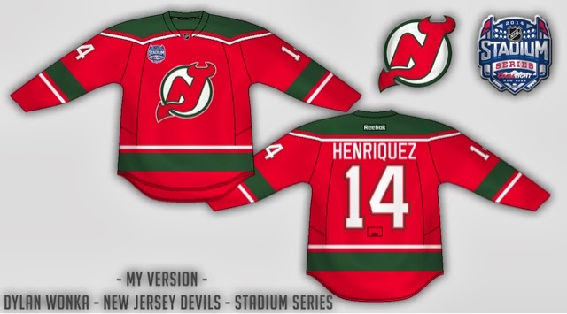
Wonka's second of the day consist of a Staidum concept. I like this concept, but ai see the reason behind the long numbers. Also as a one off the Crome logos are cool! I like the way you reversed the hem striping with the arm stripes, and I like the way they go all the way around. The straight tv numbers are fine. I don't really care either way. I would add the crome logo, stretch the numbers, and add a green outline around the letters on the name. Satan would approve. A 8.9/10
Welcome! Caden here from North Carolina! Well! Do you like going straight into the concepts? I wanted to try something different. Do you want to see your own concepts up here? Send em in! hockeyconceptideas@gmail.com
Blue Jays Comp. Vote Now!!!!!!!!!!
Have a Merry Christmas, Happy Hanukkah, Happy Kwanza, Happy Decemberween, Happy whatever Holiday you're celebrate. Caden is out!
Wow! Dylan Wonka's Avs looks amazing!
ReplyDelete