Monday, March 31, 2014

Monday: No Upsets Here!

Well we have a championship game! The Rivermen will be playing the Stags in the final! Well it will be a good game to say the least! With the Lynx and Foxes losing, they will play in the Winners Consolation Ladder, and the Express and Sabreswords keep playing in the Consolation Ladder. 
Before we go any farther, I want to say that I made the worst possible GM decision I could yesterday. To have a better shot at winning the game with +10 goalie points, I went out and signed Karri Ramo, since none of my goalies were starting. Now Ramo let in 6 goals that night to the Sens, making him a -11.5. In final score of the Sabreswords game, I lost by 9.7 points. In the end, if I hadn't signed Ramo, I would have won. 

These are the HCIHL Scores.

1 Hamilton Stags 426.4 - 4 Skopje Lisici 329.9
2 Evansville Rivermen 416.8 - 3 Louisville Lynx 356.5
5 London Sabreswords 289 - 6 Altoona Express 279.3

_________________________________________________________________________________

Pitt Panthers (Nick S.)
Right Now Pitt only has an ACHA team, but not an Div. 1 team, in fact the only colleges in PA that have teams are Robert Morris (Pittsburgh), Penn State (State College), and Mercyhurst (Erie). In my opinion Temple or someother east Pennsylvanian university should get a team, but that's for another time. I've never liked how Pitt uses black in their branding, and, even though I don't like it, I wish it was on the Blue jersey. Right now the way you don't have enough contrast compared to the white jersey. I've also never liked how that collar looks when it is colored in, one thing that Nike got right (not coloring in that style of color). I would also use a Block style of font to match the wordmark. 7.3/10

_________________________________________________________________________________

Well that's it for today, looking forward to the HCIHL playoffs and championships, and I hope you are too!

Saturday, March 29, 2014

Saturday: Capping it off

Hi you all, Alan here for your last Saturday of March here on HCI! Well early this week I'm working and me and my workmate were yapping about hockey because his two sons played hockey years ago, and he told me that rumors said that the NHL is in talks of upping the draft lottery from the top 3 to a top 5. I understand that, and I feel this could be true too, let's look at it this way there have been many NHL teams tanking, like not even trying to win the last couple of games in getting higher picks, so with that I think this was bound to happened in a big way, if this becomes true news then I'm on board!

Enough random hockey rant, let's get to the concept.

Washington Capitals alternate jersey concept [by K14]
Up points: Bringing back the teams 90's colors, to even bringing back the teams old shoulder patch is a plus with me! I admit I don't like the Caps Secondary logo, but with black, bronze, and with blue in the background it fits nicely! Using the tie down collar is a nice touch. The arms and the hem stripes make this concept complete.
Down point: the numbers is hard to see with just bronze with both blue, and black trims togrther.
My suggestion: Either replace the bronze number with white, or replace the blue trim around the numbers with white.

Well that's Saturday for you all! Before I go, I got a video from the world of YouTube! Hope you all enjoy 14 minutes of goalies losing their minds. Until then later.

Friday, March 28, 2014

Friday: I Still Haven't Found What I'm Looking For

Big injuries, the longest shootout of the year, and everything in between, it sure has been one heck of a week in the NHL. Ricky here for yet another chat here at HCI and well, I never thought of two things: that the Sabres would be bad enough to get the first pick in the draft lottery and that Edmonton can do it again and still not make the playoffs. Forgive me if I seem to be in a little sour mood today, my Foxes are being trounced by 150 points or so to the league leaders - to think we beat them earlier in the season. Enough of my shortcomings, lets talk about concepts that we don't actually have!

Courtesy of : imgur.com via WGR 550 Buffalo
We don't have any concepts, which is disheartening, but I thought I'd share this cool jersey diagram/timeline that someone working the WGR 550 AM (Buffalo) Facebook page found on Imgur. I think it is one of the most clever things ever produced because everything is on one image. I imagine it was a lot of work, so I have to give the person credit for their patience. This also looks like something I would try to do, but didn't think of before. If you want a version to zoom into, go to GR's (slang station name) Facebook page, then click photos and click on the attached  link and you should be allowed to zoom in.

No concepts, no problem. However, that doesn't mean the staff and I can keep this up forever. We really love seeing the creativity that you all have. The specific design style you have. And above all, the faith you have in HCI in general. We are very thankful that you are a part of our HCI family and the best way to let us know that is by your contributions. As far has a jump start to your designs and who sees them, I refer to the New York state lottery slogan, "hey, you never know."

-Ricky

Thursday, March 27, 2014

Thursday, New stuff for the playoff push

Hey guys, Caden here! The Icemen are fastly closing in on a playoff spot, and whether or not we beat Florida last night will really determine wether we have a chance or not. As I said before I'm super exited for the coming up Icemen trip. If you check out Dana Heinze on twitter (He is Pittsburgh's Equipment Manager) you will see a lot of the stuff he brings with him to road games to make the team feel at home, locker nametags, logo mat and signs etc. Since Dana isn't our Equipment Manager we (the Icemen) didn't have all the stuff, until now!

I went crazy with the printer and laminator and made these.
It just gives a little logo presence in our room and makes the players more comfortable. Especially since most visiting room walls are white and look like hospitals. (Passion-Commitment)

I also made these. Player nameplates that go on the respective stall
The reason they are above is because there wasn't anywhere else to put them. Most lockers have wider shelves, and they would be placed below the helmet.

The final thing I got. Well, the team paid for it, but nobody has ever taken it on the road before.
So all in all the locker room feels more at home for the players, and is more classy all around.


So I'm sorry there weren't any concepts today, SEND SOME IN! Also check out Dana Heinzes twitter at @RealDanaHeinze, and the Icemen equivalent at @StickboysIcemen


-Cade 


UPDATE,
This is the visiting locker room in Florida set up with all of our swag. (Minus the signs, they aren't in the camera angle.)

Wednesday, March 26, 2014

Wednesday

Hello, everyone and welcome to HCI!!

Recently, I've been making and selling t-shirts to friends and family. Alan Herbert even bought one! I can do pretty much anything you want at an affordable price! Check it out: www.thesoundofgoalhd.spreadshirt.com

Now on to the concepts:

London Sabreswords - Alan H.


Now we have the London Sabreswords of the HCIHL. Make sure to click the HCIHL tab on the top and visit the site! I like the green colour - It's not too green like the Dallas Starbucks. I think that the yellow should be gold. Usually, I'm not a fan of just the single yoke stripe - but this works very well. That number font is really cool! Good job on putting the HCIHL tags instead of NHL. Overall, good concept from Alan!


Tuesday, March 25, 2014

Tuesday, It's playoff time!

If the title confused you. It's HCIHL playoff time. As of now, My Evansville Rivermen are beating the lower seeded Louisville Lynx, and are playing significantly about 20 points up. The Stags are just DESTROYING Skopje and lead by about 100 points. 

In ECHL news, I'm going on a week long road trip with the Icemen, next Wednesday, we will play in  Cinci, then in Wheeling and Elmira. In Wheeling we actually get 2 locker rooms. One for forwards, one for defense, and there is plenty of room for everyone. I will post some pics 2 Tuesdays from now.


Matt McElroy Hamilton Stags
This concept was made for Matt's HCIHL team, which is a strong contender for this year's championship.

Design: I like vintage white used. For a team like the Stags it fits with the woodsy theme. The new logo and wordmark look great, better than their current, which I will picture below.

I don't like the darker green pants, but, I guess they would work. The green at the top of the home socks look arbitrary. Like it's there just to be there. If you had've put vintage white on the top of the green socks as well, it might've belonged more.


Execution: The numbers on the back are a tad small, and the collar on the green jersey is slightly darker, but it might be on purpose.


Thanks for reading, I hope the Rivermen win, More HCIHL jerseys to come, AdiĆ³s!


~Caden

Monday, March 24, 2014

Monday: Prepping for the Championship

The HCIHL playoff are on now! With the Rivermen trailing the Lynx, and the Foxes getting killed by the Stags. In the consolation ladder, which I didn't even know existed until I checked the scores yesterday, and I'm playing in it... My Express, are somehow still in the game against a team that knew that there was a consolation ladder, the Sabreswords. The way things look, this will be the last game in Altoona for the Express, and the last game in Skopje for the Foxes. Unless the Rivermen catch up, the Lynx will keep playing in Louisville, and after in the championship they will move to Las Vegas. Enough about that, now to an HCIHL team concept.

UPDATE BY CADEN! THE RIVERMEN ARE WINNING AGIAN, WHICH WE HAVE PRETTY MUCH THE WHOLE GAME!
_________________________________________________________________________________

Evansville Rivermen (Caden Patafie)
Caden shows us how his team's uniforms will look for the upcoming season, as of now they look like this. The new set will have a very original number font and be without any white in the striping. Like all of the released jerseys, except for the Pilots and the Bighorns, the Rivermen will have the Nike fake laces. The striping pattern's unique in the HCIHL although you lose the lighter blue on the dark jersey. YOU ALWAYS NEED TV NUMBERS!!!! Ok Caden already told us why it was tough for him to apply them, but you still should have them kids. The helmet is very pixelated, I'm not sure if you can fix that in pain though. Concept Rating 7.4/10

_________________________________________________________________________________

My Penn State team was able to beat Michigan on Thursday, a big feat for a team ranked 51st in the country, as Michigan was ranked 11th. Though in the next round, they lost to Wisconsin 2-1. If they would have won that game, they would have played Ohio State in the next round, as they upset Minnesota, who was ranked 1 in the nation.

Well that's all for today, hope to see everyone next Monday!

Note: Sorry this post is late, I must have forgotten to Schedule it on Blogger... ooops.

Sunday, March 23, 2014

Sunday: Another Sunday

Hey guys, Justin here for your lazy Sunday blog post. Just one concept on the table today.


LA Kings by Bradley DeBode:
I really think the Kings should go back to Yellow and Blue full time. A touch of black would work good with the 2 aforementioned colours. One thing that stands out is the yellow "arm-lines" on the home jersey, take them out. The black/blue "arm stripe" should go as well. I get the idea of a blue/gold logo but for some reason, it just doesn't work here. I suggest leaving a space white such as a part of the crown or the "LA" wordmark. Add some TV numbers and a backside and this could be a top-notch concept.

Today is March 23rd and my favoute team, the Canucks, are playing the Sabres. If they lose....i will lose it.

-Justin

Saturday, March 22, 2014

Saturday: A little birdy told me to post this!

Hello, hello, hello everyone. Alan here for your usual Saturday post here on HCI. Well it's been a week for me! Well beside my work week, in the hockey side my Jr.B team Chatham Maroons are going to the GOJHL Western Conference championship to face the Leamington Flyers, this is going to be good to me because my team have surprisingly playing good, sweeping 4 to none in both 1st, and 2nd rounds. Now they're up against the Flyers, the team that finished 1st in the GOJHL Western Conference. What's more surprising about my Maroons is was about a month or two ago my team was striped off of their 4 points (2 wins) after breaking the maximum import players rules, at first it would throw the team's "A" game, and would get an early elimination in the playoffs. But it became a 360, hopefully my Maroons can beat the Flyers, win the GOJHL Western Conference title, and play for the OHA Jr.B Sutherland Cup!
Well that's another rant I got off my chest, let's get to a concept shall we.

Slovan Bratislava KHL Stadium Series Concept [by Jake88]
Up points: For a Stadium series template used here, it really fit the team very well. The chromed logo (witch credited smartly) actually made the jersey pop to my eye. Overall this better then any NHL Stadium series! (Except the Devils)
Down points: The trim stripes on both the arms, and hem are too thin for me to see, mainly the silver, I can't see it.
My suggestion: Make the trim stripes on both the arms, and hem just thick enough to see.

Well that's today post, hope I didn't bored you all with my rant about my hometown team, and just posting 1 concept, but you can change it by sending your concepts to us! Send them to hockeyconceptideas@gmail.com. Until then later.

Friday, March 21, 2014

Friday: Fear the Turtle

Greetings and salutations all across the fruited plain, Ricky Mazella here for another HJC Friday! It's tournament time here in Buffalo and my bracket (Fear the Turtle on ESPN) is doing better than normal at this point of the tournament. March Madness really has gotten mad downtown with Dayton's upset of Ohio State yesterday. Elsewhere, my Australian football team the North Melbourne Kangaroos have opened their season with a loss to the Essendon Bombers. My NLL east leading Buffalo Bandits take on the 10-0 Edmonton Rush, and Arsenal are playing a table topping clash with league-leading Chelsea just four points ahead in English soccer. That on top of more NCAAs tomorrow.

But what's more important right now is hockey. For the first time this calendar year, the Ducks don't lead the West and in the Pacific lost to the Sharks last night to fall behind them in the standings. Also, the Sabres snapped their season long seven game long losing streak against the Oilers last night. The Sabres are supposedly going to remove the interim tag from Ted Nolan's coaching position and make it permanent when the team gets back home next week. Onto a concept.

Submitted by: Nick Spiteri
I've gotta say, Nick really has a knack for great ideas. compared to mine from a few weeks ago, but this works just as well. Instead of flagging the heck out of it, he superimposed it. I have pictures here, here, here, and here that I found browsing around. I don't know that I like the arm yokes and hem stripes, but I can understand their purpose. The logo is a tad large but that happens with such an intense design over the rest of the jersey's body. All in all, a better fit than not.

That'll do it for me today. And by the way, last week's phantom post (for which I apologize) is available for viewing on HCI. I found a version of it as a draft as I was preparing it for Saturday (to give HCI extra exposure) over at BNG. That is now readily available for you (I pride myself on great customer service). Enjoy your weekend - come on you Gunners and let's go Bandits!

-Ricky

Thursday, March 20, 2014

2 concepts, Two Desigers, 2 games, 2 days

Numbers seem to be the theme of my weeks posts on HockeyCI! The Icemen play their final two home games tommorow and Saturday, which of course I will be working at, and We have two concepts today! The two concepts are by two different designers, and this is also my second post of the week! 


Joey Fryd Tampa Bay Lightning
The lightning confirmed a new alternate for next season, though I believe it's going to be black.

Design: Though the main color is still blue, I like that the design is different enough from the main home jersey to even contistute having it. The black stripes and yoke look good, and I like the tie down collar, but I would've done it backwards. Like the staidum series ones.

Execution: The TV numbers are a tad small. But most of the concept is executed well.


Jake Miller Team Slovenia (Olympics)
Slovenia held there own in the Olympics, but with only one NHL player on the team roster, they weren't able to do much.

Design: First off, I'm glad you didn't use the lime green jersey numbers like that were actually used. They weren't visible at all on the white jersey. I like how the yoke is white in the back so the namebar could be the same color as the rest of the jersey. The sublimated mountains look great! I would have had them on the back as well. Just because it is the Olympics, I would have perfered a white helmet instead of a blue one. It's different, and you don't see it often.  

Execution: There isn't anything I can see. When it comes to making European concepts, Jake doesn't disappoint.


Did you like our post of twos? Would you rather it be a post of threes or fours? Send in your own designs at hockeyconceptideas@gmail.com


~Caden

Wednesday, March 19, 2014

Late Post

Hello, and welcome to HCI. Sorry for the late post - my dog chewed the internet cord. He's a 10 week old Pug mixed with Boston Terrier - we named him Jack.

On to the concepts:

Pittsburgh Penguins St. Pats Day - Jake M.


Oh my goodness, I love this! It sorta reminds me of the Sharks. I really like the custom logo job - the penguin with the tuxedo and top hat. The peach/beige colour striping should be a bit more of a deeper yellowish beige so give a hint of gold - because St. Patty's day. I really like this concept, a good one from Jake88!


Well that's all for this post, sorry for the time.
Come back tomorrow and remember, keep sending in the concepts to HCI.

Tuesday, March 18, 2014

Tuesday: Final 3 this week, 2 today, 1 post

As my job as a stickboy for the Evansville Icemen winds to a close with only 3 home games left in the season (Tuesday, Friday, and Saturday). I am taking Today and Friday off school to savor the last bits of Icemen hockey before the long off season. (Playoffs looking dim). I would like to acknowledge Icemen PA announcer Tommy Mason for announcing me and Oliver's (the other stickboy) name every game night, always drawing a cheer from the people behind the bench (and that weird girl with a crush on me. You know who you are!). A couple concepts today, let's go!


 V. Contreras Minnesota Wild
Contreras told me in his email that thins was his first concept. This is probably the best "first concept" I've ever seen. Nice job using the IceBorn gloves, which I suggested to Matt originally.

Design: A nice design for a first concept. Most new designers (like me) try to do something totally outrageous like adding black to the red wings or using white numbers on a yellow jersey.

I like the classic striping, The wild should ditch the green jersey, make a vintage white version of that, and use it as their main set. Green socks would be a cool feature, they would match the hem and pants nicely, and add a more classic feel to the design. The colors are balanced enough, and don't look too Christmassy.

Execution: Probably the best execution I've seen from a first concept. There is stitching over the hem stripes, but that is an easy fix.


B. DeBode Philly Flyers 3rd

This concept isn't as appealing, but I will try to find good.

Design:
Good: The flyers need a black alternate. The wordmark adds a classic feel to the design

Bad: I don't like the striping. I would've done 3 even stripes, with a white one in the middle. The font isn't something that needs to be on the back of a jersey. Check Jake's Blog (jake88jerseyconcepts.blogspot.com) for some if his sports fonts. I don't think the off namebar works on black. Though it is something Philly would do. I would've made it orange.

Execution/Presentation
Good: You applied the shoulder patches correctly, which a lot of designers don't do. The striping is all placed evenly, and is the same size Good job.

Bad: The template used isn't the most pleasing to the eye. Check our templates page for more aesthetically pleasing. The cuffs are grey, I think you just forgot to color them in, since grey isn't part of the design. The wordmark is too big.


Monday, March 17, 2014

Monday: Excuse the Lateness

For all of the people who count reading HCI as a everyday thing, I would like to apologize for not having the post up at the normal time. I know it's been a rough schedule lately, with Justin, Ricky, and Caden not writing a post when they should've, but bare with us. The changes we are making will make us different than all the other concept blogs out there and make us unique, as to how we will do that, I can't say...

HCIHL Scores

Evansville Rivermen 207.3 - Altoona Express 165.5
Hamilton Stags 219.8 - Skopje Lisici 161.9


-Jake

Saturday, March 15, 2014

Saturday: Sorry for being a little late today

Yo everyone, Alan here for a quick post here on HCI. We got only 1 concept for today, so let's not waste time and let get to the concept shall we.

Ulster Concept [by Nick S.]
Up points: For a logo that base on a rugby team, it look pretty good on a hockey jersey, and it kinda fits with hockey in general. Arms, and hem stripes maybe plain, and simple, but it fits with the logo. Lastly the colors are a good choices to use.
Down points: This one is a Nike template, you know that means? Those stupid fake lases ruins this from being a compete concept.
My suggestion: Change the collar, or put some stripes on the collar to replace those stupid fake lases.
Well that's today's post. I know I'm a little late on this one so here's the link to a random video from the wonderful world of YouTube, til then later.

Friday, March 14, 2014

Friday: At the Brickyard

The late post is never acceptable by my standards even in the event of a family emergency. To my credit I did have this both pre-written and (unknowingly) a draft for BNG Saturdays to promote HCI further. Unfortunately Blogger did not agree with me this yesterday. I do not anticipate this to be a regular occurrence, so please do not let it phase you. Now that I've straightened out my short-coming to you, we can get back to having fun!


There's a "Pairs Competition" over at HJC and well, I can't stand it. Normally I like their competitions, but this isn't one of them. However, what Caden and Jake88 of my subsidiary blog HCI have turned it into somewhat of the positive. The creativity is always appreciated here. I'm not sure how I feel about the accent colors being on the uniform but they needed to be included somewhere to evade the Phoenix Coyotes effect. I don't really have much else to say here because I'm at a loss for words. It would also cost me a position here if I put in a negative critique (just kidding). But overall, I don't see a major flaw - just where to put those secondary colors. And since I can't put them anywhere, their placement will have to suit me just fine.

Yet another Friday has come and gone. I can now move forward with my life and continue my HCI duties as normal. As for you guys: sit back, relax, and have a great hockey weekend!

-Ricky

Ricky Didn't tell me why, but he just didn't write a post

Wednesday, March 12, 2014

Wednesday: Sad Day For Hockey

Hello everybody, and welcome to HCI.

In recent hockey news, if you haven't heard, the missing Saginaw Spirit player Terry Trafford was found dead in his truck in Michigan. He was only 20 years old... Thoughts go out to the Trafford family.
Rich Peverley is in stable condition after collapsing on the bench in a game against Columbus. The collapse is most likely linked to his heart problems that kept him out of the preseason. Glad he's doing well! Before we look at concepts, I'll have to tell you this - expect some BIG changes here at HCI!

Anyways, here we go:

Denver Highlanders - Nick S


Nick is here with a concept for his HCIHL team, the Denver Highlanders (http://ncs5353.wix.com/highlandershc)
I really like the second logo, although the D should probably have a white outline in the home jersey. This concept reminds me of the Winnipeg Jets, who have a really nice jersey. The single line below the yoke shouldn't be there - it would look a lot smoother and cleaner just to have the thick stripes on the sleeve and waist area. The logo for the away jersey should be on the home one, because I really like the mountains and such. Pretty good concept from Nick!


Well, that's all for this post. See ya next time!

Tuesday, March 11, 2014

Tuesday, 78 today, snow tommorow

Yep. It's in the 70°s here in Evansville, and the crew at channel 14 are calling for 4 to 6 inches of snow tommorow. Yeah, crazy. I'm really pumped about my Evansville Rivermen, Clinched 2nd place in the league, and are looking to make some good moves during the offseason, and push for 1st next year! Though me and Jake weren't able to get our HJC pair comp entries finished in time (bummer) We are finishing the presentation, and sending it in to Icethetics and HJC, and making a sportslogos.net board showcasing our work. More to come on that.

Check out our new templates page, it has been revised, and we hope to add more to it soon. BIG changes to come for HockeyCI! You will have to wait and see, but it's all for the best. 


Edmonton Oilers 3rd Dylan Wonka

 Regular around the concept community, and former HJC writer Dylan Wonka brings us an Oilers alternate concept.

Design, I actually like the 2 colors! It works for a team like Edmonton. It's distinct, the same on the back and front, and the colors are used perfectly. A lot of designers make orange Oilers concepts, but over do the orange. Your's is perfect. A thing I would say, why is the "oil gear drop thingy" not on the shoulders? It would be perfect!

Execution, Your execution is top notch, maybe the best on HockeyCI! A note, the TV numbers may be a little too large, but it is an easy fix, and I'm glad they were included.


Ontario Reign (ECHL) Dallas Kirkpatrick.
HockeyCI (almost) daily contributer Dallas Kirkpatrick brings us the first ECHL concept in a while, and I'm glad I get to review it.

Design, I like the stripes, and how they aren't coming all the way to the edge of the jersey, they also fit with the "Reign" theme. I like the orange tie downs, mabye have them backwards like a lot of teams are doing now? Not really a fan of vintage white, not with that logo, too many other things you could do.

Execution, Unless it's for design purposes, the TV numbers really are too big here.


Thanks for reading!  I can't wait to tell you about all the new changes coming to HCI! We will be "Pruning the rough edges" of HCI, and adding many new features! It will be a great time throughout the change, but a busy one for sure, so stick with us!


~Caden


Monday, March 10, 2014

Monday. Swap, and back!

Me and Jake swapped our Thursday and Monday spots, but after today, we will be back to normal.


Design: I like the logo incorporated into he striping. It actually looks good here. The only thing I'm not a fan of, is the TV numbers being 2 different colors. I would've made them both blue with a white outline.

Execution: I can't see anything. Sweet job!

Saturday, March 8, 2014

Saturday: Trades, Drama, Comets, Oh my!


Hi every one Alan here on HCI for another Saturday post. What’s going on with HCI? Who knows, for now on to some rants, and then to the concept.

St. Louis and Callahan swap teams
St. Louis was traded to the big apple New York Rangers, while Mr. Callahan heads south to play for the Tampa Bay Lightning. What’s makes it intrusting is that they were Captain, the question is will they get the “C” with their new team? Probably not, but who knows we’ll have to wait and see.

Loungo as a Canuck no more!
After all the drama that happened in Vancouver for lord knows how long came to an end, or to some nucks fans a bitter end. I never knew the day that this would happened, from the failure to win the Stanley Cup, the early first round elimination 2 years in a row, the starting goalie saga, and the list goes on. But not anymore as he got traded to the team he made a name for himself years ago, the Florida Panthers. Last night he made an impact by making 25 saves, help the Panthers beat the Sabres 2-0, and earned a shutout, talk about moving on! With some little tweaks on the rosters, the Panthers can be a real playoff contenders for real. With this trade can this be the Vancouver Canucks ultimate down fall?
Enough rant, on to the concept

Utica Comets concept [by Justin S.]
Up points: Using the team's Inaugural Season logo really fits the team better then what their current logo looks. adding silver gives a nice touch to the jersey.
Down points: Lack of trims around the numbers, using green yokes with silver trim is a bit too much.
My suggestion: Remove the yoke, and add trims around the numbers.

Well that's Saturday, with the trade deadline in the books, you know that means? We are getting close to the "Playoffs!" Who's in? Who's out? We will see as we are on the final stretch of this season. Until then later.

Friday, March 7, 2014

Friday: The Winds of Change.

Something big is coming to HCI! But we can't tell you anything just yet. Hang on to your seats because it's going to be one heck of a ride. Until then, I will continue as normal like I am supposed to. Welcome to another installment of HCI Fridays! I am glad to present your with another pair of concepts by some of our regular contributors, And my goodness, the NHL blew up with all those trades. The Sabres are receiving a D- for their efforts since they gave almost nobody a chance to do much by getting rid of the better players (mainly Halak of the HCIHL's Foxes and now NHL's Capitals {hello, you need a goalie, Buffalo!}). As for my Ducks, a mediocre C+. Speaking of pluses and minuses, they gave away the team's season-leading plus/minus getter and lose a scorer - something newly acquired Stephane Robidas is not. I liked Fasth, but he has been injured and we needed temporary cap room and we have three other goalies more than qualified. But enough of my trade problems, it's time for some concepts.

Philadelphia Flyers
Submitted by: K14 Koncepts

To be honest, I am very surprised something quite like this hasn't been developed by the Broad Streeters. I would however like to see the black cuffs remain on this jersey or at least thicken the striping a little bit. The Blue Jackets looking captain's crest is not enticing for me to be used, but I like very much where this is headed.

Irish Hockey League
Submitted by Nick Spiteri

Another one of Nick's rugby inspired kits. The balance of color is well attributed. The only thing I'm not 100% on is the hem stripe and if it should go all the way down to the bottom or be moved towards the bottom at the hem. The colored collars are a good choice to add some additional contrast.

With the trade deadline behind us, it will be interesting to see what happens going forward this season. I created two goalie masks on the St. Louis/Buffalo trade last week and hope those will be up here soon. Until then, it's just another start to the weekend.

-Ricky

Thursday, March 6, 2014

Thursday: A Short Fill In

Hi guys. Caden had to deal with family business, so he asked me to fill in. I wish I had a bit more time to write about the trades that went on yesterday, including my Pens getting Marcel Goc and Lee Stephinak (spelling I'm sure) but I have little time. So with that lets go to our only concept.

_________________________________________________________________________________

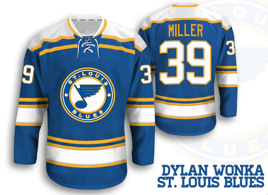
St. Louis Blues (Dylan W.)
It's a very nice concept. I like that he kept the final version with the centered logo (Sportslogos.net, in the forums, he did a concept like that) Any way the logo, with the outlines, works nicely with the striping and so does the yoke. 8.5/10

_________________________________________________________________________________

Like I said I wish I had more time, but its still better than no post, right?

Wednesday, March 5, 2014

Wednesday: Trades

Hello everyone, and welcome to another HCI post!

I can't believe Luongo's back to FLORIDA!

Today's concepts:

Denver Nuggets Concept - Stephan Scheffel


Well, this is...interesting.........Rainbow Denver Nuggets! On the blue uniform, I really think that the number and name should be white. On the white jersey, the name should be blue. I really like the city skyline in the logo! Really, I don't have much else to say - good concept.

CSU Hockey - Stephen Scheffel


I'm guessing this is Colorado State Hockey? I like it. The striping is busy, which to me - fits a college team. The logos look nice, although on the yellow jersey, the logo is way too horizontally stretched. I would make the number on the yellow jersey green. For the alternate, I'm not sure where the A comes from, because I know the team is the Rams. The striping is great, and it reminds me of the old New Jersey Devils! Overall, pretty nice concept! But it does seem really pixelated and it is filled with jagged edges.

Well that's all, folks! The trade deadline ends today, and I'm not sure if the Leafs will do anything.

See ya next time! :)