Showing posts with label Anaheim Ducks. Show all posts

Friday, April 25, 2014

Friday: Like a Well Oiled Duck

Glad to be writing you today, Ricky Mazella here for another HCI Friday! The Lightning are out, the Kings stave off elimination, and everything else is relatively entertaining. But we have some entertaining concepts too - let's have a look see, shall we?

Anaheim Ducks
Submission by: Jake88

Jake starts us off with one of the most graceful Ducks concepts I've ever seen. That's pretty good given the lack of use of this crest logo. This could still use a face-lift, but it will do just fine. The numbers are a tad large all around, and the hem needs to be fixed up tremendously - I'd rather it match the arm stripes than the yoke. While the pants are what is regularly used, I've never been a fan of it's thin stripe.  Otherwise - It's the same old song.

Edmonton Oilers
Submission by: Alan John Herbert

This was a concept inspired by a contest over at HJC. This is one of the best I saw in that contest. It makes a lot of sense too - the curvature says it all. I have many times tried to patch together such a concept and it just never happened, this is somewhat something I had in mind. I wouldn't mind seeing a little orange in here, but that was changed from copper in the original color scheme to this logo set.

Another HCI installment in the books means time to get back to playoff hockey. Whichever your team is, relax and enjoy the great quality of hockey to come!

-Ricky

Monday, February 10, 2014

Monday: Problem Solved... Hopefully

As you can tell, we here at HCI have suffered another late/no post phase. We hope that this will be it in the phase and soon HCI will be back to normal. I'm happy to show everyone the HCIHL scores, since the Express won... AGAIN!

London Sabreswords 126.2 - Skopje Lisici 100.4
Altoona Express 100.7 - Louisville Lynx 97.3
Hamilton Stags 191.2 - Evansville Rivermen 183.2

Sadly our concepts section isn't as pleasing. Today we only one concept, so obviously we need more. Send yours into HockeyConceptIdeas@gmail.com now!

____________________________________________________________________________________
 
Anaheim Ducks  (Dallas K.)
This is going to be hard. First, I'd definitely be in favor of the Ducks bringing those jerseys back, even with the edit you made to the arm stripe. I don't think the logo stands out enough, and recoloring the duck foot to work with this era is often a challenge to designers. I think Jade would work best here. For the record I've never liked that logo (on the alternate) and this only worsens it. Even the alternate jersey is a fright in it's self. First with sleeve numbers that low, they are worthless, you couldn't read them. Concept Rating (Normal Jerseys 7.2/10) (Alternate 4.5.10)
 
___________________________________________________________________________________
 
That finishes our sad, one concept post for today. Until the next Monday, later....

Tuesday, January 7, 2014

Tuesday. Ah! So close!

For the entire week, the Rivermen/Stags matchup was really close, The Rivermen deactivated high scorer Shane Doan from the IR and we had two straight wins from Marc Fluery and the Pens. Alas, Hamilton beat us by only 11 points. It was so dissapionting as we are now back to .500 and tied with Louisville for 2nd place. I would just like to say that I heard from a sports writer here in Evansville that went to the Winter Classic that it was 10$ for a cup of hot chocolate. I think for that the Michigan Wolverines are not a very good organization when there are 105,000 people there they could make way enough money charging 3! That might not even be true, but I heard that. We have a couple nice concepts for today, so let's not waste time with my ranting. New competition coming soon.


Staidum Series LA (Matt Ware)


The first Matt of the day gives us a orange vs black matchup for staidum series one of 3 (or 4). I like the logos on both jerseys. The color balance is good, but I am concerned about the amount of black on the Anehiem jersey. If a LA player was watching the puck and just saw the bottom of the jersey he could easily mistake him for a player on his own team. Not really many concerns about execution. The striping looks spectacular. 

Concept Rating: Ducks 8/10, Kings 9/10


San Jose Sharks (Matt McElroy)
So Matt McElroy went to the Winter Classic, and got a custom (ugh) Red Wings jersey for Christmas, but I don't envy him at all. If it was a Leafs jersey...

The more grey the less orange in any San Jose concept is the way to go. I like the font and the way the striping is laid out. No front numbers! Yay! I think the pants would look better with a grey stripe near the bottom, like the Isles Staidum Series pants. And the black outline on the green numbers on the away blends. I would have gone with grey numbers with a black outline on both jerseys.

Concept Rating: 9.4/10


It's kinda late, but my parents gave me this (along other things) for Christmas. If you can't see what it is it's a quilt made with a bunch of my Dad's old hockey shirts and sweaters from teams he's worked for.
Just thought I would share. I also got NHL 13 (I stay behind one year to save money) Madden 13, and another controller to go with my new Xbox (360). But this creative hockey themed quilt was the highlight of my Christmas.


Did you like the lineup of concepts? What is your opinion on the Michigan Wolverines charging $10 for a cup of hot chocolate at the winter classic? Would you leave a different review/rating for any of the jerseys? Leave a comment! It's what they're there for.


~Caden


Monday, December 30, 2013

Monday, Monday

So what's happening on your Monday? At my house it's pretty relaxed, and that's why I didn't prewrite this post. I just got a new laptop, Windows 8, of course (still learning how to work it), and though I haven't set up all of my files yet, nor downloaded Paint.net (the program I use for all of my concepts) I can still write this post! Now for your weekly HCIHL scores.
You can always check scores and stats at HCIHL.Blogspot.com
 
Altoona Express 176.9 - London (ON) Sabreswords 81.1
Evansville Rivermen 180.3 - Skopje Lisici (Foxes) 112
Hamilton Stags 193.3 - Louisville Lynx 135.2
 
Now on to your regularly scheduled concepts....
 
___________________________________________________________________________________
 
Columbus Blue Jackets (Matt W.)
One of hockey concept world's many Matts brings us a very unique Columbus concept that I'm indifferent on. I actually kinda like the Blue Jackets jerseys now (don't shoot!), and I don't know if I'd like this. Right now the striping looks a bit minor league-ish or too much like Anaheim. I'm guessing that the stars on the cuffs are centered, but the way you have it now there would be two of them. The more and more I look at the concept though, I like it. My suggestions (and this is with all of the concepts that include the Ohio flag like this) is to put some blue in the striping (on the white jersey). I'd put it right above the striping and end it at the stitching. Concept Rating: 7.7/10
 
Stadium Series LA (By Ricky M.)
 Friday's writer Ricky gives the first concept of his new mini series with LA. With the winter classic coming up, we will see the first colored game for a long time, with the last one being with LA's yellow jerseys. I really like the lack of chrome on the logos, but I can't say I like the old shield logo for LA, though I do welcome Purple back greatly. The under arm mesh looks too Nike for me, and the numbers on LA especially would be waaaaaayyyyyy too dark to see. I would like some Purple in LA's striping and some bronze in Anaheim's. The helmets are very odd, and other than the U of Michigan's helmet striping, I don't think I've seen anything like it. Concept Rating 6.5/10 (ANA 7.1/10) (LA 5.9/10)
 
___________________________________________________________________________________
 
Another post another day, goodbye and see you on Wednesday!


Monday, December 23, 2013

Monday: Without School is so Much Better II

So, Christmas Vacation's pretty good, eh? Well I know 2 weeks off is pretty good for me. Well I'm Jake, I'll get the elbow to my head, so you don't have to.

Wait, what?

_________________________________________________________________________________

Carolina Hurricanes (By Matt Mc.)
Matt's Iceborn-NHL series continues with Carolina. 

Like- 
Number font
Hurricane striping returns
Equipment

Dislike-
Sock Striping doesn't match the jersey
Black name on red jersey
Away Yoke doesn't continue to the name bar (like it does on the currents)

Could Care Less-
Logo (interchangeable with the current)
Grey Collar insert

Concept Rating 8/10

Vancouver Whitecaps MLS (By Justin S.)
Justin gives us a NHL to MLS crossover concept that features the Vancouver Whitecaps

Like-
Colors
Striping Pattern
Number Font
Advertisements

Dislike-
Lack of White in striping

Could Care Less-
Arched name
Laced Collar

Concept Rating 8.3/10

Anaheim Ducks (By Matt Mc.)
Matt's second concept of the day features the Ducks of Anaheim.

Like-
Striping Pattern
Logo 
Equipment
Fonts
The Orange jersey in general

Dislike-
Lack of gold/bronze on the white jersey
Lack of color on the white

Could Care less-
Helmet logos
Collar

Concept Rating 7.5/10
_________________________________________________________________________________

That's it for today, until next time. 

One last thing, expect something a bit different for Wednesday...

Thursday, November 28, 2013

Thursday: Thanksgiving in the US

So today's Thanksgiving in the US, and well I'm thankful for...

My family
Friends
Hockey
Concepts
Ideas

See what I did there.

Anyway later today I'm going to feast on some turkey, and I'm already wanting it now! Check our Twitter page for our weekly bonus concept featured on Sunday. As Caden told you yesterday, we have picked up a new writer, Ricky Mazella, and his first post will be tomorrow. Since Caden didn't promote it on the new Questions and Answers page, I suggest you check it out. It has answers to questions from our writers and it tells you a bit more about us. On to the concepts!

_________________________________________________________________________________

Ottawa 67's (By Alan John Herbert)
These jerseys are quite similar to the currents but certainly not identical. Alan updates the logo along with adding a black shoulder yoke to the red jersey. In my opinion, both of those moves improve upon the currents. The white jersey, though is a lateral move though. I think I might prefer the current extended yoke a bit more, but both are fine. Concept Rating: 8/10

Evansville Thunder Youth Ice Hockey Team (By Caden P.)
This is Caden's old hockey team, and have one of the better original logos that I've seen in Junior hockey (my Jets have the best! :woot:). But anyway, the black jersey looks good, the white stripes make the purple pop, but the white jersey doesn't. The black mixes in with the purple so I'd put a white stripe in between them. Also I'd add a grey stripe in the middle of the stripe. Concept Rating 7.6/10

Toronto Maple Leafs 4th Jersey (By Steve M.)
The Maple Leafs had uniforms like this from the 1970's until 1992, but Steve shows us that they can still work. The originality comment that I had on Steve's Sharks concept applies here too. I do like the return of the name font though. Suggestion: Try to incorperate different eras of Toronto jerseys in this to make it better. It's another good jersey, but yet again, the lack of originality hurts the grade. Concept Rating: 6.5/10

Anaheim Ducks Stadium Series Prediction Concept (Jake88/Me)
I made this as I was writing this post. It uses elements from the "hockey bear" t-shirt design and the recently released Islanders jersey. Also note the semi-elongated numbers and helmet stripes. If it is anything close to the design I'll be suprised.

_________________________________________________________________________________

I hope you can agree with the reviews that I was giving. 

In other news my blog had it's first post since September so check it out. Also the Islanders unveiled their Stadium Series jersey which looks sweet, if you ask me. If the Pens design is close to looking as good as that, sign me up for one! Thank you for reading and enjoy your Thanksgiving diner (if you live in the US)!

Thursday, October 31, 2013

Thursday .

Hey! Caden here to bring you guys todays post! My Team, The Evansville Icemen are 3-0 and tommorow we are playing another 3-0 team. I'm excited for that! No jersey news to report of so I will quickly say, To the concept!

Ducks/Kings Stadium Series Me
I made this concept for the stadium series LA game, Tell me what you think in the comments!


Unlike the Stags, The Louisville Lynx are 0-4 and not doing too well! I hope they can turn things around!

Had to write quick so, THANKSFORREADINGBYE!


Caden

Wednesday, October 23, 2013

Post number 74

Hey guys. Justin here. This OFFICIALY marks the post before our 75th post on this blog!! I just wanna thank Jake and Caden for adding me on as a 3rd writer and we've still got a bit more to go until 100.


_______________________________________

Anaheim Ducks (Alan John Herbert)
I'm assuming this is from HJC's old Anaheim "Unused Colours" contest. I saw the "HERBERT" name on the back and I thought it was old Ducks goalie Guy Hebert's name. But then I saw the R in the name and turn out it was you last name, oh well. This is a nice jersey, using somewhat of a Flyers jersey design (ex: arm striping). The only thing I would change about this is the green number on the white jersey. Make the outline black and green and the inside orange and fill in that empty space behind the neck. it sticks out like a sore thumb, especially on the white jersey. Overall, good execution ann good concept as well.  9/10


Evansville Riverman (Caden Patafie)

When I first saw this, I thought it was an unfinished version of the jersey. Then I took a closer look. Hey, the logo's on the upper right chest! It's like a soccer jersey, almost. I don't mind a yellow-coloured kit (haha, soccer term there) but assuming if there is another team in the HCIHL with a yellowed coloured jersey, a white one would fit well. The cityline striping reminds me of the late 90s Coyotes jerseys. It would look cool if the striping went all around the jersey and on the arms. It would look really awkward when you have a player wearing these, celebrating a goal, arms in the air and seeing the cityline get cut off under the arms. And enlarge the logo! This ain't soccer. 8.5/10


75th post tomorrow!!
-Justin

Monday, October 14, 2013

Mighty Ducks of Anaheim Still Look Good!

Hey guys! Hope everyone watched the Ducks get a franchise record 54 shots on goal while wearing the franchise's first uniforms! To tell the truth, being a 13 year old and a Pens fan, I never got to see the Mighty Ducks uniforms in action, until last night, and can I say, THEY LOOK SPECTACULAR! The CCM designers that first thought them up must have been thinking "they (the jerseys) look amazing on Edge too; why did Reebok scrap them"? And other than the 90's logo, Reebok should have brought them into Edge. Also we can buy the jerseys at Shop.nhl.com, but not on the Edge template. Seriously, why would Reebok sell the jerseys on the CCM template rather than their own. Also to note, for some reason there is no 20th anniversary patch or any customization. 

In the HCIHL, the Altoona Express beat Skopje Lisici by a score of, 179.8 to 156.4. The Rivermen topped the Louisville Lynx 108.8 to 68.9, and lastly the Hamilton Stags scored 155.1 points to beat the London Sabreswords 155.1 to 144.1. Remember to keep up with the HCIHL here. On to the concepts!

_________________________________________________________________________

Charlottetown Islanders (Justin Sulpico)
To start off with this concept, I like the connection with the NHL's Islanders. The font, being the same as the Islanders, and the template too. I'm not sure if I like the gold font, but it doesn't look as bad as I thought it would. Of course there are execution errors, but whoever the HJC writer who reviewed this found them and told Justin them, so I won't mention them. I know that you didn't design the logo, but just my one problem with it since it came out, is that it uses an almost Arial like font in the top part of it. Concept Rating 7.8/10 (Execution errors, without execution errors a 8.5/10)

Anaheim (Mighty) Ducks (Justin Sulpico)
Sorry Justin, I CAN'T STAND THE OREGON STYLE WINGS! Those don't belong on a football jersey, much less a hockey jersey! I'd just add a shoulder patch myself. I like the stiping, but maybe to make the color balancing better, I'd make the cuffs on the white jersey black, and the wings (there has to be any) on the black jersey bronze or green. Concept Rating 7.4/10

___________________________________________________________________________________

Bye guys, and I will see you soon!

Wednesday, September 25, 2013

New Canada Jerseys, (Not-so) New Writer

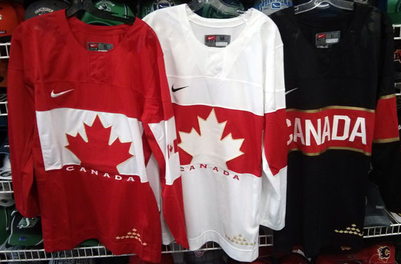
Hi, Everyone! (New) writer Justin here. I'd like to take a minute to post the Team Canada jerseys leaked late yesterday. 

They're really nice, I just don't like the assymetrical sleeves and monotone collars, makes it look empty. I haven't got any instruction from Caden or Jake on what concepts to post so i'll just post some of my own.


Anaheim Ducks Redesign.


 I straightened out the "swoosh" striping on their current jerseys, recoloured them and added duck wings on the shoulders like what the Oregon Ducks football team usually does.


Abbotsford Heat

For the primary jerseys, I took inspiration from the Flames 90s jerseys for the striping. The alternate jersey is basically an edge-ified version of the Atlanta Flames jerseys. Props to Jake for using it as inspiration in his new "Cross-League Classic" series.


New York Stadium Series
The Devils and Rangers jerseys are simply previously worn jerseys. The Islanders jersey is using the dreaded "vintage white" seen in so many outdoor games. The barberpole striping is taken from the Vancouver Canucks Millionaires jersey.


Columbus Blue Jackets (De-edge series) 


This jersey from my currently active Rbk De-edge series has not been featured on HJC yet. So consider this an HCI EXCLUSIVE!!!!! They're just the pre-edge Jackets jerseys with the Star logo plastered on the front.

That concludes this post. Stay tuned for tomorrows post. Have a good day.

-Justin

Monday, September 23, 2013

Monday. Post Number 50!!!

Hey! It's Caden, Happy 50th Post!!! I wonder who will write post #100??? I'm happy to announce the "hiring" of our new Sunday/Wednesday Writer Justin!


FYI this is the writing schedule

S Justin
M Caden
T Jake
W Justin
T  Caden
F Jake
S Caden


Tampereen Ilves Jake88
I really like the design and overall feel of the Jersey. I think the collar goes perfectly with the jersey and the stripes go well with the logo. I think the center black stripe in the chest stripe gets lost in the dark green. I would have made it white! I like the concept though and it looks better than there current sets! 

Concept Rating: 9/10


Evansville Icemen Caden P.

I made these jerseys for the Evansville Icemen! Don't Say A word about the font, but tell me what you think in the comments!

Anaheim Ducks Jake88

I know these jerseys were on the site already, But it was on Jake's post and I never got to review it!
I like the concept, but I don't like the bronze being used in the logo but nowhere else. I also don't like the NOB cutting into the piping. I like the 3rd except the bronze in the logo, again! 
Concept Rating: 8.55/10


The HCIHL announced on twitter that Alan John Herbert Joins the HCIHL as a GM of the *NEW London SaberSwords! Welcome Alan!


Thanks for reading the 50th HCI post!!!


Caden!

Thursday, September 19, 2013

Thursday


 Yo my peoples! Whatcha rockin homespice?!? How Marvelous of you to commit yourself to the viewing and enjoyment of this web page. Lets get started!!!


PICK THE LYNX JERSEY! VOTING ENDS TOMORROW!\


This was my Ducks Comp entry! Unfortunately I didn't win, but whatever! I made this with the Abbotsford Heat Template. Tell me what you think in the comments! I always like when people other than Jake comment! It makes me feel warm inside! even though its still 80o F outside and I'm warm anyway...


I kept all Jake88's European jerseys up my sleeve in case I needed them. I do now! Comon Guys! Send in your concepts! 
I like this concept, but is pretty much the same as what the currently wear! Except for the awesome striping.
I don't get the logo or what it means, but I think that it's so simple... IT'S GREAT! Kind of like the RoboPen logo from Pittsburgh's '90s days! Its hard to see the shoulder patch. Is it a wordmark or another ad or what?
I like the striping so much, This jersey (even though its basically the same as what they wear now) Will get a 8.5/10 from me!


Remember, We have writer and HCIHL GM spots available!


TTYL! And thanks for reading!

Caden (Your FAVORITE writer!)


Tuesday, September 10, 2013

Tuesday. More Teasers

Hey Readers! I honestly don't know if anyone but me and Jake reads my post!


The Springfield Sharpshooters released a new jersey teaser today! It seems to show part of the main crest.


So I see from previous teasers that the back of the jersey is orange and the front is mostly black. We could have a buffaloish jersey on our hands! We could also be seeing 2 different jerseys! Mabey a home and an alternate.

The Evansville Rivermen also released a new teaser today. Even though they "accidently" leaked it on their twitter page. 


Not seeing much. Except the royal blue piping and the striped collar. Of course we all know what the jersey looks like so I don't know why I'm even putting these teasers on my post.


This is the Ducks Comp. Entry I made for HJC! I need you to go vote for it! it only takes 5 minutes and it would be helping me out a lot. You can pick your top 5 and depending how many of each place you got you get a certain number of points. You can vote Jake88's 2nd!!! :P Tell me what you think in the comments!


NHL training camp opens tomorrow! Hockey is just around the corner!


Monday, September 2, 2013

LaboUr Day (Canada) Labor Day (US) Monday (Everywhere Else)

Sup? Caden here! Sorry for the late post, I had school! Strange I know.

On to the Concepts!


Jake starts us off with a Ducks Concept. Its a good design but im not a fan of the stripes or yoke on either of the three jerseys. Its a great idea though and i wouldn't mind the Ducks wearing these!

Concept rating 7.55/10


I LOVE this concept! Its hard to make a Swift jersey look good! I don't like the weird side panels that go across the middle of the jersey under the numbers, but except for that its great! I would also have a second blue helmet to wear with the away jersey.

Concept Rating 8/10

Saturday, August 31, 2013

Saturday is Today

Well the title is about as normal is it gets, so is today. I would have posted yesterday but I went to my school's first football game, sadly we lost to our rivals 20 to 6, next year. Any way we have three concepts by my Admin Caden, so lets get to them!

Stadium Series (NYR V.S. NYI) (Caden)
Hmmm... Not sure about this one, I'm still not a fan of the side panels and logo found on the Rangers jersey. I do like the blue helmet and lack of vintage white on the Rangers jersey, though. The Islanders jersey isn't that bad, and the logo looks pretty cool, just not as a Stadium Series logo, especially on a team who (minus the fisherman era) has always used a variation of the original logo. One other thing I can't stand is the colored name bar, let that stay in Philly. Concept Rating: 7/10

Team USA (Caden)
Hmmm... Again this one's out there. The side panels look extremely bad, more so on the blue jersey. I dislike the logo, the olympic rings certainly aren't needed. The flag on the shoulders would look good but it's already on the front on the jersey so it's a bit unnecessary. The striping does look good, very simple, a lot better than what got they gave us. One side note Nike makes the Olympic jerseys, not Reebok, and there are Nike templates in Paint Users Paradise. Concept Rating 6.5/10

Stadium Series (LA V.S. ANA) (Caden)
Hmmm... For the third time. I'll start with the LA jersey. I feel as if I am one of the only people who like cut off chest stripes, and this one doesn't look bad with it. The logo looks bad because it is the only thing with silver on it on the jersey. Now to the Ducks jersey, Vintage White to me is a big no-no for Anaheim, and the orange, jade, eggplant, and black color scheme looks horrible. I'd add an eggplant yoke and numbers to it, and the template isn't the best idea for a Stadium Series game. For both jerseys the Boston Strong patch isn't necessary, for teams in California, also the socks are too templatey. Concept Rating 7.4/10

Thanks for reading, and I hope the rest of your day is a good one!     

Wednesday, August 7, 2013

Wednesday


    Remember to submit all your jersey designs by clicking HERE. \
Jersey #1                                                          Ducks (Caden(yes me!))

I made this concept by combining the ducks new style logo (which includes black) but also incorperated the Mighty Ducks origanal colours. Concept rating 8.8/10