Showing posts with label Edmonton Oilers. Show all posts

Friday, April 25, 2014

Friday: Like a Well Oiled Duck

Glad to be writing you today, Ricky Mazella here for another HCI Friday! The Lightning are out, the Kings stave off elimination, and everything else is relatively entertaining. But we have some entertaining concepts too - let's have a look see, shall we?

Anaheim Ducks
Submission by: Jake88

Jake starts us off with one of the most graceful Ducks concepts I've ever seen. That's pretty good given the lack of use of this crest logo. This could still use a face-lift, but it will do just fine. The numbers are a tad large all around, and the hem needs to be fixed up tremendously - I'd rather it match the arm stripes than the yoke. While the pants are what is regularly used, I've never been a fan of it's thin stripe.  Otherwise - It's the same old song.

Edmonton Oilers
Submission by: Alan John Herbert

This was a concept inspired by a contest over at HJC. This is one of the best I saw in that contest. It makes a lot of sense too - the curvature says it all. I have many times tried to patch together such a concept and it just never happened, this is somewhat something I had in mind. I wouldn't mind seeing a little orange in here, but that was changed from copper in the original color scheme to this logo set.

Another HCI installment in the books means time to get back to playoff hockey. Whichever your team is, relax and enjoy the great quality of hockey to come!

-Ricky

Saturday, January 18, 2014

Saturday: Just another classic day.

Hello I'm Alan, I'll get elbow to my head, so you don't have to. Welcome to another Saturday, posted by me yours truly! Today, more concepts! Let's go!


*EDIT BY CADEN* Soon I will fill you in on the new competition thing going on*

Edmonton Oilers alternate logo concept [by Ware]
There are three of them, all of them got the oil tower with the team's word mark. One got the maple leaf, the middle got an oil drop with the team's old colors, and the last one is the same, but with the team's current colors. Out of all three, the third one is the best to my mind.

Team Denmark Concept [by Jake88]
Up points: The country's flag as arm stripes is always an good idea in my book! The main logo is classy good. The stripes on the socks, and pants is well placed. Lastly the fonts is an good choice.
Down points: Beside the stupid fake collar, nothing.
My suggestion: replace the fake collar with a better one.

Well that's today post, but before I go I decide to post another random video, a classic one from the world of YouTube! This was dated back in 2010, during the Coyotes owner-less saga a lot of funny videos was made, but this takes the cake, Until then, I'm Alan, I'll get elbow to my head, so you don't have to.

Friday, January 3, 2014

Friday: Should Auld Acquaintance Be Forgot?

With the Winter Classic now behind us until 2015, we have officially opened this season's outdoor games. And then you have the US national teams being announced. I almost forgot about my copy of last season's NHL rules and regulations. It shows amendments n norange and has been a very good reference for jerseys as well. Speaking of almost forgetting things, I have results - results for the Creighton Bluejays competition. The results are as follows:

  1. Alan (6 Pts)
  2. Jake88 (3 Pts)
  3. Justin (2 Pts)
  4. Caden (1 Pt)
  5. Ricky {Me} (0 Pts)

Edmonton Oilers
Submitted by: Ware Creative Design

Here was a good acquisition by the Skopje Lisici a month or two ago in the HCIHL. Speaking of good things, the logos are just that - a little too big, but still very reasonable options. The back numbers and shoulder patches are also a little large. The striping meanwhile, well . . . is an interesting choice, I was thrown off because of their orientation. One uniform mismatches and the other looks more Islanders than Oilers. One thing that would be interesting to see is the Oil drop in chrome - I thought of it while looking at this concept from first glance. Everything else in these looks Edmonton-esque to the appropriate jerseys, so all business is finished. 

San Jose Sharks
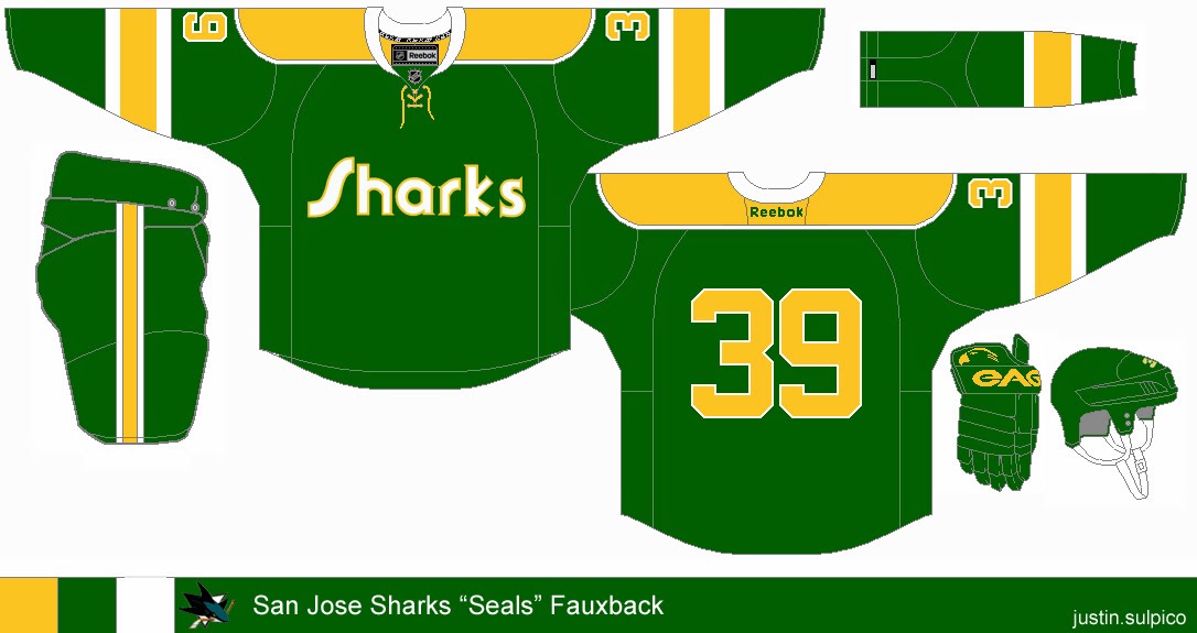
Submitted by: Justin Sulpico

Very innovative, Justin thinks he is the Tampa Bay Rays management. That is to say he is creating "old" for a team that's just the opposite. But since the team has gone through at least one jersey redesign (with or without Reebok) and that the league owns the Seals' branding makes this fall through. While this is simple, I would like to see either Seals' black or blue included as an accent color here. I also would like to see the color of something in the equipment change color - the gloves to yellow, perhaps (and possibly the socks). Seeing as the font is more yellow on white, I would use that for the crest wordmark too, just to keep the unison color on white is almost always better than white on color (for me anyway, this is no exception). That should do for this concept.


In the meantime, I had this picture taken in my brand new hockey sweater! I purchased it yesterday at a local card shop before the holiday specials were over. I managed to save $75 dollars from the store price at US$38.85. I am also close to sealing a Lady Liberty jersey having the only bid as of this sentence with less than 7 hours to go. Notice that most of the time, I go for blank uniforms for one of three reasons: It's cheaper to have them embroidered after purchase than purchasing a pre-embroidered jersey, so I can put my name and number on it, and/or because I like certain jerseys blank considering player movement (it would have to be a retired number, hall of famer, or significant contributor to the team - e.g. a Stanley Cup finalist). I have a friend who owns a jersey customization business, which somewhat attributes to the first reason.

I'm glad I was able to finish my Stadium Series concepts ahead of schedule than I had figured. They were my last overall that I completed in 2013. Now that the Winter Classic is over, my focus has shifted back towards the IIHF U-21s in Malmo, Sweden. Malmo looks like a little bit of Dubai and somewhere in Nova Scotia (places I haven't been) - but very scenic indeed. But I'm actually going to tackle that Nike template for select teams if not all participating teams. I am just waiting for Olympic curling to get underway. What? I've been curling for at least a decade and I'm only turning 22 in two weeks. Maybe I'll use the participating curling countries instead. But either way, it would be interesting. You'll be hearing from me again in seven days.

-Ricky

Saturday, December 28, 2013

Saturday: Going West!

Hello I'm Alan, I'll get elbow to my head, so you don't have to. I had an good Christmas, only got one jersey this year, and that's the Team Canada Olympics white jersey, but I did got some goodies along the way. I got Team Canada hat, the Quebec Nordiques T-shirt, Quebec Nordiques hooded sweater, and a Winnipeg Jets shirt, and track pants.

Creighton Comp Voting ends "TONIGHT" at "11:59pm"

Yes indeed Christmas may have passed, but it ain't over yet. We got New Years to go through, but for now on to the concepts.

Edmonton Oilers Concept [Matthew M.]
Up points: Nice design on the jerseys, using the tie collar is O.k. Lastly the stripes on both arms, and hem is well patterned.
Down points: No yoke on the white jersey looks empty to me, and orange numbers looks fine but only if it's used only on the dark, not on the white.
My Suggestion: Add the yoke on the white, and also on the white make the orange numbers blue.

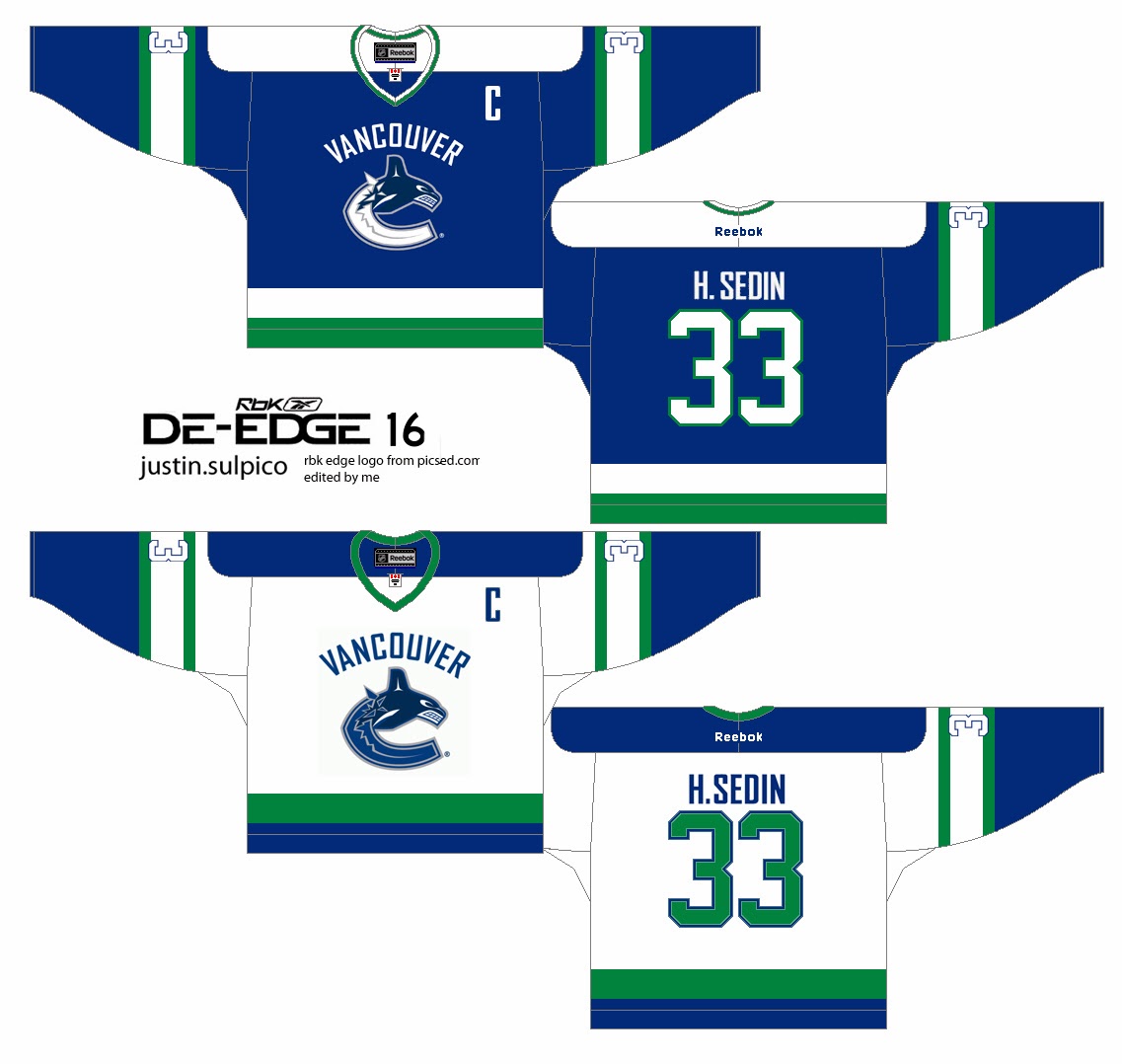
Vancouver Canucks Concept [by Justin S.]
Up points: An classic De-Edge look really fits this team nicely. The use of green on the jersey is right on.
Down Points: The "Vancouver" word mark made it busy, and there's an trademark dot beside the logo. The TV numbers is white with blue trim on a white stripes with green trim makes it unreadable.
My Suggestion: Remove the "Vancouver" word mark logo, and add green trim around the logo. Make the TV numbers green, or blue.


Well that's today's Post be here tomorrow for the Sunday post by me. Until then, I'm Alan, I'll get elbow to my head, so you don't have to.

Friday, December 20, 2013

Friday: Deja Who?

For one thing, we know all of these artists as writers of the blog at some point in time. Another thing we know is that Jake88's concept was from a series he did a few months ago.

Creighton Comp entries due S-a-t-u-r-d-a-y night!

Tampereen Ilves
Submitted by: Jake88
This particular one I remember, but not whether it was one I reviewed at HJC. I think it was the day after one of them, but I'm not 100% certain. I like this idea, but I'm not exactly sure how the logo is supposed to look like a lynx . . . but it's passable I guess, definitely not on Jake88. As many of you may have figured out by now, I love when he is able to fill out his glove template in multi-color. Everything, and I mean everything matches. The only thing that I might do revolves around the pants and helmet switch the color of one of those items to black and I'll be okay. You can even do the helmet for one uniform and the pants for the other.

Edmonton Oilers
Submitted by: Caden Patafie

To be honest, I'm intrigued with this. While I don't like the lack of an accent color (on the logo for sure), I do like that the logo includes the traditional Oilers word-mark inside the oil drop. The font itself is okay, but I don't know if the Blues/Predators template is what I'd use for this. Definitely add at least one accent color like a white or even the copper and/or red from the Bettman era stripe days.The piping helps a lot here, but only because of the other placement of orange in the jersey. You can keep this template if it can be made look at least decent with a minimum of one accent color, then I'm cool with it. Otherwise, ditch it for maybe Philly's template.

Washington Capitals
Submitted by: Justin Sulpico

This says traditional black and gold Caps all over it. This uniform was only ever produced in black. The black was introduced as an alternate for 1997/98 and got promoted to full time road set in 2000/01 and switches to home for 2005/06 with the post-lockout era beginning. The idea and the execution are spot on. These have been slightly changed to Justin's liking compared to the jersey the black version of this replaced. I like the black numbers better than the white from the actual one, but as much as I like the hem striping and its spacing, I think that the white between the black and gold should be removed thus making the hem slightly shorter.

Creighton Comp entries due S-a-t-u-r-d-a-y night!

In the mean-time, I was in Philadelphia this past week for the NCAA Division I men's soccer championship. There I went to the Phillies team store - the only one of the three open. The last three days have recapped my trip and yesterday goes more in depth on the uniform apparel at the shop. But more importantly and in other news, Teemu Selanne is back on the score sheet! His first goal in I think 25 or so games. I leave you with this lovely holiday reminder from Sabres p-x-p man Rick Jeanneret: "'Tis the season, fa-la-la-la-la-la-LaFontaine!"

-Ricky