Showing posts with label New York Rangers. Show all posts

Friday, January 10, 2014

Friday: The Hockey Rangers are Very Prevalent

We have two concepts today and by the way I got another new hockey jersey (and a baseball one)! I'm even bidding on a third one. While you'll get to see them, first thing's first. We have two concepts one is new and one is not. One is by an HCI writer and one is not. One has an alternate and one does not. One has some red and one does not. See a pattern here? I am beating around the bush a little too much, but all in good fun. Let's get to both right . . . NOW!

Creighton Bluejays
Submitted by: Justin Sulpico

As you may recall, our Sunday writer Justin Sulpico submitted this into our Creighton Bluejays competition a few weeks ago. While I don't like that he has brought back the old wordmark, Everything else is spot on His came in third place, but had I voted (like I thought I did) this would've been my selection. I'm not sold on the number font, but it makes sense and could be a lot worse than other fonts.

Submitted by: Matt McElroy

This Rangers Shield logo is a step backwards for the Rangers, who I'm guessing won't change still for at least another 10 years with the way technology is going. The red pants and its striping will be around, I'm sure. But wait, what is this?! The classic yoke striping is gone from the road white! Due to the classic yoke, I would get rid of what has been put in place and put the classic yoke back.


Though you've seen the Buffalo Sabres one already, I didn't have my camera handy as it was left in my dad's vehicle. Speaking of the Sabres (eh?), their front office layout has changed with the hiring of Tim Murray formerly of the Ottawa Senators as general manager (among other hires). Note the Christmas decor is still up from Orthodox Christmas in this picture (though there really isn't anything commercialized about it). The latter two came in yesterday so I was really excited - it made me forget about other bad news (home stuff) for a while, that is until I had to go back to it. I'm still working on the "acid trip" bidding (now at US $61 when last I checked yesterday night). Even though the Halos are a baseball team, I included it anyway.

All in all, we had a solid day at the office. It's a matter of time until teh HCIHL's Skopje Foxes continue to climb up in the standings. After an emphatic win last week, they are continuing on that good momentum to start this week. They could be in a heat for second place at the end of the game week. But no matter, off to create more concepts I go.

-Ricky

Wednesday, December 11, 2013

Wednesday: Quiet... Too Quiet

Am I the only one to notice that? We've barely had any jersey news in a while. The rest of the series jerseys still need to be unveiled, and Olympic jerseys seem to have taken a break. I hope that we can get the rest of the stadium series jerseys out soon because you'd think the market would eat them up! Same thing with the (horrible) Olympic jerseys. Do you know what time it is? CONCEPT TIME!

_________________________________________________________________________________

New York Rangers Third Jersey (Jeremy R.)
Jeremy's back and now he's showing us a NYR third jersey that I kinda like. The double blue isn't horrible, and it fits with the logo quite well. I wish that there was more red on the yoke though. The arched name always looks good, and so does the 3 tone collar. I'd take the number off the front of the jersey because that's a feature that should ONLY belong on Buffalo, if anywhere. Concept Rating: 8.2/10

Minnesota Wild Third Jersey (Ricky M.)
Well it seem's Ricky's back to his old self. Sadly, while this would have worked on the Islanders side of things, the Wild are a classy team and this would look very out of place with their other jerseys. I've never been a fan of the yellow in some of the Wilds logos so that might be why I don't really care for this one as much. Allong with that, the wordmark doesn't fit the Euro-Modern feel of this template, and I would add the Bear/Cat/Whatever Else People Think it is logo. One more thing, I would also switch the green and red, maybe for more of a north stars look. Concept Rating: 5.7 The jersey doesn't fit the team nor the logo.

_________________________________________________________________________________

So did you like todays post. Two concepts may not be a lot, but you can easily boost up that number to 3 or 4 concepts regularly by sending in concepts! You know, by making a jersey and sending it in to Hockeyconceptideas@gmail.com. It's that easy! Also vote, vote for the fuel comp, we need you!

Wednesday, December 4, 2013

Wednesday: Ducks and Kings Unveil Stadium Series Jerseys

Well if you haven't checked Icethetics or Sportslogos.net in the past day you haven't seen the Ducks and Kings new jerseys. But knowing that I almost never go a day without checking it, I've seen it on both sites. Speaking of Icethetics, I got my first concept on there! So on to the concepts! But first your one reminder.


INDY FUEL COMP ENTRIES DUE SATURDAY
                                                                                                                                                                   

St. Louis Blues 4th Jersey (Steve M.)
Congrats to Steve on finishing his series (I think)! And he does it with a pretty good concept. The double blue works in the striping, and the fonts work too. I like how you put St. Louis in the logo, like it was in the 80's. I might add a shoulder patch, preferably the trumpet, but it isn't bad without it. Concept Rating: 8.5/10

New York Rangers 3rd Jersey (Justin S.)
The Rangers have a pretty good 3rd jersey now, but Justin makes a few fixes to make it look just a bit better. I like the arched name, and the script is good. The striping, I don't mind the change, and personally if it was the other way around (their current 3rd to this one) I wouldn't care either. Concept Rating 8.6/10


Have any complaints with this post? I do. Two concepts? Send some more in! Problem solved! Also we have this competition, the Indy Fuel comp. send those in too! Remember....

Sunday, December 1, 2013

Sunday: Give me Liberty, and an Wolf! Plus an bonus jersey review!

It's Sunday, you know that means? More concepts! We also have our first contest, and it's for the ECHL's Indy Fuel! Send in your entries before Saturday!

Before we get to the concepts, I forgot to add one thing to yesterday post, my review of the NY Islanders "Stadium Series" jersey, I was so gun ho for it, but got busy in the morning and forgot, so I'll post it here!
Photo from sportslogos.net

Photo from sportslogos.net
This jersey has potential, but there are things I got beef with. Number 1. Just the "NY" logo looks too plain to my taste, even with the chrome touch to the logo doesn't help out at all. Number 2. The shoulder yoke has that sweet looking design but making it just white ruins it, and cutting the back of it just to put the "Reebok" word mark on it, What were they thinking? Number 3. The nameplates, Really? You have to pull an Flyers with that, it was good at first, now it just stupid. Lastly number 4. The stripes, on the arms only stop half way is a bad move to me, the hem got only one white line witch look bland in an bad way. My Jersey Collection Rate: Discount!

Now with that out of the way, on to the concepts.

New York Rangers concept [by Steve]
This is very good jersey. Using the Liberty logo is always good thing, adding the stripes on the hem to match the arms is a good move. The down point is the numbers, it's looks good, but it lacks white trim between the red, and silver, and pixels around the collar area. Overall: good jersey that almost complete. Score: 7.5/10

Hartford Wolf Pack concept [by me]
I try to make it simple and self ID. Stripes on the arms and on the side all the way down. With both the numbers, and nameplate are the NYR old alternate fonts from 1996-2007. What do you think of my concept?

Well that's today post hope you all enjoy the rest of the weekend, and remember Indy Fuel Contest! Til then later!

Sunday, November 3, 2013

Sunday: Writing Today's Post a Bit Late

First, want to say, how close is that Stags V.S. Express game? It's been back and forth the whole time! Right now the undefeated Stags are winning 159.4 to 152.7. But, with Altoona having three good Blackhawk players playing against a goalie changed Calgary, things could go in the Express's way. 

In other news I am sorry for not writing this post as early as expected. I told Caden and he said "it's fine" so now to the reason this post is late. Ok, I had a hockey game about two hours away. We tied the team 3-3 with the tying goal being assisted by yours truly. The team that we played was probably the best team that we had played yet and we are 0-2-1 in our league (2-2 outside our league) so we can only improve from now. 


_________________________________________________________________________

New York Rangers (Ricky Mazella)
When I first saw this I thought how much potential does this have? Sure the Rangers should never change (especially wearing an actual logo) but for conceptual purposes it works. The white jersey is almost the same (shoulder patches and logo) but the blue jersey is rehauled, and I can't say I am a fan. White yolks work only sometimes (and the 70's) and it doesn't look that great here. The red jersey has potential, too (more than the rest of the set) but again I can't like it. Maybe too much striping? Execution errors! No TV (arm) numbers and the shade of blue in the logo isn't the same as the jersey. Concept Rating 6.5/10

Los Angeles Kings Stadium Series (Jake88/Me)
Like it says on the concept I took some inspiration from Caden's stadium series concept from a few days ago. I think that this looks like something that the Kings could wear and maybe should. Also if you notice, I redid my branding to something a bit more "classy" so if you check my blog anytime soon there might be some new stuff on it.

_________________________________________________________________________

Bye guys!

Friday, October 18, 2013

Hey guys, it's FRIDAY!!!!!

Hey guys, Justin here back from a blogging "hiatus", I should say. Things have changed a bit on the blog. If you check the top bar, a tab has been added for Jake and I's jersey concept collections. Go check them out.

____________________________

Here are a bunch of concepts by me:


Rangers De-edge


HJC "IIHF Bottom 10" Contest Entry [South Africa]


Canucks De-edge


Some harmless self advertising here, below are some Facebook pages that I run, check them out and feel free to give them a "like":


Have a great Friday you guys. And a good weekend as well.-Justin

Wednesday, September 25, 2013

New Canada Jerseys, (Not-so) New Writer

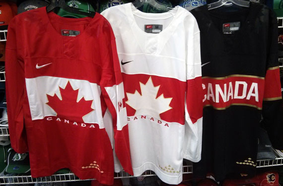
Hi, Everyone! (New) writer Justin here. I'd like to take a minute to post the Team Canada jerseys leaked late yesterday. 

They're really nice, I just don't like the assymetrical sleeves and monotone collars, makes it look empty. I haven't got any instruction from Caden or Jake on what concepts to post so i'll just post some of my own.


Anaheim Ducks Redesign.


 I straightened out the "swoosh" striping on their current jerseys, recoloured them and added duck wings on the shoulders like what the Oregon Ducks football team usually does.


Abbotsford Heat

For the primary jerseys, I took inspiration from the Flames 90s jerseys for the striping. The alternate jersey is basically an edge-ified version of the Atlanta Flames jerseys. Props to Jake for using it as inspiration in his new "Cross-League Classic" series.


New York Stadium Series
The Devils and Rangers jerseys are simply previously worn jerseys. The Islanders jersey is using the dreaded "vintage white" seen in so many outdoor games. The barberpole striping is taken from the Vancouver Canucks Millionaires jersey.


Columbus Blue Jackets (De-edge series) 


This jersey from my currently active Rbk De-edge series has not been featured on HJC yet. So consider this an HCI EXCLUSIVE!!!!! They're just the pre-edge Jackets jerseys with the Star logo plastered on the front.

That concludes this post. Stay tuned for tomorrows post. Have a good day.

-Justin

Saturday, August 31, 2013

Saturday is Today

Well the title is about as normal is it gets, so is today. I would have posted yesterday but I went to my school's first football game, sadly we lost to our rivals 20 to 6, next year. Any way we have three concepts by my Admin Caden, so lets get to them!

Stadium Series (NYR V.S. NYI) (Caden)
Hmmm... Not sure about this one, I'm still not a fan of the side panels and logo found on the Rangers jersey. I do like the blue helmet and lack of vintage white on the Rangers jersey, though. The Islanders jersey isn't that bad, and the logo looks pretty cool, just not as a Stadium Series logo, especially on a team who (minus the fisherman era) has always used a variation of the original logo. One other thing I can't stand is the colored name bar, let that stay in Philly. Concept Rating: 7/10

Team USA (Caden)
Hmmm... Again this one's out there. The side panels look extremely bad, more so on the blue jersey. I dislike the logo, the olympic rings certainly aren't needed. The flag on the shoulders would look good but it's already on the front on the jersey so it's a bit unnecessary. The striping does look good, very simple, a lot better than what got they gave us. One side note Nike makes the Olympic jerseys, not Reebok, and there are Nike templates in Paint Users Paradise. Concept Rating 6.5/10

Stadium Series (LA V.S. ANA) (Caden)
Hmmm... For the third time. I'll start with the LA jersey. I feel as if I am one of the only people who like cut off chest stripes, and this one doesn't look bad with it. The logo looks bad because it is the only thing with silver on it on the jersey. Now to the Ducks jersey, Vintage White to me is a big no-no for Anaheim, and the orange, jade, eggplant, and black color scheme looks horrible. I'd add an eggplant yoke and numbers to it, and the template isn't the best idea for a Stadium Series game. For both jerseys the Boston Strong patch isn't necessary, for teams in California, also the socks are too templatey. Concept Rating 7.4/10

Thanks for reading, and I hope the rest of your day is a good one!     

Saturday, August 17, 2013

Saturday

I know it really doesn't matter, but it's been one week since I posted my first HCI post. Also HCI now has a Twitter for the HCIHL, my concept for the league is in todays post. Here's the logo designed by me.

I made this really fast and here it is. Of course the star and leaf is for Canada and the US. If you want a team email us.

Altoona Express HCIHL cocnept (Jake88[me])
I included the logo I made for this fictional team. The colors are from the Altoona Curve baseball team, and the Express name is from Altoona's history of trains. Any C&C in the comments is welcome.

2014 Stadium Series (NYR V.S. NJ)(Caden)
Caden gives us the New York Rangers V.S. New Jersey for the Stadium Series second game. I think the "Weird Al Yankovic" name is right with the side panels and Rangers logo instead of the diagonal wordmark. Again I would use a block font instead of the Arial-like font you have. Concept Rating  7.3/10

As always thanks for reading!