Showing posts with label Team Canada. Show all posts

Wednesday, February 12, 2014

Wednesday: Olympic Hockey!

Hello everyone, and welcome to HCI! I hope you're having a good day!

I will be watching Olympic hockey today in school!!!! Can't wait! GO CANADA GO!

Time to write about some concepts!

Admiral Vladiostok - Jake88


KHL Stadium Series! I love the chrome logo you used, I don't know why some people didn't seem to like them in the NHL Stadium Series... Anyways, the diagonal stripe used here is awesome, although, the sleeve stripes have two small lines from the template next to them. I always try to remove all template lines, but that's just personal preference. In this case, the small stripes should have been removed. It also looks like the 18 on the back isn't centered, but I'm not sure. This is a great concept, with wonderful colours and ideas!


New York Islanders - Dallas K.


Lately, I've seen A LOT of black Islanders concepts. I just found out that the Islanders are moving to Brooklyn! This brings back the "fishsticks" logo, when they had that great goal horn! It's hard to create an Islanders jersey with the fishsticks logo without screwing it up - and you executed this very well! The mean fisherman is supposed to look "dark and scary" so that is where the primary black comes in great! I love the little wave design on that logo, and it fits in great here! I really think that the laces should be turquoise, and maybe the numbers. Overall, this is a pretty nice concept!


Well, that wraps up my second post on HCI! If you have any suggestions/constructive criticism about my posts, feel free to contact me!

thesoundofgoalhd@Outlook.com

Have a nice rest of your Wednesday! :)

Saturday, February 1, 2014

Saturday: 1st day of February!

Howdy everyone, Alan here for another wonderful Saturday here at Hockey Concept Ideas. Yes is day one of February, and tomorrow is the Super Bowl! Today we got only 2 concepts, but first I got another rant I want to type about, let’s get on ranting shall we.

San Fran got “Bulled” out.
Remember last week that I said the San Francisco Bulls could be moving or fold? Well 2 days after my rant the team ceased operation, I been informed by many from Caden, to Icethetics (my jersey news bible) about this. Well that’s a no surprise to me, what’s surprise me was the Bulls wasn’t the first team to fold mid-season, in fact the last team to fold mid-season was the Augusta Lynx, that I didn’t know. Beside that this news remind me of the WHA now that’s what I called having bad market teams, don’t believe me, google it, and you’ll won’t believe on how many teams folded, relocated, and ceased mid-season that lead to the merge with the NHL.
I’m done ranting for now, so let’s get to some concepts O.K.

CCCP Concept [by Justin S.]
 Up points: Nice work on the lines on the arms. Stars are a good touch on the yokes. Lastly a hem stripe "yay!"
Down points: With just single lines on both arms, hem, including numbers, and word mark logo makes the jerseys plain to me.
My Suggestion: Add trims and you got a winner.

Team Canada IIHF Concepts [by K14]
Up Points: Like the logo, it maybe plain but it's a classic. Real lace is a good sign. Red and white only is alright with me. Two maple leafs as hem is fine with me.
Down point: Using the Toronto Maple Leafs shoulder patch as shoulder patch for Team Canada is alright, but I felt like is unfitting to me, it has the Maple Leafs vibe to it.
My Suggestion: Change the the Shoulder patch to make look less Maple leafs.

So after that is the Team Canada concept gets my writers pick. Here's once again everyone's favorite segment the "Hockey Videos from Youtube! (Double video edition)" Today is former TSN, and current Fox sports 1 anchor Jay Onrait calling hockey games featuring Sergei Bobrovsky!

Well that's today, come by tomorrow for Super Bowl Sunday post of HCI, until then, later.

Friday, January 31, 2014

Friday: 10 PM East Coast Hockey

You may be used to being up at 10 PM Eastern to watch a sports event in the Pacific Time Zone, but I will be for one last time this regular season behind the PA microphone at Smead Arena for Springfield College club hockey. In the Mean time, another jersey came in, but we'll get to that later. First, a pair of concepts.

Team Canada (The World Championships)
Submitted by: Alan John Herbert

Alan has distributed what I think are the best team Canada concept I have come across by a concept designer. While there are produced one I actually don't mind, this would look even better in real time! The gold accenture is absolutely classic. The black highlights are well placed and even the extra two leaves are a welcomed addition. The main white looks more sophisticated than using black, though I do miss the main black stripe a little. Maybe a black helmet will ail my sadness. Gotta chose this one for my writer's pick this week.

Michigan v. Michigan State (Outdoors)
Submitted by: Alan John Herbert

Alan is being very traditional "doing new things for new events" as we saw with the NHL when introducing the new uniform templates. this is much the same idea with logos inside of logos. Other than that these might make for everyday use. I'm not significantly impressed with these other than the yoke striping inside the Spartans jersey. Then again, college is simple compared to any professional team really. So I guess it makes sense after all.


Surprise! I haven't been able to get my pictures of it up, but this was from the original listing. I liked this version better solely because of the character of the hem stripe, which kept this jersey sane before Reebok took over jersey making. Still looking for more classics, but only the same ones from the other times that still elude me. 

Keep sending in your stuff, we love seeing it and want to see it sooner rather than later. Drop us a line with your content, just remember our guidelines. In no time, you'll see me back here in one weeks time. Until then, I bid you a good weekend!

-Ricky

Monday, January 13, 2014

Monday: Lack of News

Well we to be in a pretty long period of time with out any jersey unveilings, I'm sure it's been worse, but with the Olympics days away and half the teams (Switzerland and Sweden officially, Norway, Slovenia, and Austria) haven't unveiled their respective jerseys yet. As we wait for these to come out, you can read the two new Altoona Express articles on HCIHL.blogspot.com or click on the HCIHL tab on the tab bar. We will definitely be starting a new comp soon, so be ready for that.

____________________________________________________________________________________
 
Team Canada (By Mat R.)
Mat is been making some pretty good concepts lately and this is no exception. I don't really like how the leaf doesn't finish on the back of the jersey, because it should continue onto the back. Also I don't know about it, but I might add a colored in collar. I also think that the numbers don't really need the two outlines, it would fit more with the logo if they didn't. Concept Rating 8/10
 
2016 Winter Classic Detroit V.S. Colorado (Justin S.)
                              
Well I actually see where Justin is coming from with the Detroit striping. I don't think that they've ever used it in their existence, but it was on their 2009 Winter Classic socks. I also think that Justin is referencing the proposed Nordiques jersey design that they would have worn if think didn't move. I think I'll start with Detroit first. I really liked this years Winter Classic number font, and I think it would good here, using the logos and fonts, other than that nice job. Colorado is... different. I don't think that the numbers would be difficult to see in that shade. Though I like amount of blue used, I think that more burgundy and less silver would look good. One execution note, there are no TV numbers on the Detroit jersey. Concept Rating 8.4/10
 
___________________________________________________________________________________
 
Well that's it for today, see you on Saturday!


Friday, November 15, 2013

Friday: Canada, and Canada

As you see the title above it, yes it's an all team Canada post! Let's not waste time and get going.

Team Canada concept (by Caden)
This one is one of those things that Canada "SHOULD" go with instead of with one arm stripe, and Caden give this an final touch. With that it made me wanna buy it! The only down point witch doesn't matter it's just adding an icing to my cake put thin hem stripes and we got an winner! Score: 8/10

Team Canada concept (by me/yours truly)
 On this concept just simple stripes on the hem, the socks, and on the side of the pants. Simple stripes on the arms with a maple leaf cut off the end of the middle stripe. The logo of team Canada with the classic word mark from their alternate logo. The numbers, and nameplate are standard block. What score you give this concept of my?

Well that's today post, be here tomorrow for some more HCI post by me as we're days away for the big 100. Until then, later.


Sunday, November 10, 2013

Sunday: Canada and St. John's?

Hello people who read this blog! In today's post I will be reviewing the Canadian Olympic jerseys and St. John's Icecaps new thirds. In my personal life, I scored a goal in my team's game yesterday and my first in the regular season. Sadly our team couldn't hold on to a 2-1 lead and we tied 2-2, I was a plus 2 in the whole game. In the game I had this morning we didn't do nearly as good and lost 1-2. On to the jerseys!

_________________________________________________________________________

Team Canada
From Nike
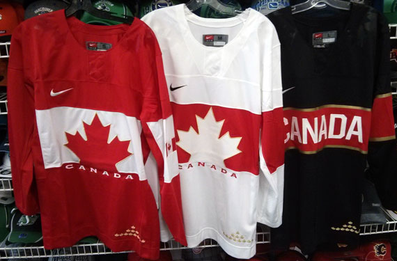
In my opinion, these have by far the most potential of any of the jersey's released thus far. All you need to do is add the one stripe to the other side. Maybe if you want to, continue the gold outline of the leaf to the rest of the chest stripe, but it might be too much. Jersey Rating: 7.5/10

St. John's Icecaps 
From Icethetics
Here is a victory for concept artists everywhere. Troy Birmingham, a graphic artist from St. John's, Newfoundland approached the newly founded team in 2011 with his design. Although I wouldn't normally like this much silver anywhere, it doesn't look bad here (I'm not really a fan of the Whalers jerseys that were like that). The one thing that kinda confuses me is that the collar is a tiedown and the yoke is square. These are features that are on most of Reebok's new jerseys. I'm guessing Reebok got involved there. The logo isn't bad, for an American like me I had to read the Icethetics article to find out what the tower in the background was, but It's a good feature. Jersey Rating: 8/10

Texas Stars 
From Taylor Vause
I couldn't help but bring these up too. This is another concept artist who made his design in real life. This one was designed by a player of the Texas Stars though. The player, Taylor Vause, had done this before, with the Swift Current Broncos, he made two designs that he wore in games. You can read about them here. About the jerseys, the only problem is mismatching placement of the stars between the hem and sleeves. Jersey Rating: 8/10

_________________________________________________________________________ 
Bye guys, Happy Veterans day tomorrow!

Wednesday, September 25, 2013

New Canada Jerseys, (Not-so) New Writer

Hi, Everyone! (New) writer Justin here. I'd like to take a minute to post the Team Canada jerseys leaked late yesterday. 

They're really nice, I just don't like the assymetrical sleeves and monotone collars, makes it look empty. I haven't got any instruction from Caden or Jake on what concepts to post so i'll just post some of my own.


Anaheim Ducks Redesign.


 I straightened out the "swoosh" striping on their current jerseys, recoloured them and added duck wings on the shoulders like what the Oregon Ducks football team usually does.


Abbotsford Heat

For the primary jerseys, I took inspiration from the Flames 90s jerseys for the striping. The alternate jersey is basically an edge-ified version of the Atlanta Flames jerseys. Props to Jake for using it as inspiration in his new "Cross-League Classic" series.


New York Stadium Series
The Devils and Rangers jerseys are simply previously worn jerseys. The Islanders jersey is using the dreaded "vintage white" seen in so many outdoor games. The barberpole striping is taken from the Vancouver Canucks Millionaires jersey.


Columbus Blue Jackets (De-edge series) 


This jersey from my currently active Rbk De-edge series has not been featured on HJC yet. So consider this an HCI EXCLUSIVE!!!!! They're just the pre-edge Jackets jerseys with the Star logo plastered on the front.

That concludes this post. Stay tuned for tomorrows post. Have a good day.

-Justin