Showing posts with label CHL. Show all posts

Saturday, April 12, 2014

Saturday: Ying and Yang

Hi everyone, Alan here for another Saturday post here on HCI. Did you all miss me? I do! Today no concept, but that doesn't mean I can do some reviews, here are two alternates that I will review them, one from the WHL, the other from the NHL, one that is good, and the other that is ugly. Let's get to it!

Buffalo Sabres Alternate Jersey
 During the team's 40th Anniversary season they had that to me could have been one of the best alternate jersey the team ever wore, until after the 2011-12 season the higher ups decide to ditch it, and bring in a new alternate. So let me get this straight, we went from a good alternate, to this horrible alternate. When I saw the first image that is yellow, I thought it's going to be all yellow jersey, then the logo, at that time I thought it's going to be a good alternate jersey just like the team last alternate. But comes some more images until the leak and believe me this was a disaster of a jersey. First of all the idea of cape style could of work but with both numbers, and nameplate fonts ruins it for me. Arm stripes are terrible, nuff said. I see some white on the jersey, but I don't feel it live up what it suppose to. The collar is O.K. but could of done better. Lastly the captain, and alternate captain with two swords could be the only thing that is cool, but on this it's bad.
So overall I hope the Sabres put this jersey out of it misery.
   My Recommendation: Buy it at a thrift store!


Calgary Hitmen Alternate Jersey
 This jersey is base on the team's first ever set! I got to say despite there is pink on this jersey, but the pink color is well tame, it's like they added to give it an eye popper effect, and it work pretty good. The arms is good, nice use of the flame detail on it. The hem is plain but simply put together. The colors beside the pink the grey, and black work together very well. I like how they use the team's first logo as a shoulder patch, followed by the team's anniversary patch. The only two things I got with it's the TV numbers being black intend of white, and second the fonts now I know it's good and all, but I felt like they didn't need it. If they change the fonts to a standard block that is white with pink trim around it on both the back, and on the sleeves, make the flame stripe in the arms go a little higher.
Overall best alternate jersey the team got, and who knows maybe we can see these as the team's main dark jersey set intend of the team's current dark jersey.
My Recommendation: Buy it at full price, it's well worth it!


Well that's my reviews on two alternate jerseys, I know I'm little late in posting this, but well worth it. Until then later.

Thursday, November 28, 2013

Thursday: Thanksgiving in the US

So today's Thanksgiving in the US, and well I'm thankful for...

My family
Friends
Hockey
Concepts
Ideas

See what I did there.

Anyway later today I'm going to feast on some turkey, and I'm already wanting it now! Check our Twitter page for our weekly bonus concept featured on Sunday. As Caden told you yesterday, we have picked up a new writer, Ricky Mazella, and his first post will be tomorrow. Since Caden didn't promote it on the new Questions and Answers page, I suggest you check it out. It has answers to questions from our writers and it tells you a bit more about us. On to the concepts!

_________________________________________________________________________________

Ottawa 67's (By Alan John Herbert)
These jerseys are quite similar to the currents but certainly not identical. Alan updates the logo along with adding a black shoulder yoke to the red jersey. In my opinion, both of those moves improve upon the currents. The white jersey, though is a lateral move though. I think I might prefer the current extended yoke a bit more, but both are fine. Concept Rating: 8/10

Evansville Thunder Youth Ice Hockey Team (By Caden P.)
This is Caden's old hockey team, and have one of the better original logos that I've seen in Junior hockey (my Jets have the best! :woot:). But anyway, the black jersey looks good, the white stripes make the purple pop, but the white jersey doesn't. The black mixes in with the purple so I'd put a white stripe in between them. Also I'd add a grey stripe in the middle of the stripe. Concept Rating 7.6/10

Toronto Maple Leafs 4th Jersey (By Steve M.)
The Maple Leafs had uniforms like this from the 1970's until 1992, but Steve shows us that they can still work. The originality comment that I had on Steve's Sharks concept applies here too. I do like the return of the name font though. Suggestion: Try to incorperate different eras of Toronto jerseys in this to make it better. It's another good jersey, but yet again, the lack of originality hurts the grade. Concept Rating: 6.5/10

Anaheim Ducks Stadium Series Prediction Concept (Jake88/Me)
I made this as I was writing this post. It uses elements from the "hockey bear" t-shirt design and the recently released Islanders jersey. Also note the semi-elongated numbers and helmet stripes. If it is anything close to the design I'll be suprised.

_________________________________________________________________________________

I hope you can agree with the reviews that I was giving. 

In other news my blog had it's first post since September so check it out. Also the Islanders unveiled their Stadium Series jersey which looks sweet, if you ask me. If the Pens design is close to looking as good as that, sign me up for one! Thank you for reading and enjoy your Thanksgiving diner (if you live in the US)!

Tuesday, September 17, 2013

Tuesday

Well, Preseason hockey is in full swing and I'm super excited! There is a writers spot available to write an either Tuesdays or Wednesdays for HCI! Email us to apply! We also have HCIHL GM spots available! Lets just go ahead and start now then!


Pick the LYNX jersey! Voting ends Friday!


Saginaw Spirit Alan John Herbert

Alan John Herbert Brings us a Spirit Concept which is OK, but not better than their currents. I think it is a good idea I just aren't a fan of the piping. The arms on the white jersey aren't my favorite either. Also remember that the OHL uses white jerseys at home the first half of the season. I like the choice of the number font. It fits really well with the Spirit image! 

Concept Rating 7.8/10


Evansville Icemen Caden P.


I made this Jersey as a Alternate/Specialty Jersey for the ECHL affiliate of the Columbus Blue Jackets, The Evansville Icemen. It is basically a Columbus jersey with Evansville and Springfield patches on the shoulders. 
Tell me what you think!


Soviet Union Caden P.


 I made this jersey for the Return of the Soviet Union comp on HJC. I made the concept based off the old Chicago Winter Classic jerseys with different colours. I tried to incorporate the classic "Red Army" feel and also have a new look to the jerseys! Catch the "Somethingov" Miracle Reference. The Red helmets are also based off the 1980 Miracle on ice Olympic game. Tell me what you think in the comments.


17 days till my favorite team, The Evansville Icemen start Training Camp! I play the part of head stickboy for the team so I'm off the charts excited 

Thanks for Reading, Readers!


Caden


Monday, September 16, 2013

Well I Suppose This is a Title... (Monday)

Well, today's your favorite day of the week, MONDAY! I have a crap load of homework and as much as I hate to rely on study halls, I have to write this post and make my Soviet Returns Entry on HJC. Yes, I am putting this ahead of my homework, FEEL HAPPY! Well I will give you a concept by my as usual and nothing else, except for my hate of the dreaded day we English speakers call Monday.

Seattle Thunderbirds (Jake88/Me) 
The Seattle Thunderbirds are a team in the WHL now but many people would like them in the NHL. I am one of those people, but with their history in the WHL I think that a name change would be in store. Either way Seattle should have a NHL and both Florida and Phoenix shouldn't, I mean check out this picture of a Florida game from yesterday. Ok now to the concept. I like the Thunderbirds 3rd jersey, so I tried to make a white one like it. It didn't translate well into a dark jersey, so I made a completely different, classic style, dark jersey. I also went in a different direction with the hem stripe and added UCLA striping to the yoke. It's really nothing special, but since I made it I don't mind it.

Here is the logo I made for HJC USSR contest, too.
I think you can see my inspiration on this and it's kind of cool, I hope to show you the jerseys that go along with it on HJC tomorrow or Wednesday.   

Read HJC, read Icethetics, read HCI... read HCI again. And again, and again, and again. And if you do you will be thanked five times by me. Don't know what I'm talking about?

Thanks for reading!

Now you do, and bye!

Friday, September 13, 2013

Friday the 13th

Hey Reader! All 1 of you! Sorry for the late post. NHL preseason Is. One. Day. Away!  
to the concepts!

to thTo the concepts!


This is my Staidum Series Chicago concept I made! What do you think? 
Tell me in the comments!


 I like the Owen Sound jersey for Alan John Herbert's OHL redesign series! I would have used a different font for the back though. A alternate jersey and a 2nd white helmet would be nice too!

Concept Rating 9/10


Which jersey do you like better?!?  The top one is Lynx1 the bottom is Lynx2 Vote in the poll to decide the new jersey for the Louisville Lynx!


The Springfield Sharpshooters unveiled there jerseys and logos at the same time! I will let Jake tell you about them tomorrow and i will review them Sunday or Monday.


Speaking of Jake he brings us a great Marlies Concept, I like every aspect of these jerseys! Its just so well executed and designed! I would have put a Marlies logo on the helmet instead of the ML logo. I would like the Maple Leafs in these! (with a different logo of course!)

Concept Rating a perfect 10/10! (a first on HCI)


T

Sunday, September 8, 2013

Sunday (Very Late)

Sorry for the late post. Excelling Students program at school means extra homework and crap!
The 4th HCIHL team is the Seattle Sharpshooters! Like the Wild and Sabers, They are releasing jersey teasers. This is the 2nd one!

It looks like a good jersey! I will like to see how this turns out!


I drew up this Preds concept as a space filler! Tell me how you like it in the comments!


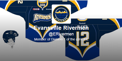
The Evansville Rivermen also released their first 3rd jersey teaser today! Every day there will be a new teaser and the full jersey will be released next Sunday! Stay tuned!

*UPDATE The whole Jersey was leaked on the Rivermen twitter page today! @ERivermen 
This is what they look like. The Rivermen contacted me after taking it down and said they will still do the teasers and unveiling on their twitter page! I will like to see how that plays out!


Alan John Herbert send us our guest concept for today! A London Knights concept! A solid concept with everything except that I doubt a OHL team could afford to buy extra pants and a third helmet just for an alternate uniform. I would also recolour the shoulder patch on the alternate to go with the colour scheme. maybe vintage white???

Concept Rating 9/10


Friday, August 30, 2013

Thank Goodness It's Friday

As the ECHL season is just around the corner, I'm busy getting things ready for the Evansville Icemen! Thats why the post is so late! What jersey do you want to win JOTM? Email us and let us know!


Alan John Herbert starts us off with a concept for the " North Bay Battalion" a OHL team. The execution on the jersey is great! butttt..... I'm really not a fan of the shoulder yoke going up and around the reebok wordmark on the back of the jersey.  I would also have the Helmet match the equipment, aka Black helmet or green pants.

Good concept overall so I think it can get away with 8/10


Jake88 gives us a almost perfect Montana State concept. The only thing I'm not a fan of is the "Baby Poop Brown" (term coined by Nashville's old 3rd) Third jersey but it could work. I would also put the "M" on the shoulders of the home and away jerseys and the "Bobcat" on the alternate shoulder.

Concept Rating, Another 8/10 for Jake88

Sunday, August 25, 2013

Sunday

YO! Its Caden here! remember to vote for me in the Favorite writer poll! I'm sick in bed so sorry for the late post! I have a good jersey today/night so lets go ahead and get started! Go ahead and submit your jerseys for the August JOTM contest before it's too late!
This is a concept for the Q-Leauge by Jake88. I like everything  but the weird yoke and the logo. 
Concept rating 9/10

The HCIHL due to lack of owners has been shut down. :(
Sorry!

Thursday, August 15, 2013

Thursday


Jake88 is not available so I guess I'm going to write the post today.


We have a new banner on the website made up of "teaser" pics the Sabers released of there new third jersey.

We could always use more writers so if you want to write for HCI email me @ hockeyconceptideas@gmail.com

and to the concepts!!!


This logo I made the other day because I was bored. I thought the Devils would need a color flop so thats the only change I gave them to there logo. Tell me you're thoughts in the comments

Concept rating 8 /10


                                                         Courtesy Hockey Jersey Concepts


Sunday, August 11, 2013

Sunday

Hey guys, Jake88 here on part of Caden being out of town, or at least thats what he told me. I have two concepts today, and would like to point out that I have a concept on HJC up for Concept Of The Week (COTW), wink, wink.

Kamloops Blazers (Jake88[me])
Both of the concepts I have today were made recently, and this one I made yesterday, although the idea has been in my head for a while. More back story, I would like to point out that last night when I finished this I showed it to Caden, he loved it, so that's why it's on today (I don't like to unveil concepts immediately). For this concept I wanted the "blaze" from the logo to cut into the striping and I think it works. The only thing I might change is the orange numbers on the blue jersey. By the way the strange yoke is for the New Jersey Devils.

HK Poprad (Jake88[me])
First I would like to say that the logo that was used here was made by a very talented Slovakian man named Rudolf Vychovaly (yes I know I credited him on the concept too). You can look up more of his great work here. About the concept, this team is from Poprad, Slovakia, and this template is one I have been playing around with. Since I made this concept today, I can't tell you much about it the only thing I am not sure about, but should do more often is the non-matching arm and hem striping. 

Remember to give your opinions in the comments, because I want to improve and if you have problems don't hesitate comment on it! I guess I should say (for the blog) that Caden's Warrior Cup Challenge comp. entry was on HJC today, and you can vote for it this week, while you vote for my Donbass Donetsk concept for COTW. 
Wait, why don't you vote for my Warrior Cup Challenge comp. entry, wink, wink.
Bye and have a good rest of your day!