Showing posts with label New York Islanders. Show all posts

Friday, May 2, 2014

Friday: The Lighthouse is Working

Second round ahoy, HCI readers! One game is in the books and what a doozie it was. The Canadiens won it in two overtimes and took the first lead of the series. My Ducks go at it tomorrow, while the remaining two series start tonight. Until then, let's view a concept.

New York Islanders
Submission by: DDragon60 Studios (Phil Beck)

Phil has brought us a home and road of the first ever Islanders alternate (which was orange) and my gosh does it look gorgeous. If the alternate were brought back, c'est magnefique! The rest of the equipment and uniform look very solid to boot. I really appreciate that the Stadium Series logo is no more then a shoulder patch logo here.

While I'd love to stay and chat, it imply cannot be. Until next time, I bid you good hockey!

-Ricky

Wednesday, February 12, 2014

Wednesday: Olympic Hockey!

Hello everyone, and welcome to HCI! I hope you're having a good day!

I will be watching Olympic hockey today in school!!!! Can't wait! GO CANADA GO!

Time to write about some concepts!

Admiral Vladiostok - Jake88


KHL Stadium Series! I love the chrome logo you used, I don't know why some people didn't seem to like them in the NHL Stadium Series... Anyways, the diagonal stripe used here is awesome, although, the sleeve stripes have two small lines from the template next to them. I always try to remove all template lines, but that's just personal preference. In this case, the small stripes should have been removed. It also looks like the 18 on the back isn't centered, but I'm not sure. This is a great concept, with wonderful colours and ideas!


New York Islanders - Dallas K.


Lately, I've seen A LOT of black Islanders concepts. I just found out that the Islanders are moving to Brooklyn! This brings back the "fishsticks" logo, when they had that great goal horn! It's hard to create an Islanders jersey with the fishsticks logo without screwing it up - and you executed this very well! The mean fisherman is supposed to look "dark and scary" so that is where the primary black comes in great! I love the little wave design on that logo, and it fits in great here! I really think that the laces should be turquoise, and maybe the numbers. Overall, this is a pretty nice concept!


Well, that wraps up my second post on HCI! If you have any suggestions/constructive criticism about my posts, feel free to contact me!

thesoundofgoalhd@Outlook.com

Have a nice rest of your Wednesday! :)

Saturday, February 8, 2014

Saturday: Putting LEGO blocks together for this post.

Hi everyone, Alan here for another Saturday here on HCI. Well in case you want to know what the title means? Well tonight I'm going to the movie theater to watch "The LEGO Movie!" I'm excited to see this movie, ah my childhood is coming back to me. After that this Sunday I'm off to Dresden to watch some Jr.C playoffs action on afternoons, and back to my town of Chatham to watch my Jr.B team the Maroons in action. Well enough of that, on to concepts.

New York Islanders Alternate concept [By K14]
Up points: Black with bright colors is not easy to pull off, but this one really works for me. The logo maybe not the best to everyone, but with right colors like this one it works. The hem stripes is wavily nice.
Down points: The Brooklyn Nets logo, and the numbers is too plain for this jersey. The arm stripes is good, but withe the wave hem stripe make the jersey look unbalance.
My Suggestion: Change the number fonts to anything with trim to give that eye pop effect. Use ether the team's main logo, or the lighthouse logo as shoulder patch. lastly give the arm stripes the same treatment as the hem stripe.

Fort Wayne Komets Concept [by me]
Back in 2012 this is my first ever ECHL concept the Fort Wayne Komets, this team had alot of history from their days in the old IHL to being the official member of the ECHL. This concept I try to give a "modern" look to it with the strips on the arms, made the spaceman logo as the teams main crest because it look very modern and I like the logo, add their classic comet with the "K" logo on it as the secondary logo on the shoulder and use the New York Islanders old 2002-2007 alternate jersey fonts for both the numbers and NOB.

Well that's today post. I know some of you all where hoping for more concepts, well ah ha yeah I'm getting low on concepts. But you can make the difference by sending your concepts in! Just send them to hockeyconceptideas@gmail.com so we can post more concepts on this site. Until then, I'm off to movie theater and enjoy the LEGO movie. Later!

Monday, December 9, 2013

Monday: HCIHL Scores and More!

Hello all! Jake88 here, just like any Monday on HCI. As usual, we have some great concepts today, one by a great logo and template designer, one by a writer, and one be a man who's concepts haven't been seen on HCI yet! If you skip the HCIHL scores you can see the concepts now, but who would skip them? Here they are!

Evansville Rivermen 184.9 - London Sabreswords 126.8
Hamilton Stags 131.2 - Altoona Express 75.2
Louisville Lynx 167.7 - Skopje Lisici 152

How about them Lynx? 4-6 after being once 1-6 (right?). Meanwhile my Express have been worse than any other team in the HCIHL. This week we play the Rivermen, and need a win.

_________________________________________________________________________________


Fuel Comp. Vote Now!

Boston Bruins (By Matt Mc)
Matt brings us our first concept of the day and it's a good one. I like the inclusion of brown and a yellow home jersey. The balancing of colors on both jerseys are done nicely. I'm not sure if I like the brown helmet on the white jersey, and speaking of which, the helmets need logo stickers on them. My only other problem with this concept is the lack of yoke striping on the back of the jersey. I would have done what you did with the Philadelphia Aces (IceHL) team. Concept Rating 8.7/10

New York Islanders 3rd Jersey (By Ricky M.)
When I first saw this concept, I was thinking "What happened to Ricky? He normally does crazy mix and match templates, this is... normal." The thing is, with a crazy logo like this the crazy template would actually work. If anything it would compliment the logo. I really like the yoke striping, though. I dislike that the atlantic green and yellow are used in the logo and no where else. All in all the jersey is pretty plain while the logo certainly isn't. Concept Rating 7.2/10

Chicago Blackhawks Stadium Series Jersey (Jeremy R.)
HCI's newest artist gives us a Chicago stadium series jersey that I really would not be surprised to see on the ice. The white yoke and hem stripe fit with the Isles jersey, and the elongated numbers fit with every jersey and t-shirt out so far. I don't like how the T.V. numbers are placed since there would be a huge gap in between them. On an execution error the black used in the name is different from the black everywhere else. Concept Rating 8/10

*EDIT BY CADEN*
Always remember to put your Name/ID on the concept outside the jersey. Not just on the NOB.


_____________________________________________________________________________

So do you think that I was unfair to a new artist, or that I was too picky with Matt? Tell me!

In my hockey life, we had two games this weekend that featured a 8-2 win and a 4-1 win with me scoring the sixth goal in the 8-2 game. My school has a game tonight that I hope we can win.

Bye and check tomorrow for Caden's post!

Sunday, December 1, 2013

Sunday: Give me Liberty, and an Wolf! Plus an bonus jersey review!

It's Sunday, you know that means? More concepts! We also have our first contest, and it's for the ECHL's Indy Fuel! Send in your entries before Saturday!

Before we get to the concepts, I forgot to add one thing to yesterday post, my review of the NY Islanders "Stadium Series" jersey, I was so gun ho for it, but got busy in the morning and forgot, so I'll post it here!
Photo from sportslogos.net

Photo from sportslogos.net
This jersey has potential, but there are things I got beef with. Number 1. Just the "NY" logo looks too plain to my taste, even with the chrome touch to the logo doesn't help out at all. Number 2. The shoulder yoke has that sweet looking design but making it just white ruins it, and cutting the back of it just to put the "Reebok" word mark on it, What were they thinking? Number 3. The nameplates, Really? You have to pull an Flyers with that, it was good at first, now it just stupid. Lastly number 4. The stripes, on the arms only stop half way is a bad move to me, the hem got only one white line witch look bland in an bad way. My Jersey Collection Rate: Discount!

Now with that out of the way, on to the concepts.

New York Rangers concept [by Steve]
This is very good jersey. Using the Liberty logo is always good thing, adding the stripes on the hem to match the arms is a good move. The down point is the numbers, it's looks good, but it lacks white trim between the red, and silver, and pixels around the collar area. Overall: good jersey that almost complete. Score: 7.5/10

Hartford Wolf Pack concept [by me]
I try to make it simple and self ID. Stripes on the arms and on the side all the way down. With both the numbers, and nameplate are the NYR old alternate fonts from 1996-2007. What do you think of my concept?

Well that's today post hope you all enjoy the rest of the weekend, and remember Indy Fuel Contest! Til then later!

Saturday, November 30, 2013

Saturday: Middle of the Island!

What's up, Alan here in doing an all Islanders post, let's get going.

New York Islanders concept [by Steve]
Once again another 4th jersey series by Steve. This jersey maybe plain to some, but it's smart to me! Good move on the using the stripes on both arms, hem. good chose of putting the lighthouse logo, and the team's main logo on the shoulder. The only down point that isn't too much it's the lack of outline on the lighthouse logo, beside that this is an very good Islanders concept one of those I wish they use this for the "Stadium Series." Score: 9/10

New York Islanders concept [Jake88]
 This concept I believe what would look like if the NHL jersey system took over by Nike. Nice idea on making the wave stripes on the arms, and the wave stripe base on the fishstick logo is an good touch. Numbers and nameplate is clean, and straight! Overall: An good Islanders jersey, only in an alternate level. Score: 8/10

New York Islanders concept [by Me]
This was part of an HJC contest called "Make the Fishstick logo look good Competition." I use the wave stripes that was base on my Erie Otters concept, made it 4 stripes for "you know what the 4 stripes means by now," the logo was tricky to do, but pulled off nicely. The colors are blue, orange, navy blue, and white. What do you think? What score you give this?
Well that's today post! Be here tomorrow for my Sunday post, til then later.

Friday, November 29, 2013

Friday: Blog Hopping

"Hello hockey fans, it's Ricky Mazella - the Voice of the Springfield College Pride" . . . well not quite. While what I just wrote was true, that's not what I'm here to talk about. I'm glad to be a part of the HCI family coming over from HJC. It was a privilege, but a better opportunity arose and it led me here, after parting ways by mutual consent. I'm really excited for my first post today! Though the only thing that could make it better is if the Ducks could start winning, as they're in a slump following a great start. Nonetheless, Caden and the gang have done a great job here and hopefully I can continue that strong tradition during my tenure here.

For those of you who aren't familiar of me or my work, I'm 21 (5/6) years old from suburban Buffalo, NY where I'm a fan of the Anaheim Ducks (before I saw any of the movie trilogy) and a fourth year sport management major at Springfield College in MA. I began my graphic design career after stumbling upon HJC (for the second time) and the old Icethetics (then the Tournament of Logos) in February of 2011. I then began my blog, Buffalo Nickel Graphics, on the 5th of May in 2012. My blog covers a variety of sports and templates. These include but aren't limited to curling and Australian football in sports as well as a transportation, dasher boards, and playing surfaces in templates. I encourage you to check those templates out and submit them here on HCI!

Enough about me, let's dig in!

NY Islanders {Caden}

As you can see, this is purely intended for the current contest at HJC to improve the "Gortons/Fishsticks" logo. Mine will be here soon, after it's up on HJC anyway. Pretty good for a paint job, I know. And it's simple. However, the rubric never lies. That's another thing - I hate grading concepts, so I have my own rubric to help me. In this case, it's not what I figured it would be, but that's why it's there. Upon further review, it is a 6 outta 10.

Calgary Flames {Steve Maurer}

Here is what I said when I had to review it on my final HJC post last week:

I feel that this could work with some minor changes. The striping could stay as is but a swap of colors may be an alternative.I'm surprised that the Cal-gary team hasn't done something similar just yet. Use solid red lettering for the NOB and the assistant's "A" as well. Then I'll be happy

What I know: The assistant's "A" was the primary in Atlanta.
What I learned: If using a red outline, larger is better and smaller should be solid in color.
What I want to know: why thin yellow jersey stripes separate the striping.
This one looks pretty good, but I'm on the fence of liking it or not; a 7.5 out of 10.

Nothing has changed in one week in this case.

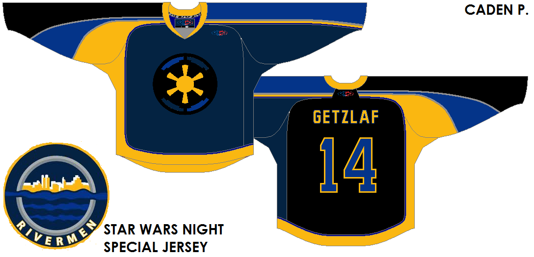
Evansville Rivermen (Star Wars night) {Caden}

Caden has really gone promo with his HCIHL team. Using the most recent Montreal All-Star Game template, he finds a way to keep it up. My biggest issue is that he is issuing a player that is on my team and one that I have franchise tagged. Secondly, this is the prime example of a typical promo gone wrong jersey. That's bad because he doesn't break a trend and it looks atrocious to me. As he continues to lose brownie points, may I make a note that this is a promo that I would never support because the other teams that have done so fail to do it properly. No hard feelings but it's one that's gotta go back to the drawing board.  A 5 outta 10.

Speaking of my team, the Foxes of Skopje, they've had three guys who went on IR on the same day. The last is a co-captain who started the season there. After that, I don't have much to say other than we should have four wins so far and not three. In the mean time enjoy your weekend and happy hockey - a bientot.


-Ricky


*EDIT BY CADEN* I found HCI on the Wayback machine. The site has improved so much since then. to see what the site looked like on September 16th 2013, click here.

Friday, October 25, 2013

Friday. 76! (Caden)


Hello fine readers! It's Caden here. I would like to announce that the NEW Rivermen jersey will be announced at a later date. Also, let us know in the comments what you think about the new template for the site, such as bringing back the top "pages" bar, and the addition of our templates and maps page. We also added a Jersey concept series page and a whole new website for the HCIHL! click the link at the top of the page or go to HCIHL.blogspot.com! I don't have much to say, except go to icethetics.info to check out the new logo the the Flames patented. On to the concepts!

PS. Today I will be trying out William Butala's Yay or Nay review system.

New York Islanders Chris Hengel
This is Chris' first concept on HCI, so let's cut to the cheese!

Yay,
The colo(u)r balance on the away jersey! Minus the numbers
The grey element kept in the 3rd
The tie down collars 
The orange numbers on the black jersey
The filled in yoke on the third jersey

Nay,
First, the presentation. The alternate gets lost because the background is so dark. Try using a light grey back ground.
The spacing of the numbers. The numbers seem too far apart.
While were on the topic of numbers, I think the away numbers should be Blue, and the home numbers be White.
The NOB font. It seems childish. Try using a arial or block font instead.
Using the same template for all 3 jerseys. The point of a third jersey is to be different. Not just a recolo(u)red Home/Away jersey. Check out our templates page for some great options! 

Overall, 
I liked the colo(u)r balance in the jerseys, not as much the numbers. I also loved the yokes on all the jerseys, but aspeicialy the 3rd. That's really all I have to say about the jerseys, so...

Concept Rating, 8/10

Team Turkey (LOL) Jake88
Jake88 brings us a concept for the HJC bottom 10 comp. Go vote for it! And my Isreal one! And Justin's South Africa one!


Yay,
The wordmark
The crest
The striping
The yoke on the home, the shoulder patches on the away
The socks
The pants logo

Nay,
The small NOB
The fake laces. Not Jake but Nike

Overall,
Jake brings us a amazing concept where (for once) I'm not complaining! 

Concept Rating, 9.9/10


Hey guys! Thanks for reading! What do you think of Butala's Review system? It sure makes it easier for me! Tell me what you think in the comments! 

Again, Thanks for reading!!!

Caden

Thursday, September 26, 2013

Post "Hump Day" Blues

What's Up??? I am writing this post because I lovvveee you*! The HCIHL has added Ricky M. (HJC's Friday guy) and Matt McElroy as GMs and Matt will also be the HCIHL "League Advisor!" We might get a new Tuesday writer but that's still in the works! Since Jake and Justin came along and now possibly a new Tuesday writer, my blog writing work has gone down, but my blog Administrative work has gone up! Figuring out what jerseys will go on what post and now having to also keep up with what's sent in, requests for HCIHL expansion teams,and I even had one guy who wanted 5$ a post credited to his PayPal in order to write once every 2 weeks for us! That's why I have decided to promote Jake88 to assistant Admin! Meaning he will have more say in stuff like hiring new writers and such! This is the new writing schedule

S: Justin P.
M: Jake88
T: New Tuesday Writer
W: Justin P.
T: Caden P. (Yes me!)
F: Jake88
S: Caden P.


I have a few concepts for you today so getting started as quick as possible would we great! 


New York (Brooklyn) Islanders Caden P. (me)

I made this Islanders concept for there move to Brooklyn. The basic premise of my design was to recol(u)r everything to give the islanders a new image! I recolo(u)red the logo and kept the Island in the logo but made the colo(u)r similar to the background so it wont be the main focus. (They are in Brooklyn after all!) I also changed the black jersey to incorporate the victory stripes in a big manner. You can't let a dynasty like that go! Maybe for a team like Montreal but the Islanders SUCK!


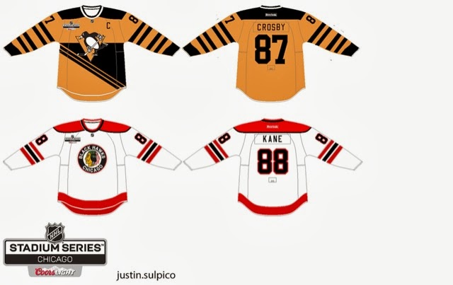
Stadium Series Chicago/Pittsburgh Justin S.


The reason I like this set is because though the are old fashioned, these are completely new jersey designs! I think the era you are trying to capture with the Pens jersey would look better with the robopen logo! The back bottom looks empty but I'm not sure what I would do with that.
The Chicago one is ok, but I would make the hem stripe the same as the arm stripe. The stadium series logo is different and wouldn't have the cores logo on the jerseys. The NHL has a strict no corporate logos on jerseys aside from RBK. 

Concept Rating 9/10


Augsberger Panther Jake88

If only Jake would make North American jerseys... I don't really know much about European jerseys so my comments don't mean much if I judge this from a NHL perspective than I would say that the numbers are too far apart but I don't know if that's acceptable in the DEL which I presume the Panther are still in unless they moved. I like the concept but I can't call it good/bad because I just don't know!

Concept Rating 0/0 (I can't judge something I don't know about. I will research the KHL, DEL, and SlimLeaguea jerseys tomorrow and I will know more)


Thank for reading and I hope you get over these post Humpday blues!


Caden

Wednesday, September 25, 2013

New Canada Jerseys, (Not-so) New Writer

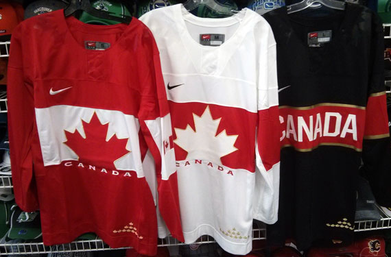
Hi, Everyone! (New) writer Justin here. I'd like to take a minute to post the Team Canada jerseys leaked late yesterday. 

They're really nice, I just don't like the assymetrical sleeves and monotone collars, makes it look empty. I haven't got any instruction from Caden or Jake on what concepts to post so i'll just post some of my own.


Anaheim Ducks Redesign.


 I straightened out the "swoosh" striping on their current jerseys, recoloured them and added duck wings on the shoulders like what the Oregon Ducks football team usually does.


Abbotsford Heat

For the primary jerseys, I took inspiration from the Flames 90s jerseys for the striping. The alternate jersey is basically an edge-ified version of the Atlanta Flames jerseys. Props to Jake for using it as inspiration in his new "Cross-League Classic" series.


New York Stadium Series
The Devils and Rangers jerseys are simply previously worn jerseys. The Islanders jersey is using the dreaded "vintage white" seen in so many outdoor games. The barberpole striping is taken from the Vancouver Canucks Millionaires jersey.


Columbus Blue Jackets (De-edge series) 


This jersey from my currently active Rbk De-edge series has not been featured on HJC yet. So consider this an HCI EXCLUSIVE!!!!! They're just the pre-edge Jackets jerseys with the Star logo plastered on the front.

That concludes this post. Stay tuned for tomorrows post. Have a good day.

-Justin

Saturday, August 31, 2013

Saturday is Today

Well the title is about as normal is it gets, so is today. I would have posted yesterday but I went to my school's first football game, sadly we lost to our rivals 20 to 6, next year. Any way we have three concepts by my Admin Caden, so lets get to them!

Stadium Series (NYR V.S. NYI) (Caden)
Hmmm... Not sure about this one, I'm still not a fan of the side panels and logo found on the Rangers jersey. I do like the blue helmet and lack of vintage white on the Rangers jersey, though. The Islanders jersey isn't that bad, and the logo looks pretty cool, just not as a Stadium Series logo, especially on a team who (minus the fisherman era) has always used a variation of the original logo. One other thing I can't stand is the colored name bar, let that stay in Philly. Concept Rating: 7/10

Team USA (Caden)
Hmmm... Again this one's out there. The side panels look extremely bad, more so on the blue jersey. I dislike the logo, the olympic rings certainly aren't needed. The flag on the shoulders would look good but it's already on the front on the jersey so it's a bit unnecessary. The striping does look good, very simple, a lot better than what got they gave us. One side note Nike makes the Olympic jerseys, not Reebok, and there are Nike templates in Paint Users Paradise. Concept Rating 6.5/10

Stadium Series (LA V.S. ANA) (Caden)
Hmmm... For the third time. I'll start with the LA jersey. I feel as if I am one of the only people who like cut off chest stripes, and this one doesn't look bad with it. The logo looks bad because it is the only thing with silver on it on the jersey. Now to the Ducks jersey, Vintage White to me is a big no-no for Anaheim, and the orange, jade, eggplant, and black color scheme looks horrible. I'd add an eggplant yoke and numbers to it, and the template isn't the best idea for a Stadium Series game. For both jerseys the Boston Strong patch isn't necessary, for teams in California, also the socks are too templatey. Concept Rating 7.4/10

Thanks for reading, and I hope the rest of your day is a good one!