Showing posts with label San Jose Sharks. Show all posts

Tuesday, January 7, 2014

Tuesday. Ah! So close!

For the entire week, the Rivermen/Stags matchup was really close, The Rivermen deactivated high scorer Shane Doan from the IR and we had two straight wins from Marc Fluery and the Pens. Alas, Hamilton beat us by only 11 points. It was so dissapionting as we are now back to .500 and tied with Louisville for 2nd place. I would just like to say that I heard from a sports writer here in Evansville that went to the Winter Classic that it was 10$ for a cup of hot chocolate. I think for that the Michigan Wolverines are not a very good organization when there are 105,000 people there they could make way enough money charging 3! That might not even be true, but I heard that. We have a couple nice concepts for today, so let's not waste time with my ranting. New competition coming soon.


Staidum Series LA (Matt Ware)


The first Matt of the day gives us a orange vs black matchup for staidum series one of 3 (or 4). I like the logos on both jerseys. The color balance is good, but I am concerned about the amount of black on the Anehiem jersey. If a LA player was watching the puck and just saw the bottom of the jersey he could easily mistake him for a player on his own team. Not really many concerns about execution. The striping looks spectacular. 

Concept Rating: Ducks 8/10, Kings 9/10


San Jose Sharks (Matt McElroy)
So Matt McElroy went to the Winter Classic, and got a custom (ugh) Red Wings jersey for Christmas, but I don't envy him at all. If it was a Leafs jersey...

The more grey the less orange in any San Jose concept is the way to go. I like the font and the way the striping is laid out. No front numbers! Yay! I think the pants would look better with a grey stripe near the bottom, like the Isles Staidum Series pants. And the black outline on the green numbers on the away blends. I would have gone with grey numbers with a black outline on both jerseys.

Concept Rating: 9.4/10


It's kinda late, but my parents gave me this (along other things) for Christmas. If you can't see what it is it's a quilt made with a bunch of my Dad's old hockey shirts and sweaters from teams he's worked for.
Just thought I would share. I also got NHL 13 (I stay behind one year to save money) Madden 13, and another controller to go with my new Xbox (360). But this creative hockey themed quilt was the highlight of my Christmas.


Did you like the lineup of concepts? What is your opinion on the Michigan Wolverines charging $10 for a cup of hot chocolate at the winter classic? Would you leave a different review/rating for any of the jerseys? Leave a comment! It's what they're there for.


~Caden


Friday, January 3, 2014

Friday: Should Auld Acquaintance Be Forgot?

With the Winter Classic now behind us until 2015, we have officially opened this season's outdoor games. And then you have the US national teams being announced. I almost forgot about my copy of last season's NHL rules and regulations. It shows amendments n norange and has been a very good reference for jerseys as well. Speaking of almost forgetting things, I have results - results for the Creighton Bluejays competition. The results are as follows:

  1. Alan (6 Pts)
  2. Jake88 (3 Pts)
  3. Justin (2 Pts)
  4. Caden (1 Pt)
  5. Ricky {Me} (0 Pts)

Edmonton Oilers
Submitted by: Ware Creative Design

Here was a good acquisition by the Skopje Lisici a month or two ago in the HCIHL. Speaking of good things, the logos are just that - a little too big, but still very reasonable options. The back numbers and shoulder patches are also a little large. The striping meanwhile, well . . . is an interesting choice, I was thrown off because of their orientation. One uniform mismatches and the other looks more Islanders than Oilers. One thing that would be interesting to see is the Oil drop in chrome - I thought of it while looking at this concept from first glance. Everything else in these looks Edmonton-esque to the appropriate jerseys, so all business is finished. 

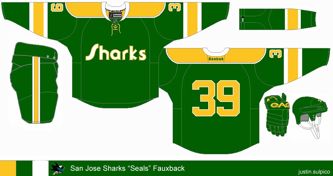
San Jose Sharks
Submitted by: Justin Sulpico

Very innovative, Justin thinks he is the Tampa Bay Rays management. That is to say he is creating "old" for a team that's just the opposite. But since the team has gone through at least one jersey redesign (with or without Reebok) and that the league owns the Seals' branding makes this fall through. While this is simple, I would like to see either Seals' black or blue included as an accent color here. I also would like to see the color of something in the equipment change color - the gloves to yellow, perhaps (and possibly the socks). Seeing as the font is more yellow on white, I would use that for the crest wordmark too, just to keep the unison color on white is almost always better than white on color (for me anyway, this is no exception). That should do for this concept.


In the meantime, I had this picture taken in my brand new hockey sweater! I purchased it yesterday at a local card shop before the holiday specials were over. I managed to save $75 dollars from the store price at US$38.85. I am also close to sealing a Lady Liberty jersey having the only bid as of this sentence with less than 7 hours to go. Notice that most of the time, I go for blank uniforms for one of three reasons: It's cheaper to have them embroidered after purchase than purchasing a pre-embroidered jersey, so I can put my name and number on it, and/or because I like certain jerseys blank considering player movement (it would have to be a retired number, hall of famer, or significant contributor to the team - e.g. a Stanley Cup finalist). I have a friend who owns a jersey customization business, which somewhat attributes to the first reason.

I'm glad I was able to finish my Stadium Series concepts ahead of schedule than I had figured. They were my last overall that I completed in 2013. Now that the Winter Classic is over, my focus has shifted back towards the IIHF U-21s in Malmo, Sweden. Malmo looks like a little bit of Dubai and somewhere in Nova Scotia (places I haven't been) - but very scenic indeed. But I'm actually going to tackle that Nike template for select teams if not all participating teams. I am just waiting for Olympic curling to get underway. What? I've been curling for at least a decade and I'm only turning 22 in two weeks. Maybe I'll use the participating curling countries instead. But either way, it would be interesting. You'll be hearing from me again in seven days.

-Ricky

Monday, December 2, 2013

Monday: Without School is so Much Better!

Yep! Monday is so much better! So you're probably wondering why I don't have school today, right? Well living in the "mountains" of Pennsylvania has some advantages. With all the hillbilly hunters that live around here, and Monday the first day of deer season, we get a day off. Well for all of you that don't have a day off on Monday I can try to make your day better with some concepts.

              INDY FUEL COMP ENTRIES DUE SATURDAY
_________________________________________________________________________________

Phoenix Coyotes 4th Jersey (By Steve M.)
Lets start out with some positives, and there are a lot. The font definitely, surprisingly the lack of outline doesn't look bad and it fits with the jersey. The striping also looks great, and so does the light yoke. A light yoke normally doesn't work, but it looks great here! The a logos are certainly work here. Now here are the bad parts. I don't really like the white in the logo, I'd make that black or sand. The black collar sticks out to me, maybe make it a lace up or put a sand outline on it. Concept Rating 8.2/10

San Jose Sharks 3rd Jersey (Ricky M.)
This is Ricky's impression of how the Sharks should do their third jersey. I would love to see San Jose in an orange (or grey) jersey and this concept demonstrates a in which it really shouldn't be done. Sorry Ricky, I can't say I'm the biggest fan of this concept. I would like it say that there are some good parts of this concept though. I like the striping on the bottom of the jersey, and the logo usage is fine. If you dropped the extended yoke the arm striping would be fine too. The unfavorable parts include the numbers (I can't say the drop shadow works) and the name font looks crowded with all the outlines. Speaking of numbers, the TV numbers are gigantic! The lace up collar would be good, but the outlines should be switched according to the rest of the striping. Keep the normal yoke, and outline it the way the extended yoke and I think the concept will look a lot better. Not horrible, but with some fixes it could be much better. Concept Rating 6.5/10

Sarnia Sting (By Alan John Herbert)
HCI's weekend writer Alan brings us a concept out of his OHL redesign. Putting the honeycomb design on the Sting has been a popular thing to do among concept artists. Touching on the positive parts, the honeycomb works here, and so does the font. Sarnia's normal logos are fine, and I don't have any problems with the equipment. The angler striping would work but, I don't like how the striping wouldn't connect when the player would stand up. I would make it connect ala Mighty Ducks. The other down point is the socks, I think that if you put the honeycomb on them it would be better. Concept Rating 8.5/10


So do you agree with my ratings? Was I too tough on my critiques? Us writers love to know how our ratings could be better. On that note, bye and have a nice day!

Monday, November 25, 2013

Monday: Time machine

Hey guys. Monday's normally a downer, and pretty dreary, but with it being the only full day of school that I have this week it's pretty good. If you think of that one day and a half as a whole week, Hump day should be at about 6th period. Well this long Thanksgiving break should give me time to work on some concepts and it will be nice to do so.

On the exact opposite side of things, my HCIHL team, the Altoona Express, lost by about 40 some points, and it was truly a slow, long week. Here are the scores of week 8 of the HCIHL.

London Sabreswords 152.8 - Altoona Express 113.7
Skopje Lisici 163.4 - Evansville Rivermen 137.8
Louisville Lynx 153.4 - Hamilton Stags 122.1

Well as you can tell in the scores, it was upset week. In every match, the team with the worse record won! Oh, yeah that kinda sucks for me...
In other news the Stags first defeat was a nice thing to watch, with the team with only one win beating the undefeated team. Good job for the Lynx!

_________________________________________________________________________________

Colorado Avalanche (Alan Herbert)
Our first stop on todays timemachine, 2011 where Alan shows us how the team from the Mile High City should look. Their current jerseys are truly an edge mess, with piping wherever it can fit, and quite boring. I like this because it builds off both looks of the franchise the current, and the obviously better pre-edge look. This jersey looks good, but I think I bit more mountain look make "good", "great". Right now I don't like how the smooth yoke transitions into the "choppy" mountain striping. I'd make the whole extended yoke mountainous, myself, but it probably looks fine either way. Also TV number always add to a concept. Concept Rating: 8.3/10

Ottawa Senators (3rd? Stadium Series?) (Brian B.)
First, Caden didn't tell me what type of jersey this was supposed to be, so that info is always helpful on the concept (or e-mail for that matter). 
Now the time machine is stopping in the time when Alfredsson played on the Sens. The jersey is very cluttered, with the chest stripe, and full hem striping, combined with the laurel leaf pattern, and large arm striping. The logo looks very 30's and thats good for a throwback concept, in fact the team (if they were around at the time) probably could have played in sweaters like these. But today has completely different standards than back then, so making the jersey less complicated could go a long way. I'd start with taking the chest stripe out, then as a touch up, add the laurel leaf pattern to the cuffs of the jersey. To really go with a throwback look, put the sweater collar on the jersey. Concept Rating: 7.5/10

San Jose Sharks 4th Jersey (Steve M.)
Steve brings us to the last stop on our time machine ride today, and it's with the Hertl era of San Jose. I'm normally not a fan of bringing grey back into the Sharks colors but a few concepts can get away with it, this being one of them. But this concept does need some fixes. One, add grey trim to the numbers. Two, (and the bigger of the two) make it unique! The Sharks original jerseys were almost the exact same thing as this! With a logo like that, a lot is achievable, maybe if you added gradient striping (in the logo) down the arms. Also, do something with the shoulder area, that also would look nice. Good jersey, just not that original. Concept Rating 7/10

_________________________________________________________________________________

I don't have that much to say to finish out this post. Well other than, Thanks for reading, Bye! 

Oh, also follow us on our Twitter page and as always...


Tuesday, November 12, 2013

Tuesday: 11-12-13

Hello. Keep reading this amazing blog for some concepts. This concludes the short part of this post where I, Jake88, talks about stuff.


Team USA (Caden P.)
Simple much? Ok this is about as simple as it gets. Color in panels on the white, and stripe cuffs and a matching hem stripe. The red yoke is really an ugly feature on the white jersey if you ask me, and the whole design is simple, too simple, not Nike simple, but a different simple. I really dislike the crest (though it does go with the jersey). Not that there aren't any good features on it. I like the striping pattern on the blue jersey (if it was moved up), and the gold medals in the collar are a nice touch. Concept Rating 6/10

*EDIT BY CADEN* I still remain sexy as ever though! You all know that!

San Jose Sharks (Jake88/Me)
What if Nike took over the NHL? I hope that the Sharks would wear something like this. The wave striping fits in with the name and it's angled to stay similar to the last Pre-Edge jerseys. The font is the Arizona Cardinals. 


Bye, Happy Reading.

Thursday, October 10, 2013

Thursday, Jake88 special (Written by Caden)


Today is Jake88 day!!! We have 3 of his jerseys featured today! The Evansville Icemen have a Blue/White Exhibition game 80 miles away in Owensboro tomorrow, so I'm super busy! Being a stickboy and all! I've been given a big honor as a jersey designer but I can't tell you what it is quite yet! I will fill you with developments when I can!


Bridgeport Sound Tigers Jake88


Jake88 made this awesome jersey for the Sound Tigers using an old Islanders template. It's perfect! there is absolutely nothing I would change about it! The striping is perfect! the colo(U)r distribution! Everything's just amazing! this would be an EPIC 3rd for Bridgeport and it's an EASY

Concept Rating 10/10!!!

San Jose Shark(nado)s Jake88


Jake88 brings us a Sharks "fix" and he fixed it! this concept is 1000 times better than what they have and if I owned a NHL team, he would be my head jersey designer! Him and Matt McElroy! I think there is too much orange and I'm not a fan of the names in the yoke! too Nikeish! Except for that a solid concept and I will give a

Concept Rating 9/10

Phoenix Coyotes Jake88

From Great, to Hate! Sorry Jake but I'm not a fan. I really don't like the striping and the way you used sand and black. I've always been a fan of the 2 color jerseys. The logo isn't my favorite either. The jersey would look better with a squared off yoke. The Execution is OFF THE CHARTS though so I will give this jersey

Concept Rating 7.5/10

If you saw my letter to the readers that I wrote yesterday, Cool! if not Go back and read it! When the HCI staff votes on a schedule I or Jake or Justin will let you guys know!!!


Just because I thought this was cool, Pageview breakdown! Also I don't have it count mine or Jake's pageveiws in the stats.

Country Pageviews
United States
2455
Canada
375
Indonesia
95
Serbia
42
Russia
25
Sweden
19
China
17
Germany
9
Denmark
7
United Kingdom
7

Thanks for reading!!!

Caden Patafie!


Tuesday, August 20, 2013

Tuesday: Next Wave

For the people who have yet to see San Jose's new jerseys I have the good's right here.
From Sportslogos.net
I am not a fan of these, the Sharks had one of the best looks in the NHL, all they had to do is get rid of the front number and add the fin as a shoulder patch; but instead we get this. So far the Sharks, Canes, Remparts (QJMHL) Charlottetown Islanders (QJMHL)(good logo though), have all had bad jersey designs, as the Stars got IMO the best look in the NHL, and the Providence Bruins (AHL) dropped the white for a good look. Speaking of a new look, the Sabres 3rd jersey is probably going to suck too. Here's a link to the Sportslogos.net take on the new jerseys.

San Jose Sharks (Jake88[me])
This is how I think that San Jose should have made the "minor changes". The changes I made were the name plate yoke, on the Stars template which is my favorite template. The striping stays the same and so do the numbers. The new alternate is inspired by the pre-edge alt. with the bent arm stripes. I added a hem stripe to complete the jersey, something the new jerseys need. Sometimes I think that Reebok can make the best looks and San Jose was one of the things that cemented that for me, now the trust in Reebok is going away. Give me your opinions on my idea of the perfect Sharks jersey in the comments.

Also pay attention to the HCIHL, I want some more teams in it, and you guys can provide.