Saturday, November 30, 2013

Saturday: Middle of the Island!

What's up, Alan here in doing an all Islanders post, let's get going.

New York Islanders concept [by Steve]
Once again another 4th jersey series by Steve. This jersey maybe plain to some, but it's smart to me! Good move on the using the stripes on both arms, hem. good chose of putting the lighthouse logo, and the team's main logo on the shoulder. The only down point that isn't too much it's the lack of outline on the lighthouse logo, beside that this is an very good Islanders concept one of those I wish they use this for the "Stadium Series." Score: 9/10

New York Islanders concept [Jake88]
 This concept I believe what would look like if the NHL jersey system took over by Nike. Nice idea on making the wave stripes on the arms, and the wave stripe base on the fishstick logo is an good touch. Numbers and nameplate is clean, and straight! Overall: An good Islanders jersey, only in an alternate level. Score: 8/10

New York Islanders concept [by Me]
This was part of an HJC contest called "Make the Fishstick logo look good Competition." I use the wave stripes that was base on my Erie Otters concept, made it 4 stripes for "you know what the 4 stripes means by now," the logo was tricky to do, but pulled off nicely. The colors are blue, orange, navy blue, and white. What do you think? What score you give this?
Well that's today post! Be here tomorrow for my Sunday post, til then later.

Friday, November 29, 2013

Friday: Blog Hopping

"Hello hockey fans, it's Ricky Mazella - the Voice of the Springfield College Pride" . . . well not quite. While what I just wrote was true, that's not what I'm here to talk about. I'm glad to be a part of the HCI family coming over from HJC. It was a privilege, but a better opportunity arose and it led me here, after parting ways by mutual consent. I'm really excited for my first post today! Though the only thing that could make it better is if the Ducks could start winning, as they're in a slump following a great start. Nonetheless, Caden and the gang have done a great job here and hopefully I can continue that strong tradition during my tenure here.

For those of you who aren't familiar of me or my work, I'm 21 (5/6) years old from suburban Buffalo, NY where I'm a fan of the Anaheim Ducks (before I saw any of the movie trilogy) and a fourth year sport management major at Springfield College in MA. I began my graphic design career after stumbling upon HJC (for the second time) and the old Icethetics (then the Tournament of Logos) in February of 2011. I then began my blog, Buffalo Nickel Graphics, on the 5th of May in 2012. My blog covers a variety of sports and templates. These include but aren't limited to curling and Australian football in sports as well as a transportation, dasher boards, and playing surfaces in templates. I encourage you to check those templates out and submit them here on HCI!

Enough about me, let's dig in!

NY Islanders {Caden}

As you can see, this is purely intended for the current contest at HJC to improve the "Gortons/Fishsticks" logo. Mine will be here soon, after it's up on HJC anyway. Pretty good for a paint job, I know. And it's simple. However, the rubric never lies. That's another thing - I hate grading concepts, so I have my own rubric to help me. In this case, it's not what I figured it would be, but that's why it's there. Upon further review, it is a 6 outta 10.

Calgary Flames {Steve Maurer}

Here is what I said when I had to review it on my final HJC post last week:

I feel that this could work with some minor changes. The striping could stay as is but a swap of colors may be an alternative.I'm surprised that the Cal-gary team hasn't done something similar just yet. Use solid red lettering for the NOB and the assistant's "A" as well. Then I'll be happy

What I know: The assistant's "A" was the primary in Atlanta.
What I learned: If using a red outline, larger is better and smaller should be solid in color.
What I want to know: why thin yellow jersey stripes separate the striping.
This one looks pretty good, but I'm on the fence of liking it or not; a 7.5 out of 10.

Nothing has changed in one week in this case.

Evansville Rivermen (Star Wars night) {Caden}

Caden has really gone promo with his HCIHL team. Using the most recent Montreal All-Star Game template, he finds a way to keep it up. My biggest issue is that he is issuing a player that is on my team and one that I have franchise tagged. Secondly, this is the prime example of a typical promo gone wrong jersey. That's bad because he doesn't break a trend and it looks atrocious to me. As he continues to lose brownie points, may I make a note that this is a promo that I would never support because the other teams that have done so fail to do it properly. No hard feelings but it's one that's gotta go back to the drawing board.  A 5 outta 10.

Speaking of my team, the Foxes of Skopje, they've had three guys who went on IR on the same day. The last is a co-captain who started the season there. After that, I don't have much to say other than we should have four wins so far and not three. In the mean time enjoy your weekend and happy hockey - a bientot.


-Ricky


*EDIT BY CADEN* I found HCI on the Wayback machine. The site has improved so much since then. to see what the site looked like on September 16th 2013, click here.

Thursday, November 28, 2013

Thursday: Thanksgiving in the US

So today's Thanksgiving in the US, and well I'm thankful for...

My family
Friends
Hockey
Concepts
Ideas

See what I did there.

Anyway later today I'm going to feast on some turkey, and I'm already wanting it now! Check our Twitter page for our weekly bonus concept featured on Sunday. As Caden told you yesterday, we have picked up a new writer, Ricky Mazella, and his first post will be tomorrow. Since Caden didn't promote it on the new Questions and Answers page, I suggest you check it out. It has answers to questions from our writers and it tells you a bit more about us. On to the concepts!

_________________________________________________________________________________

Ottawa 67's (By Alan John Herbert)
These jerseys are quite similar to the currents but certainly not identical. Alan updates the logo along with adding a black shoulder yoke to the red jersey. In my opinion, both of those moves improve upon the currents. The white jersey, though is a lateral move though. I think I might prefer the current extended yoke a bit more, but both are fine. Concept Rating: 8/10

Evansville Thunder Youth Ice Hockey Team (By Caden P.)
This is Caden's old hockey team, and have one of the better original logos that I've seen in Junior hockey (my Jets have the best! :woot:). But anyway, the black jersey looks good, the white stripes make the purple pop, but the white jersey doesn't. The black mixes in with the purple so I'd put a white stripe in between them. Also I'd add a grey stripe in the middle of the stripe. Concept Rating 7.6/10

Toronto Maple Leafs 4th Jersey (By Steve M.)
The Maple Leafs had uniforms like this from the 1970's until 1992, but Steve shows us that they can still work. The originality comment that I had on Steve's Sharks concept applies here too. I do like the return of the name font though. Suggestion: Try to incorperate different eras of Toronto jerseys in this to make it better. It's another good jersey, but yet again, the lack of originality hurts the grade. Concept Rating: 6.5/10

Anaheim Ducks Stadium Series Prediction Concept (Jake88/Me)
I made this as I was writing this post. It uses elements from the "hockey bear" t-shirt design and the recently released Islanders jersey. Also note the semi-elongated numbers and helmet stripes. If it is anything close to the design I'll be suprised.

_________________________________________________________________________________

I hope you can agree with the reviews that I was giving. 

In other news my blog had it's first post since September so check it out. Also the Islanders unveiled their Stadium Series jersey which looks sweet, if you ask me. If the Pens design is close to looking as good as that, sign me up for one! Thank you for reading and enjoy your Thanksgiving diner (if you live in the US)!

Wednesday, November 27, 2013

Wednasday. Thanksgiving Eve.

Hello concept fans! Caden here! How fares Thanksgiving eve? Yesterday I went to the homeless shelter and handed out uncooked thanksgiving meals to 3,500 familys to cook on Thanksgiving. Not me by myself of course, but it made me realize how blessed I am... If you guys haven't heard we've picked up Ricky Mazella "off waivers" from HJC. He's a really talented writer and I'm happy to have him on board with the rest of us. You can look at his blog by clicking here. I will stop blabbing my mouth and get to what you guys came to see. The Concepts! 


Utica Comets Jake88

I would first like to say, This is a million times better than Utica's current set of jerseys. I Like the font and the way you did the striping. With the thin blue one in the middle and all. I do wonder what the numbers would look like with a small green dropshadow? I'm not really a fan of the wordmark on the helmet or the non existence of hem stripes, but the "hanger effect" is a nice touch.

What I would do: Add hem stripes that are the same as the arm stripes, Put the puck/comet thingy on the helmet instead of the wordmark, and Add a green outline or dropshadow to the numbers.


This jersey is so much better than the one that came from Uranus! Still a couple changes to bump up the score any. A 8.2/10


Fishsticks Contest Entry Dylan Wonka (New York Islanders)

I know this is an entry for a contest, where you have to use the "fishsticks" logo, so that won't effect my review of the jersey. this concept is pretty similar to mine, so there isn't much I dislike. I like the teal cuffs and yoke stripes. There is also the perfect amount of orange used too. I don't like that the logo is the only place where white is used. I also don't really like the font.

What I would do: Change the font to a standard block one, and switch the silver/grey (Not sure which) to white. Other than that you're right on!


This one's a catch! A 9.1/10


The ECHL is getting a team in Indy for next season. This is the logo from their website. I made a concept that Jake will be reviewing at some time. Not sure how many jerseys are in line for him! It's a short ride from EVV so I'm sure I will be making some games to cheer on the Icemen. 


I hope you all have a happy Thanksgiving! And as always, YOU ARE WELCOME FOR THE GREAT CONCEPTS Thanks for reading!


Tuesday, November 26, 2013

Tuesday.

Hello concept fans! It's your favorite writer Caden here with some special news! First of all I'm pretty bummed out because my Icemen "scored" the tying goal .5 seconds AFTER the 3rd period ended. Needless to day it was disallowed. More importantly if you don't following the HCI twitter (@HCIblog) you should! Each week we will be posting a never before seen bonus concept on twitter, so you should check it out like a hot chick in a bikini. I've always wanted to say that! Alright, nothing much more to say, other than check out our twitter page (@HCIblog) Thanks in advance for following!


Boston Bruins Steve M.
This is part of Steve's 4th jersey series, which will soon be added to our jersey series page. I really like yellow 3rds (or 4ths in this case) because they can be used on the road as well. I like the striping and yoke a lot too! I'm not really a fan of the logo/letter thingy. Even though it's classic, it's too collegey. The B look nice on the shoulders though. You might also want to change the shade of black in the #s to the same as the striping.

I like the jersey, but couldn't "bear" the logo. A 7/10


Winnipeg Jets Brian B.
Wow! I am a sucker for double blue designs and this is no different! The color balance is perfect on the away, the home could use a smige more white. I like the chest stripes. I like the yokes. I like everything! EXCEPT the # font. The stencil font for a military themed jersey is something they would do in the minor leagues. I would also ditch the tie down collar because of the chest stripe.

I love the double blue, but the numbers can "fly by!" A 8.9/10


Thought I'd make you smile today! If you were wondering why I didn't get thanksgiving break, well it's one of the benefits of being homeschooled! :'(


*UPDATE* Former HJC Friday writer Ricky Mazella has joined our team! He will write for HCI on Friday starting Friday Nov. 29th. Check his blog out here. Just from me I'm honored to have an HJC writer on our team. Even though he doesn't write for them any more, "He's Played in the Big Leagues!" So to speak.


And as always, Thanks for reading.


-Caden

Monday, November 25, 2013

Monday: Time machine

Hey guys. Monday's normally a downer, and pretty dreary, but with it being the only full day of school that I have this week it's pretty good. If you think of that one day and a half as a whole week, Hump day should be at about 6th period. Well this long Thanksgiving break should give me time to work on some concepts and it will be nice to do so.

On the exact opposite side of things, my HCIHL team, the Altoona Express, lost by about 40 some points, and it was truly a slow, long week. Here are the scores of week 8 of the HCIHL.

London Sabreswords 152.8 - Altoona Express 113.7
Skopje Lisici 163.4 - Evansville Rivermen 137.8
Louisville Lynx 153.4 - Hamilton Stags 122.1

Well as you can tell in the scores, it was upset week. In every match, the team with the worse record won! Oh, yeah that kinda sucks for me...
In other news the Stags first defeat was a nice thing to watch, with the team with only one win beating the undefeated team. Good job for the Lynx!

_________________________________________________________________________________

Colorado Avalanche (Alan Herbert)
Our first stop on todays timemachine, 2011 where Alan shows us how the team from the Mile High City should look. Their current jerseys are truly an edge mess, with piping wherever it can fit, and quite boring. I like this because it builds off both looks of the franchise the current, and the obviously better pre-edge look. This jersey looks good, but I think I bit more mountain look make "good", "great". Right now I don't like how the smooth yoke transitions into the "choppy" mountain striping. I'd make the whole extended yoke mountainous, myself, but it probably looks fine either way. Also TV number always add to a concept. Concept Rating: 8.3/10

Ottawa Senators (3rd? Stadium Series?) (Brian B.)
First, Caden didn't tell me what type of jersey this was supposed to be, so that info is always helpful on the concept (or e-mail for that matter). 
Now the time machine is stopping in the time when Alfredsson played on the Sens. The jersey is very cluttered, with the chest stripe, and full hem striping, combined with the laurel leaf pattern, and large arm striping. The logo looks very 30's and thats good for a throwback concept, in fact the team (if they were around at the time) probably could have played in sweaters like these. But today has completely different standards than back then, so making the jersey less complicated could go a long way. I'd start with taking the chest stripe out, then as a touch up, add the laurel leaf pattern to the cuffs of the jersey. To really go with a throwback look, put the sweater collar on the jersey. Concept Rating: 7.5/10

San Jose Sharks 4th Jersey (Steve M.)
Steve brings us to the last stop on our time machine ride today, and it's with the Hertl era of San Jose. I'm normally not a fan of bringing grey back into the Sharks colors but a few concepts can get away with it, this being one of them. But this concept does need some fixes. One, add grey trim to the numbers. Two, (and the bigger of the two) make it unique! The Sharks original jerseys were almost the exact same thing as this! With a logo like that, a lot is achievable, maybe if you added gradient striping (in the logo) down the arms. Also, do something with the shoulder area, that also would look nice. Good jersey, just not that original. Concept Rating 7/10

_________________________________________________________________________________

I don't have that much to say to finish out this post. Well other than, Thanks for reading, Bye! 

Oh, also follow us on our Twitter page and as always...


Sunday, November 24, 2013

Sunday: Lucky you, unlucky me

Hi everyone, as the title said sadly I have to work tonight, but that won't stop me from posting some more concepts, 2 concepts from 1 concept artist and 1 from me that was made in 2011, so let's get going.

Minnesota Wild Concept (by Steve)
Now normally I hate wheat color jerseys, but this one I'm O.k. with it! Nice two stripes on both the arms, and hem. The yoke would bad but with red trim on it is a good touch. Finally the numbers modern but fits this theme to me. The down point is the numbers and nameplate is red instead of green, and the collar tag is yellow that I felt it didn't match the jersey. Overall: Good jersey, just change the color on the collar, the nameplate, and vise virsa the numbers, and it's good to go. Score: 7.5/10

 Colorado Avalanche Concept (by Steve)
 Once again Steve gives us another 4th jersey series with the Aves. The jersey is good but it needs some more work. The stripes should be like the hem, an mountain design with an little more thickness, add steel blue trim around the yokes to match the stripes, and the "C" look too plain to me, with some trim on it like the numbers would give it some life to it. Overall: Execution is close, but fix these errors, and it's a winner! Score: 7.5/10

Chatham Maroons GOJHL Jr.B Concept (by Me)
This my local team in my hometown of Chatham, Ontario. The home and road jersey was an modification to their old set they wore before the change to there new look a year later. the alternate was base on the teams glory days where they won 4 western conferences titles in a row including one OHA Jr.B Sutherland Cup title in 1999. Here's what my team is wearing now. What do you think of this concept leave an comment about it.

Well this ends my 3 days of craziness, hope I wasn't too harsh on some of these concepts? Be here tomorrow for your regular postings, til then later.

Saturday, November 23, 2013

Saturday: Day 2: Seeing red!

Hi folks is Saturday you know that means? "More Concepts!"

NHL All-Stars concept (by Brian B.)
An modern form of an classic set, and an 90s set. This one could be a good set. He got the arm stripe right, the choosing of the collar was O.K. Using the Preds numbers, and nameplate is an good move. Modern "NHL" crest and stars with trim on the front gave that classy feel, with modern touch to it. The down point is the hem, and the small numbers down front corner of the hem. My suggestion is remove the small numbers, thin out the hem, and give it the same treatment as the arm stripes. Score: 8/10

Carolina Hurricanes Concept (by Steve)
Another NHL 4th jersey series by Steve, today it's the Carolina Hurricanes. Everything about this jersey is right on the money. The only thing I want to add on this concept is add the hurricane flags on the hems, and "Winner!" Score: 9/10

HC Slavia Praha concept (by Jake88)
This one is my cup of tea. Their current set was plain, but this one give some live to it, sure it just stripes, and piping but good enough spaces to put ads on them. The main logo is beautiful and deserve to be on the front without replaced with ads. The Dallas Stars numbers is an good touch too. Score: 8.5/10

Well that's Saturday. Be here tomorrow for day 3 of my crazy weekend, and remember send in your concepts in. Til then later.

Friday, November 22, 2013

Friday: The Aftermath

Hi everybody Alan here with part 1 of my crazy weekend it'll be busy for me. (Depends on what's going on from my work.) But that doesn't stop me from posting some concepts here on HCI, so let's not waste time and get going.

Helsignin Jokerit concept (by Jake88)
With words now that next year this team will join the KHL, and what a better way then an concept made by Jake for this team. This concept is simple yet fitting. Two tone red checkerboard on the arms, hem, inside the collar, pants, and even on the socks, lastly keeping the sleeves and hem at same colors for both dark, and white. very clever if I say so myself. Keeping the red numbers on both jerseys was risky but pulled off nicely. Overall: Simple and smart. Score: 9/10

Team Slovakia concept (by Dylan W.)
The Slovaks new set was clever, but this one is good, but not great. Work marks on the front hem area and the cross on the arms was O.K. The side penal, and stripes on wrist is not my cup of tea, and the choosing of fonts for the numbers not an big fan of. My suggestion: Replace the side panels with hem stripes, move the wrist stripes up close to the cross, and lastly change the numbers with an different fonts. Overall: Not the best Team Slovakia Concept to my taste. Score: 6.5/10

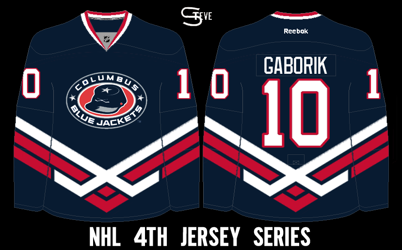
Columbus Blue Jackets concept (by Steve)
Nice idea of the sicks stripes on the arms, and hem that felt connect nicely done. Standard block for the numbers, and nameplate is an good move. Execution errors is the stripes needs more white on it, and the red on the main logo does not match the red on the jersey. Overall: Not bad 4th jersey, but fix these errors and we got an winner. Score: 7/10

Well that's Friday post, here's an Music Video about Friday

Don't like it? Well there will be more of this video, unless you sent in more of your concepts in and I won't be able to put this video up, call it "More Awesomeness, Less Lameness!"

See you all tomorrow, til then, later.

Thursday, November 21, 2013

Yadsruht

Hello concept fans! Caden here for a 2nd consecutive day. The HCIHL will release some big news in the coming time sooo... YEAH. Really not much to talk about EXCEPT, This is a leak that hasn't been put on Icethetics OR HJC so THIS IS THE FIRST CONCEPT SITE TO REPORT THIS! The Swiss have leaked their Sochi jerseys so I will give you a look at them.


Yay,
The chest stripe on the white (With 2 arm bands!) 
The corner logo
The "Suisse" on the arms

Nay,
The black pants
The fact the the red jersey has NO striping at all
The fake laces.

Overall I like these jerseys. They keep the extras to a minimum. The red jerseys is too simple but that could be easily fixed

Jersey Rating
White 9/10
Red 7/10
Overall 8/10


Calgary Flames 3rd Brian B.
This is Brian's first concept on HCI and right off the bat I like it! It is outside the box like a 3rd jersey should be. Doesn't have that wordmark, and features in its place that "Calgary Fields" logo. I don't have any complaints with the jersey design, but I would add a pants stripe or logo. Also, why not have the sloping stripes on the socks like you have on the jersey? I really like the design of the jersey and this is what Calgary should have done. If I'm ever the GM of an NHL team, I will read Icethetics and HJC before we design our jerseys! 

For a first on HCI, a 9/10!


Do you think my review of Brian's jersey was fair? Do you like the Switzerland jerseys WHICH WE REPORTED ON FIRST? Start a convo in the comments! 

And in the words of Vsauce, And as always. Thanks for watching reading!

Caden.

Wednesday, November 20, 2013

WED. 102 and counting

Yo! Caden here. My food drive was a huge success! We collected 1,313 pounds of food for the Tri-State Food Bank and had a undisclosed amount of monetary donations. Anyway. It went great! Before the concepts I'm going to give you guys the "1/3 of the season is over playoff predictions" bracket. If you guys want to submit a bracket it will be put on a post as soon as possible. You can check HCIHL scores here

Let's get to some concepts!

TEAM RUSSIA Dylan Wonka
So, Wonka brings us a concept on HCI which is a nice refresh from their actual set. He keeps the shoulder "wings" but they are sublimated. He also has some pattern near the bottom of the arms/hem that is sublimated. Everything is really nice, fresh BUT. I don't like the font. A block font wouldn't work, neither would a pointy one like the Sabreswords jerseys. This one looks a little weird. I'm not sure what it is. One more thing. You might want to lose the "necklace" around the collar, and just make it blue.

Mahilov! A 9.001/10!

(Russian Translation)
Так, Вонка приносит нам концепцию HCI, которая является хорошим обновления от их фактического набора. Он держит плечо "Крыльям", но они сублимированные. Он также имеет некоторые картины вблизи нижней части руки / кромка что сублимируется. Все действительно хорошая, свежая, но. Мне не нравится шрифт.Блок шрифта не хочет трудиться, тот будет одним заостренным как Sabreswords майки. Это выглядит слишком. Если вы понимаете, что я имею в виду. слишком современно. И еще один момент. Вы можете потерять «ожерелье» вокруг воротника, а просто сделать его синим.

Mahilov!9.001/10!


ALTOONA EXPRESS 3RD Jake88
Jake88 gives us a 3rd jersey for the Altoona Express of the "World Famous" HCIHL

Yay,
The extended yoke
The logo
The Calgary 3rdish hem stripe

Nay,
The font
The piping
The wavy arm stripes

Overall,
I like the concept. Too bad the 3rd jersey program will be discontinued for next season. The logo works well.

You can't get tied to the tracks with this jersey! A 8/10

Thanks for reading! What do you think of my HCIHL playoff predictions? Tell me in the comments. I love having conversations sparked amongst our readers in the comments!


Tuesday, November 19, 2013

Tuesday: Concept 101

See what I did in the title... No... Ok...

Recovering from that awkward moment, concepts?

Team Germany (Dylan Wonka)
Congrats to Mr. Wonka on getting his first concept on HCI. His work is some of the best on HJC and we are happy to have his concepts here, too. 

Review time! White jersey: perfect, don't change a thing. The flag striping looks good and so does the coat of arms (Bundesadler). Now the dark is a bit of a change. The sublimated yoke on the white becomes black alternating stripes and the jersey is almost completely free of any red or white. I can see how it would fit in with the theme of the Olympic jerseys, but yellow and black times classic Germany, doesn't work for me. In my opinion, their 2010 Olympic jerseys looked great, and black sublimation looked good. Concept Rating: 8/10, but this inspired my to make a dark jersey fix that I will post later tonight or tomorrow. 

Buffalo Sabres Concept Fix (Caden P.)
After reading my comments from yesterdays 100th post, Caden made this fix of his original concept. I like the return of pure blue and yellow (no grey or white other than in the logo) but there are a few things holding this concept back. First, I don't know why the Nike logos are sublimated in that way, and then there are the yokes. The phantom yoke is bugging me to death on the blue and on the white the yoke just looks wierd. The concept needs numbers to get a higher score with me, but as it is now a 7.5/10 is the score. 

So thanks for reading and if you haven't go check out the 100th post from yesterday!


*EDIT BY CADEN*

We gave the twitter page a slight makeover. So if you don't follow us you can here!

Thanks for reading! (and following!)

Monday, November 18, 2013

100! 100! Ohhhhh 100! IOO


*Does little dance around room* Caden here. Whooo! we finally made it! 100 posts going from a site where I was the only writer to a 3 writer site. A big thanks to Matt McElroy for helping me with the redesign of the site. Thanks to Jake88, Alan John Herbert, and Justin Sulpico for writing for the site. Today we will have all 3 writers write about 3 different concepts, in a 3 part extravaganza. Since my intro is already done. I will go first.


Dallas Stars Alan John Herbert

Alan brings us a Dallas concept which I love! Just change the font to something a little less cornery (CORNERy. NOT CORNy) and remove the yoke stripes. I also like the color balance on both jerseys with the hem and arm stripes. A good concept with lots of potential. The stars point to a 9/10 from me.

PS. you also might want to change the color layout on the gloves too.


Hamburg Freezers Jake88

Yay;
The double blue color scheme
The Blue arms on the white jersey
That sexy pants stripe!
The socks

Nay;
The faux sash
The blue helmet with the white jersey
The tie down collar (The jersey looks modern and sleek. The tie down collar is more classic.)

This jersey left me frozen. But that hawtt pants stripe thawed me out. An 8/10.


Finland Olympic Hockey Team Sochi 2014 Caden (Me)

I made this Concept based off the jerseys Nike released recently. The only changes I made were

Darkening the blue
Adding a yokes on the jerseys
Removing the flag striping on the blue
Adding red accents

Let me know what you think in the comments!

The post isn't done yet! Jake and Alan still have to write!

Keep reading!


Hey, Hey, Hey everyone! Alan here in doing my part of the 100th post. Let's get going then.

Donask Donbass concept (by Jake)
Pure Brilliant concept by Jake here, the mountain design on the hem, good arm stripes, nice choice of fonts, using yokes is an nice touch. Overall: Best concept made by Jake I've ever seen. Score: 10/10

Detroit Red Wings concept (by Caden)
If the NHL decide to go Nike this one they should do. The white jersey may have an large logo, but adding an arm stripe, and yoke to make up for it. The dark jersey has an not a very big logo, but big enough to go across the jersey, stripe on the hem, and stripes on the wrists. I recommend adding arm stripes on the dark jersey and you're good. Score: 7.5/10

Windsor Spitfires OHL Concept (by me)
I'll let you all read the details my concept here. I just made their blue as the main color, and use the team's old logo and add the team's current word mark on it.

Well that's my post for 100, Jake will finish the rest. Til then later.

Picking up where Alan let off, I will run the final trek of the 9 concept race. I just want to say, I think I joined writing for this blog on it's 8th post or at least in area, and I've stuck with it ever since. On to my concepts!

Milwaukee Admirals (Alan Herbert)
Alan impresses us with this great Milwaukee Admirals concept from HJC's competition. I like striping, simple and effective, in other words, it works. Although I have never been a fan of Milwaukee's branding, this logo works quite well. There are a few changes I'd make though. The light blue helmet isn't working for me, I'd make it black. The number font works (and I'd like to know what it is) but I'd add an extra outline to look more like the striping. Other than that, nice concept and a 8.5/10.

Buffalo Sabres (Caden Patafie)
 Well here's one for you,  courtesy of our great leader, Caden. This is what he thinks like Buffalo would look like in the Nike Swift template. The grey jersey is a good idea and looks nice with the color scheme. About the colors though, I don't think a lot of Buffalo fans would want this as their full time jersey (not that Nike is exactly doing what people want anyway). I like the grey yoke on the black jersey and the inverted colors, it's a risky move that I might not have done, but it looks nice. On the third I'd put the original striping on it rather than the plain striping. Concept Rating: 8.3/10

Milwaukee Admirals (Jake88/Me)
My turn! This was my entry into HJC competition. I already said that I don't like Milwaukee's current branding so I used a older logo. I based the striping off of that logo, too. Since the "line" (I don't know what else to call it) is a big part of the Admiral's branding I put it on the numbers, like the big club in Nashville's guitar strings, and as a collar effect. I like it and I hope you do too!

Well I can't believe that it's been this long. The blog started in early August and I've been helping pretty much the whole time. To tell the truth, the only reason I joined this blog, is because of our newest writer. Yeah, Alan was the reason the blog is the way it is today. When he submitted a concept to me new blog, I felt I should do the same for another blog, to pass the favor along. After submitting a few concepts to Caden, he asked me to write on Friday of that week. Soon, Friday turned into every other day and HCI truly began.

As always thanks for reading. It's really nice to have a increasing reading population and I hope that someday we turn into a HJC or an Icethetics. Goodbye, from all of us at HCI! 

Sunday, November 17, 2013

Sunday. 1 concept. Kinda late too.

Hey guys! I'm glad you're reading the 99th post in HCI history. It's short but sweet. I've been busy working on the 9 concept, 3 writer post for tomorrow. I can't believe it will have been 100 posts!


Evansville Icemen Caden Patafie

Other than my Nike NHL series. This is my first concept where I applied the striping to a blank template, instead of using a Paint Users Paradise template and just changing the colors and applying logos. I know to all you experienced jersey designers it doesn't mean much but I'm pretty proud of it. Considering I use Microsoft paint for my concepts. You can judge the concept in the comments. It's pretty self explanatory.

Thanks for reading! And come back tomorrow for the 100th post!