Showing posts with label Buffalo Sabres. Show all posts

Saturday, April 12, 2014

Saturday: Ying and Yang

Hi everyone, Alan here for another Saturday post here on HCI. Did you all miss me? I do! Today no concept, but that doesn't mean I can do some reviews, here are two alternates that I will review them, one from the WHL, the other from the NHL, one that is good, and the other that is ugly. Let's get to it!

Buffalo Sabres Alternate Jersey
 During the team's 40th Anniversary season they had that to me could have been one of the best alternate jersey the team ever wore, until after the 2011-12 season the higher ups decide to ditch it, and bring in a new alternate. So let me get this straight, we went from a good alternate, to this horrible alternate. When I saw the first image that is yellow, I thought it's going to be all yellow jersey, then the logo, at that time I thought it's going to be a good alternate jersey just like the team last alternate. But comes some more images until the leak and believe me this was a disaster of a jersey. First of all the idea of cape style could of work but with both numbers, and nameplate fonts ruins it for me. Arm stripes are terrible, nuff said. I see some white on the jersey, but I don't feel it live up what it suppose to. The collar is O.K. but could of done better. Lastly the captain, and alternate captain with two swords could be the only thing that is cool, but on this it's bad.
So overall I hope the Sabres put this jersey out of it misery.
   My Recommendation: Buy it at a thrift store!


Calgary Hitmen Alternate Jersey
 This jersey is base on the team's first ever set! I got to say despite there is pink on this jersey, but the pink color is well tame, it's like they added to give it an eye popper effect, and it work pretty good. The arms is good, nice use of the flame detail on it. The hem is plain but simply put together. The colors beside the pink the grey, and black work together very well. I like how they use the team's first logo as a shoulder patch, followed by the team's anniversary patch. The only two things I got with it's the TV numbers being black intend of white, and second the fonts now I know it's good and all, but I felt like they didn't need it. If they change the fonts to a standard block that is white with pink trim around it on both the back, and on the sleeves, make the flame stripe in the arms go a little higher.
Overall best alternate jersey the team got, and who knows maybe we can see these as the team's main dark jersey set intend of the team's current dark jersey.
My Recommendation: Buy it at full price, it's well worth it!


Well that's my reviews on two alternate jerseys, I know I'm little late in posting this, but well worth it. Until then later.

Friday, January 3, 2014

Friday: Should Auld Acquaintance Be Forgot?

With the Winter Classic now behind us until 2015, we have officially opened this season's outdoor games. And then you have the US national teams being announced. I almost forgot about my copy of last season's NHL rules and regulations. It shows amendments n norange and has been a very good reference for jerseys as well. Speaking of almost forgetting things, I have results - results for the Creighton Bluejays competition. The results are as follows:

  1. Alan (6 Pts)
  2. Jake88 (3 Pts)
  3. Justin (2 Pts)
  4. Caden (1 Pt)
  5. Ricky {Me} (0 Pts)

Edmonton Oilers
Submitted by: Ware Creative Design

Here was a good acquisition by the Skopje Lisici a month or two ago in the HCIHL. Speaking of good things, the logos are just that - a little too big, but still very reasonable options. The back numbers and shoulder patches are also a little large. The striping meanwhile, well . . . is an interesting choice, I was thrown off because of their orientation. One uniform mismatches and the other looks more Islanders than Oilers. One thing that would be interesting to see is the Oil drop in chrome - I thought of it while looking at this concept from first glance. Everything else in these looks Edmonton-esque to the appropriate jerseys, so all business is finished. 

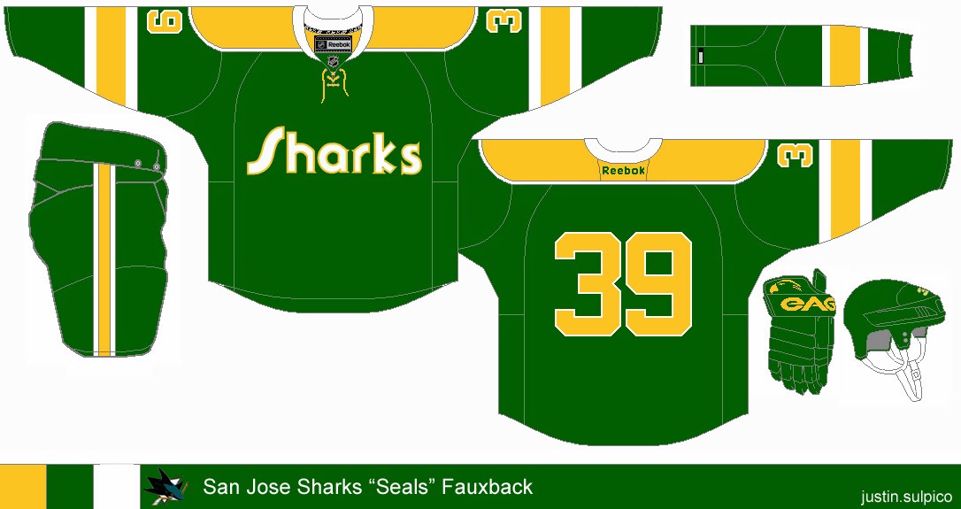
San Jose Sharks
Submitted by: Justin Sulpico

Very innovative, Justin thinks he is the Tampa Bay Rays management. That is to say he is creating "old" for a team that's just the opposite. But since the team has gone through at least one jersey redesign (with or without Reebok) and that the league owns the Seals' branding makes this fall through. While this is simple, I would like to see either Seals' black or blue included as an accent color here. I also would like to see the color of something in the equipment change color - the gloves to yellow, perhaps (and possibly the socks). Seeing as the font is more yellow on white, I would use that for the crest wordmark too, just to keep the unison color on white is almost always better than white on color (for me anyway, this is no exception). That should do for this concept.


In the meantime, I had this picture taken in my brand new hockey sweater! I purchased it yesterday at a local card shop before the holiday specials were over. I managed to save $75 dollars from the store price at US$38.85. I am also close to sealing a Lady Liberty jersey having the only bid as of this sentence with less than 7 hours to go. Notice that most of the time, I go for blank uniforms for one of three reasons: It's cheaper to have them embroidered after purchase than purchasing a pre-embroidered jersey, so I can put my name and number on it, and/or because I like certain jerseys blank considering player movement (it would have to be a retired number, hall of famer, or significant contributor to the team - e.g. a Stanley Cup finalist). I have a friend who owns a jersey customization business, which somewhat attributes to the first reason.

I'm glad I was able to finish my Stadium Series concepts ahead of schedule than I had figured. They were my last overall that I completed in 2013. Now that the Winter Classic is over, my focus has shifted back towards the IIHF U-21s in Malmo, Sweden. Malmo looks like a little bit of Dubai and somewhere in Nova Scotia (places I haven't been) - but very scenic indeed. But I'm actually going to tackle that Nike template for select teams if not all participating teams. I am just waiting for Olympic curling to get underway. What? I've been curling for at least a decade and I'm only turning 22 in two weeks. Maybe I'll use the participating curling countries instead. But either way, it would be interesting. You'll be hearing from me again in seven days.

-Ricky

Wednesday, December 18, 2013

Wednesday: Nothing Special

Welcome to a regular HCI post! No College Classic stuff, no HCIHL scores, and no contest winners to announce. Sounds fun right? But you can be the next contest winner by submitting an entry into the Creighton Bluejays comp.! Now that's fun!

Also I suggest you check out the new HCIHL website. You can click here, or to get to it easier click on the HCIHL tab. We've been posting a lot of news lately so I suggest you read some of it. But enough about that, on to the concepts!

 Creighton Bluejays Comp. Entries Due Saturday 

By Caden P.
By Justin S.
_________________________________________________________________________________

Dallas Stars 3rd (By Jeremy R.) 
Jeremy starts us out with an "unmarked concept", but seriously putting your name on your concept is really important. Everyday *thousands of concepts are stolen other concept artists.
*Number may be exaggerated just a little... 

Anyway, I can't say I truly like the concept that much. I see where Jeremy is coming from, with the arm striping from the white jersey, and hem from the green. But I really don't like the rest. The green numbers would be impossible to see from a distance, same with the name. Make those white, with a green outline. Also I don't prefer the green pit stains or piping. The way I'd fix this is put the hem striping as the arm striping, take out the piping/pit stains, and fix the number situation. As an execution errors go,the T.V. numbers are too small, and the black in the logo is different from the black on the jersey. Concept Rating 6.4/10 Not bad, just not for me.

Buffalo Sabres  (By Matt Mc.)
Matt provides us with a nice Sabres concept that doesn't fall out of favor with me. The striping is new and interesting, but the white part doesn't show up well on the yellow jersey, I'd find a way to fix that. The number font doesn't really fit the rest of the jersey if you ask me, but isn't horrible. The square yoke, though something Reebok would do, isn't something I prefer, rounded would fit. Though Matt's whole series he's been using dark helmets for white jerseys, which I don't mind here, but I thought I'd point it out. Concept Rating 8.2/10 Make those small changes and a 9/10 is in your future.


Pittsburgh Penguins Matching Stadium Series Jersey (By Brian B.)
Brian gives us a jersey to match the one the Pens just came out with. It fixes all the Stadium Series problems such as the chrome logo, weird TV numbers, and elongated back numbers. I didn't include the hem in there because I personally don't mind the hem, and I think that you should have it here too. either that or curve the stripe to get it to follow the hem like the Stadium Series jerseys. The only other problem that I have here is the collar insert, they keep it gold for a reason (in reference to Pittsburgh's golden triangle [also seen in the logo]). Concept Rating 8.5/10 I'd love to see my Pens wear both of those jerseys full time (minus the Chrome logo, ect...), but with those small fixes, I'd have one in my closet pretty fast!

_________________________________________________________________________________

Did you like to today's 3 concepts? Do you wish there was four? You can make four happen by sending a concept in! It's quick and easy! So get to your email provider right now and send your concept to HockeyConceptIdeas@gmail.com. I won't let you read anymore of this post because I know how important it is to send in those concepts, so bye and come back soon!

Tuesday, November 19, 2013

Tuesday: Concept 101

See what I did in the title... No... Ok...

Recovering from that awkward moment, concepts?

Team Germany (Dylan Wonka)
Congrats to Mr. Wonka on getting his first concept on HCI. His work is some of the best on HJC and we are happy to have his concepts here, too. 

Review time! White jersey: perfect, don't change a thing. The flag striping looks good and so does the coat of arms (Bundesadler). Now the dark is a bit of a change. The sublimated yoke on the white becomes black alternating stripes and the jersey is almost completely free of any red or white. I can see how it would fit in with the theme of the Olympic jerseys, but yellow and black times classic Germany, doesn't work for me. In my opinion, their 2010 Olympic jerseys looked great, and black sublimation looked good. Concept Rating: 8/10, but this inspired my to make a dark jersey fix that I will post later tonight or tomorrow. 

Buffalo Sabres Concept Fix (Caden P.)
After reading my comments from yesterdays 100th post, Caden made this fix of his original concept. I like the return of pure blue and yellow (no grey or white other than in the logo) but there are a few things holding this concept back. First, I don't know why the Nike logos are sublimated in that way, and then there are the yokes. The phantom yoke is bugging me to death on the blue and on the white the yoke just looks wierd. The concept needs numbers to get a higher score with me, but as it is now a 7.5/10 is the score. 

So thanks for reading and if you haven't go check out the 100th post from yesterday!


*EDIT BY CADEN*

We gave the twitter page a slight makeover. So if you don't follow us you can here!

Thanks for reading! (and following!)

Wednesday, November 13, 2013

Wednasday. 5 to go!

Sup jersey fans?!? Caden here. I can't believe that the 100th post will be on Monday! It will feature all 3 writers and 6 concepts! Maybe more if you guys send some in! My Eagle Scout project is Saturday at the Icemen game. I am doing a food drive and it's already been well advertised by the Icemen. Inclunding Radio and TV interveiws. I want to fill a bus! So if any of you are in Evansville November 16th, Bring me some food outside the Ford Center!

(I normally don't sound that nasal. I had a cold the day the video was made.)

To the concepts!

Carolina Hurricanes Jake88
The 'Nike NHL thingy is catching on and both of our concepts today are just that!"

Yay;
The sublimated flag stripes
The fact that the coloUrs aren't red and black
The flags on the stripes
The execution

Nay;
The brightness of the colors. That green should stay on the back of your blog.
The font
This may be the son of a Trainer woe, but the helmet logo is way too small

Overall, I like the creativity of this concept, and the execution is perfect. The brightness of the green especially ruins the concept for me

A 7.4/10


Buffalo Sabres Caden P. (Me)


I tried to capture the simplicity of the jerseys Nike is releasing lately, but not be too simple. As Jake pointed out my USA concept was. I also made a off color 3rd. Tell me what you think in the comments, and happy Wednasday!

Thanks for Reading!

Saturday, November 2, 2013

Saturday

Sup? Caden here! Sorry about the late post. There's no jersey news to write about or anything like that, so these intros are the hardest part to write. A quick HCIHL update before the concepts


All 3 of the scores have changed since I took this screenshot. The difference is no more than .2 though.


Buffalo Sabres Me (Caden)

I made this concept with many elements of the Sabre's history, and added some new features, but tried to keep everything clean and balanced. The only difference from Home to Away is switching white with blue, Except for keeping the collar and cuffs blue and replacing the helmet logo with a wordmark. You can review my concept in the comments, or Jake/Justin can review it at a later date.


Reading Royals Jake88

I like this concept. A fresh clean jersey Reading needs. From their jerseys to there arena, it's all too old fashioned and bland. A 3rd like this would fix that! I'm a fan of that shade of purple in all the jerseys, not just this one. The unique yoke is also a big plus! I'm not getting the Diamond on the shoulder yokes, but if you explained your reasoning it would be fine. I would swicth the numbers so it would be Grey with a Black outline. And that pants stripe! Not my favorite! Those are my only complaints for the design. *Quick Execution Note. As of 13/14, The ECHL uses CCM jerseys, and not Reebok. As pictured below. They also use the "Pre Edge" wool socks. 


My likes outweigh the dislikes and execution errors. A "royal" 8/10


Sorry for the lateness! Thanks for reading! (See what I did there) (Ya know, the Reading concept) (Cause there spelled the same) (No?) (Ok!)


Caden


Sunday, September 15, 2013

Sunday

Well. Not much to say. Preseason Hockey is BACK! To check out the results of the Anaheim Ducks Unused Colo(U)r Contest, which me and Jake both have entries for, check out Hockey Jersey Concepts.

PICK THE LYNX JERSEY! VOTING ENDS FRIDAY!


SPRINGFIELD SHARPSHOOTERS Jake88


I like the Sharpshooters jersey set in general, but I'm not a fan of the brown. I think black replacing the brown to make a "06 Flyersish" set would be sharp! I always like seeing helmets in jerseys especially if its a final draft for a team. I like the alternate but think the bottom of the back of the jersey is empty. Maybe move the numbers and the name bar down some and you would be spot on.

Jersey Rating 8.5/10

Buffalo Sabers Caden (Yes me!)

I made this Buffalo Sabers jersey incorporating design features from all the eras except the Black/Red era.

Template: BuffaSlug 
Logo: Original
Colors: Buffalo's new 3rd (Not really an era but I wanted something pointing to that)


The third Jersey is somewhat modeled after their current thirds
Tell me what you think in the comments!!!


Oulun Kärpät Jake88


I know nothing about international hockey! So I Google imaged the Kärpät and found 2 things. 1 they must have won the league championship a billion years in a row cause all I could find were Championship pics! 2, these jerseys a 500% better than what they have! 


None of the teams they were playing had great jerseys either! That doesn't mean these jerseys are perfect, just better. It doesn't seem like their league does the colored glove thing either. (for you readers in Canada, "Coloured")

I only have 4 critiques for this amazing set! 
\
1: The arm stripes cutting through the piping.
2: The shade of yellow on the logo being noticeably different that the shade of yellow in the striping.
3: No shoulder patch.
4. The numbers seem too small.

Change those and you would have a perfect set!

Concept Rating, 8.8/10

Evansville Rivermen

Even though it had already been leaked, The Rivermen ask me to do the unveiling and review of their jersey. Well here it is! I like it as an alternate. everything just goes together so perfectly! Except for the back. I would have raised the numbers some so they weren't touching the hem/back stripe. I think the wordmark is a little boring but again its good for an alternate! The main logo on the shoulders would look nice too.

Jersey Rating: 8.5/10

Also a hint to the 6th and final HCIHL team.
It will be a Canadian team, and will be in the same city as an NHL team.
Happy guessing!


Thanks for reading!

Caden


Wednesday, September 4, 2013

Hummmmpppppp Dayyyyyyyyy.

Before the Concepts, lets review Buffalo's third jerseys, A (Sabers Planned) Argument and reveal on Steve Ott's Twitter page.


This is the tweet that started it all


Then this came...


Long awaited, but TerriblE jersey! Sabers and Cape! Must be Zorro! the number font is bad. The namebar is too big. The blue "cape" on the back is bad. The silver on the arms is bad. I will watch the first game that they wear these just too see them in action, but i HATE these jerseys! Its sad to see in the NHL. There are also 2 different shades of yellow on the jersey. Its hard to tell. Now will they wear white helmets or blue? 

Jersey Rating 3/10

Minn #WhiteHot > San Jose #NewWave > Buffalo Third


I made this for fun. I kinda like the buffaslug. Its better than having a cape on the back of your jersey! Tell     me what you think in the comments!