Showing posts with label Pittsburgh Penguins. Show all posts

Monday, April 21, 2014

Monday: De Pens

No I don't have a long write up about how my team lost after having a 3-1 lead in double O.T., or how we can't score on powerplays, I just have a concept for them.

After missing my last two posts I couldn't comment on our HCIHL, so now I will.
The Rivs pulled it out against the Stags and won the first Patafie cup, and their GM, was Caden Patafie... Coincidence?... Yeah probably.

The Lynx held onto the 3rd place spot through most of that series (I think) but the Foxes came back to win.

In the second consolation game, the my Express, now the Bighorns, pulled it out and won. And in the end, I somehow made Alan's Sabreswords lose two of their Regular season games they had already won, and the Express came in 5th. (See Season Standings)

_________________________________________________________________________________

Pittsburgh Penguins (V. Contreas)
V. brings us this Pens concept. Believe me, I am all for the return of athletic gold, and dropping Vegas. Do I think Mario's ever gonna do it, No, but someone must have (for the better) swayed his opinion for the new rumored alternate. THANK YOU, for using the correct logo from that time period, not the new one, nor the Pigeon. I like everything about this concept but two things. 1. Silver. No silver or gray, or anything relating to that 90's alternate (which isn't bad, for it's time, but it needs to stay in the past). and 2. The striping order. If you turned the gray into white this would be fine, but the gray stripe, as it is now, is in the middle of the sleeve stripes and the top (outer) of the hem. It just looks sloppy. Concept Rating 7.5/10, the exclusion of gray would help so much.

_________________________________________________________________________________

Ok then, hope you liked todays post, first concept in a while.

Monday, March 3, 2014

Monday: Back From Chi-Town

Like Justin yesterday, I attended the Stadium Series game in Chicago. Sadly, our tickets weren't that good (first section, which despite being good for football, kinda suck with the boards in hockey). The Upper dome seats that Justin got, are supposed to be the better seats, since you can see the game for all aspects, and even better, don't get snowed, or in Justin's case, rained on. The game sucked too. Fleury played ok, but the rest of the team didn't play that good at all. The atmosphere of the game is kinda like a party, with the $8 beers, and everything else. I didn't want to play that much for a soda, But I got an $11 hot chocolate anyway. Best of all, I got to wear my Jussi Jokinen jersey that had come in the mail just 2 days before I left. (I don't think I'm going to wash it unless it gets really dirty because it was "soaked in the game snow", it's valuable.) In all the worst part of the night was not being able to hail a cab after the game and being stuck on the streets until about 11:30, when a cab finally came.

What? 3 straight weeks! I don't believe it! Next week you can see the final playoff picture.

_________________________________________________________________________________

Colorado Rockies Alternate Jersey (Stephen T.S.)
Well, I don't follow any type of Baseball whatsoever, so this is going to be hard for me. (Looking through Sportslogos.net). Ok, seeing what they have there, i'm curious, why green. (Again I don't know anything about the team, or the MLB in general, just that the Pirates actually did good last year). All the uniforms seen to be grey, white, purple or black, none in either of the colors shone here. From an aesthetic standpoint, I think that The uniform is OK. I'd thicken the lines and just overlay the numbers and logos on it. (with a white outline of course) Also I'd get rid of the silver in the logo and replace it with the creme color. One good thing about this is the pants, I think that those fit this uniform very well. (I'm not going to touch on execution since Steven has already heard it from HJC, and has improved). 6.8/10

_________________________________________________________________________________

I'm going to finish this with a couple of pics of my Stadium Series experience...


(others to be added later)

Note: the reason why this post is 30 mins late, is due to my grandparents slow internet, and me losing the original Rockies concept.


Monday, February 3, 2014

Monday: And... Seattle Wins!

And.... For the record they were my choice! Anyway this blog is about hockey (though it would be cool to have a Football Jersey Concepts, or a Soccer (the real Football) Jersey Concepts site) but that's for another day. So now we have our weekly HCIHL scores!

Altoona Express 161.5 - London Sabreswords 140.1
Louisville Lynx 171.2 - Hamilton Stags 117.8
Evansville Rivermen 283.5 - Skopje Lisici 125.7

Well the Express have a win (finally) and if they win out (including beating Louisville this week, and then the Stags, and Rivermen) a slim chance at playoffs! (London has the same slim chance, just a different schedule) After that motivating story we go to the concepts!

__________________________________________________________________________________
 
Pittsburgh Penguins (Dallas K.)
Ah.. My favorite team nice that I get to see them at Soldier Field, but that obviously isn't the point of this concept. I don't think that I could get behind them using the roundel full time, nor that busy of a striping pattern. The return Robo-Penguin is interesting, but a lateral move IMO. One thing that I always point out when artists do this with Pens concept is the collar insert should be colored gold. To sum it up, Golden Triangle...In the logo...the one thing Reebok did right...Pittsburgh. I'm having a hard time finding anything that I like in this, but it's not a bad concept... at all. Concept Rating 7.5/10 (But an improvement over their currents)
 
Team Prussia (Alan J.H.)
When Prussia gets a hockey team pigs will be flying for sure! 1. It's in the dessert and 2. It doesn't exist anymore. That doesn't stop our writer Alan from making them jerseys though, and good ones at that. The dark jersey is perfect, but the feels more empty. Maybe using bigger striping or switching the colors in the striping would help. I hate it normally but maybe an off color name bar would look good on the white jersey. Don't know. I like the fonts used. Concept Rating 7.8/10 And a writers pick nom!
 
___________________________________________________________________________________
 
I've been making a bit more concepts lately and they are coming out pretty good, I want to unveil them as a series, so you have a bit of a wait coming before they hit town. Until next Monday goodbye!

Saturday, January 11, 2014

Saturday: All a board!

Hello I'm Alan, I'll get elbow to my head, so you don't have to. Another Saturday HCI post by yours truly, sadly I got nothing to rant about so let's get to some concepts shall we.
Blackhawks vs. Penguins Stadium Series Concept [by Ware]
 Up points: The stripes on both jerseys are excellent, the logos are classy, and nice. Nothing else much to say about, nice set!
Down points: On the Pens the chest stripes didn't go all the way back around, and no white trim around the numbers. The only thing on the Blackhawks is the number on the back of the jersey.
Suggestion: On the Pens, add white trim around the numbers so that the chest stripes can go all the way around. On the Hawks make the numbers on the back white and it's all good.

Altoona Express [by Jake88]
 Up points: The design is spot on, the fonts on both numbers, and nameplates is an good choice. The logo is original and good, mostly the logo on the alternate is very good.
Down points: On the road looks too plain to my taste with just gold pipings.
Suggestion: Add black or maroon piping on the road. Make the alternate logo the main logo for both home, and road.

Well that's today post, hopefully you all have a good weekend like I will, before I go, I got a random hockey video from the good old YouTube! Hope you all enjoy it. It's an footage from the 2010 Winter Olympics Gold metal game between Canada, and USA with Sid's "Golden Goal" in 5 different telecast. Until then, I'm Alan, I'll get elbow to my head, so you don't have to.


Wednesday, December 25, 2013

Wednesday: Your Presents Include...

It's Christmas day, and I wanted to try something a bit different...
I wanted to use a William Butala esque rating system that I thought would be fun for Christmas. The way that I decided to do this is through hockey team Christmas card/greetings. Well I know that you all are dying to see what type of ratings I do so we should get to it. But first your one reminder...

 Creighton Comp Voting ends this Saturday Dec 28

_________________________________________________________________________________

Philadelphia Flyers (By Jeremy R.)
Jeremy starts us out with a Flyers sweater that isn't that bad. He kinda fixes the problems that were on the original edge jersey (angled arm stripes, nothing on the hem, ect...). He replaces it with arm piping and pretty much fill in the blank arm stripes that, in this case aren't bad. I think that the captains patch should have an orange outline, and the number on the front shouldn't be there. I also like the collar. On an execution note one of the TV numbers on the back view is missing. I also find the pit stains unnecessary.

I give this one the rating of Philly's rival team, and my personal favorite team, the Penguins. This concept in my opinion isn't as good as their currents, but tries to be (like any concept). The Pens video tries to be like this (awesome) Blackhawks video, but doesn't really do it. Concept Rating 7.5/10

London Sabreswords Christmas Game (By Alan H.)
Our own writer Alan, gives us this nice Christmas game concept for his HCIHL team that I like. :The striping is pretty nice, but I kinda reminds me of this Lithuanian jersey (don't ask why). I'd have to see how the side panels would look in a game, because it's so different, but it works. The logo is great and the jersey is good for one time use. I don't have any problems with it at all.

I give this one the rating of the Virden Oil Capitals, wait who's that? They are a team playing in the MJHL in Virden, Manitoba. Like this concept the video is very festive and it's well done, especially for a junior team. Concept Rating 9/10

_________________________________________________________________________________

Well that's it for today. Sorry about the late post, but hey I'm sure Santa's late sometimes too. Bye and Happy Holidays!

Wednesday, December 18, 2013

Wednesday: Nothing Special

Welcome to a regular HCI post! No College Classic stuff, no HCIHL scores, and no contest winners to announce. Sounds fun right? But you can be the next contest winner by submitting an entry into the Creighton Bluejays comp.! Now that's fun!

Also I suggest you check out the new HCIHL website. You can click here, or to get to it easier click on the HCIHL tab. We've been posting a lot of news lately so I suggest you read some of it. But enough about that, on to the concepts!

 Creighton Bluejays Comp. Entries Due Saturday 

By Caden P.
By Justin S.
_________________________________________________________________________________

Dallas Stars 3rd (By Jeremy R.) 
Jeremy starts us out with an "unmarked concept", but seriously putting your name on your concept is really important. Everyday *thousands of concepts are stolen other concept artists.
*Number may be exaggerated just a little... 

Anyway, I can't say I truly like the concept that much. I see where Jeremy is coming from, with the arm striping from the white jersey, and hem from the green. But I really don't like the rest. The green numbers would be impossible to see from a distance, same with the name. Make those white, with a green outline. Also I don't prefer the green pit stains or piping. The way I'd fix this is put the hem striping as the arm striping, take out the piping/pit stains, and fix the number situation. As an execution errors go,the T.V. numbers are too small, and the black in the logo is different from the black on the jersey. Concept Rating 6.4/10 Not bad, just not for me.

Buffalo Sabres  (By Matt Mc.)
Matt provides us with a nice Sabres concept that doesn't fall out of favor with me. The striping is new and interesting, but the white part doesn't show up well on the yellow jersey, I'd find a way to fix that. The number font doesn't really fit the rest of the jersey if you ask me, but isn't horrible. The square yoke, though something Reebok would do, isn't something I prefer, rounded would fit. Though Matt's whole series he's been using dark helmets for white jerseys, which I don't mind here, but I thought I'd point it out. Concept Rating 8.2/10 Make those small changes and a 9/10 is in your future.


Pittsburgh Penguins Matching Stadium Series Jersey (By Brian B.)
Brian gives us a jersey to match the one the Pens just came out with. It fixes all the Stadium Series problems such as the chrome logo, weird TV numbers, and elongated back numbers. I didn't include the hem in there because I personally don't mind the hem, and I think that you should have it here too. either that or curve the stripe to get it to follow the hem like the Stadium Series jerseys. The only other problem that I have here is the collar insert, they keep it gold for a reason (in reference to Pittsburgh's golden triangle [also seen in the logo]). Concept Rating 8.5/10 I'd love to see my Pens wear both of those jerseys full time (minus the Chrome logo, ect...), but with those small fixes, I'd have one in my closet pretty fast!

_________________________________________________________________________________

Did you like to today's 3 concepts? Do you wish there was four? You can make four happen by sending a concept in! It's quick and easy! So get to your email provider right now and send your concept to HockeyConceptIdeas@gmail.com. I won't let you read anymore of this post because I know how important it is to send in those concepts, so bye and come back soon!

Saturday, December 14, 2013

Saturday: Penguin Day!

Howdy everyone it's me Alan here for another Saturday post here on HCI! Today we got 2 Penguins concepts base on the Stadium Series! 

 Indy Fuel voting closes "TONIGHT!"

As speaking of Stadium Series, yesterday the Pens unveiled their jersey for their game against the Blackhawks, and I have to say it's look pretty good. I decide to give my quick review of the Pens Stadium Series.
Pictures from Sportslogos.net
Up Points: The yoke look weird, but creative. The Oilers style collar is an good idea. Finally the hem stripes looks nice.
Down Points: Chromed logo (not surprised.) Half stripes on the arms (also not surprised.) Tilted TV numbers, Why? Finally "what is up with the stretched numbers on the back?
Overall: Three things I got beef with, but still better then the team's current set that's for sure!
My Jersey Collection Rate: Buy it when it's on sale.

Last Sunday, I did an head to head post and everyone enjoy it, some question the match up, yes I did match an Europe team with an NHL team, but that's my first time of giving it an shot. Today there is two different versions of the Pittsburgh Penguins Stadium Series Concepts made by one artist, so I decide to put these two head to head to see if one is better then the Pens Stadium Series jersey, and one would make the team's current set (I hope not) look good, here we go. 

Pittsburgh Penguins Stadium Series Concept Version 1 [Jeremy R.]
Up Points: Collar lace with the new style yoke is an good combo. Arm stripes that's go all the way around is an smart move.
Down Points: Vegas gold, and black on the side doesn't fit with this jersey to my taste. An single hem stripe looks plain. Vegas gold on arm sleeves doesn't fit to me for odd reason. Lastly grey numbers, and grey arm stripes with black trim just not my cup of tea.
My Suggestion: Make the vegas gold sleeves white with black wrist stripe. Switch the grey with vegas gold.

Pittsburgh Penguins Stadium Series Concept Version 2 [Jeremy R.]
 Up Points: Collar lace with the new style yoke, including white trim on the yoke is an good combo. Arm stripes that's go all the way around is an smart move.
Down Points:  Black on the bottom side doesn't fit with this jersey to me. An single hem stripe looks bland. Lastly grey numbers, and grey arm stripes with black trim looks like it's blends with the vegas gold.
 My Suggestion: Switch the greys with white.

Winner: Despite both jerseys got grey on it that doesn't fit with the jerseys, nor does the single hem stripes. But in the end I say the "Version 2" is the winner, this jersey could be potential be the Penguins alternate jerseys, if the team goes all vegas gold love.

Well that's today post, be here tomorrow for the Sunday post. Until then, later.

Saturday, November 16, 2013

Saturday: Two Penguins Alternate concepts by me

Yesterday we saw team Canada concepts, today I'll show you two Pittsburgh Penguins Alternate concepts by me yours truly, one was made in 2011, and another from last year, so let's get going.

Pittsburgh Penguins Alternate concept (by me in 2011)
I took the inaugural '95 alternate jersey and give it some tweaks, using the team's current main logo, and with the touch of new style Reebok cut, and here you go this. With black, white, gradient vegas gold, and gradient grey.

Pittsburgh Penguins Alternate concept (by me in 2012)
 At first you look at this and think, it almost look like there inaugural '95 alternate jersey, indeed it's almost look like it, but I gave it some few changes, the first one was switch the grey to gold, add gold to dark gold hem stripe for good measure, and if you look at the Pens crest (including the pants as well) the gold area it'll change from gold to dark gold.

Well that's today post by me. Witch Penguins Alternate concepts you like the most?
Be here tomorrow for number 99, and mostly on Monday for post number 100, what it is? You'll have to wait and see til then later.

Wednesday, October 2, 2013

Gotta get down on hump day (Wednesday)

Hello, blog-reading folk. Hope you enjoyed the first night of NHL regular season competition. Justin here once again to update the blog with your hockey jersey fix. Let's get it started.

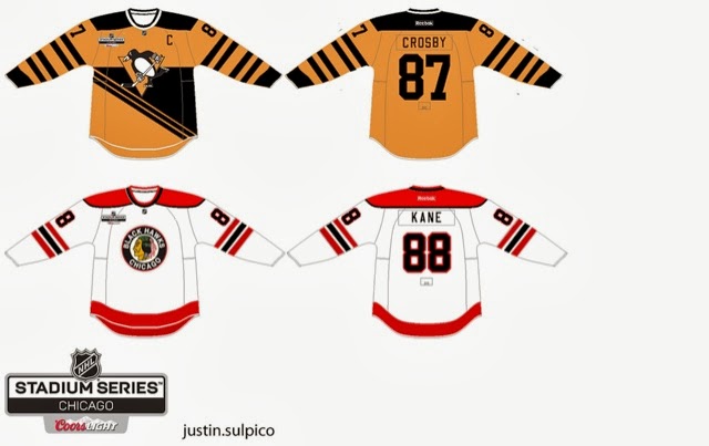
Pittsburgh vs. Chicago Stadium Series (Caden)


Here, Caden does the jerseys for the upcoming outdoor game at Soldier Field. First, i'll focus on the Hawks jersey. It's an update of their 2009 Winter Classic jerseys. I like the colour scheme, but it would've looked better with the logo with the coloured indian head. The black-and-white version of the logo makes it look plain. Aside from lack of sleeve numbers and wrong Reebok logo, I like it. 8.001/10

The first thing I noticed right off the bat with the Penguins jersey is that it's a CCM old-school style jersey. Use the Edge template for it. The yellow makes the penguin logo look off-centre. I don't mind having no white jersey in the game. I suggest outlining the yellow part of the logo to make the triangle pop out a bit more. Aside from lack of sleeve numbers and wrong Reebok logo, It's OK. A little bit more execution, and it can be a great concept. 7.99999993/10


Atlanta Thrashers (Justin, me)


I took the last Thrashers home jerseys, made it symmetrical and slapped the "T" logo on the shoulders. Nothing much.

That's it for today, guys. Thursday's post is coming up, when else?!? Thursday!

-Justin

Thursday, September 26, 2013

Post "Hump Day" Blues

What's Up??? I am writing this post because I lovvveee you*! The HCIHL has added Ricky M. (HJC's Friday guy) and Matt McElroy as GMs and Matt will also be the HCIHL "League Advisor!" We might get a new Tuesday writer but that's still in the works! Since Jake and Justin came along and now possibly a new Tuesday writer, my blog writing work has gone down, but my blog Administrative work has gone up! Figuring out what jerseys will go on what post and now having to also keep up with what's sent in, requests for HCIHL expansion teams,and I even had one guy who wanted 5$ a post credited to his PayPal in order to write once every 2 weeks for us! That's why I have decided to promote Jake88 to assistant Admin! Meaning he will have more say in stuff like hiring new writers and such! This is the new writing schedule

S: Justin P.
M: Jake88
T: New Tuesday Writer
W: Justin P.
T: Caden P. (Yes me!)
F: Jake88
S: Caden P.


I have a few concepts for you today so getting started as quick as possible would we great! 


New York (Brooklyn) Islanders Caden P. (me)

I made this Islanders concept for there move to Brooklyn. The basic premise of my design was to recol(u)r everything to give the islanders a new image! I recolo(u)red the logo and kept the Island in the logo but made the colo(u)r similar to the background so it wont be the main focus. (They are in Brooklyn after all!) I also changed the black jersey to incorporate the victory stripes in a big manner. You can't let a dynasty like that go! Maybe for a team like Montreal but the Islanders SUCK!


Stadium Series Chicago/Pittsburgh Justin S.


The reason I like this set is because though the are old fashioned, these are completely new jersey designs! I think the era you are trying to capture with the Pens jersey would look better with the robopen logo! The back bottom looks empty but I'm not sure what I would do with that.
The Chicago one is ok, but I would make the hem stripe the same as the arm stripe. The stadium series logo is different and wouldn't have the cores logo on the jerseys. The NHL has a strict no corporate logos on jerseys aside from RBK. 

Concept Rating 9/10


Augsberger Panther Jake88

If only Jake would make North American jerseys... I don't really know much about European jerseys so my comments don't mean much if I judge this from a NHL perspective than I would say that the numbers are too far apart but I don't know if that's acceptable in the DEL which I presume the Panther are still in unless they moved. I like the concept but I can't call it good/bad because I just don't know!

Concept Rating 0/0 (I can't judge something I don't know about. I will research the KHL, DEL, and SlimLeaguea jerseys tomorrow and I will know more)


Thank for reading and I hope you get over these post Humpday blues!


Caden

Friday, September 13, 2013

Friday the 13th

Hey Reader! All 1 of you! Sorry for the late post. NHL preseason Is. One. Day. Away!  
to the concepts!

to thTo the concepts!


This is my Staidum Series Chicago concept I made! What do you think? 
Tell me in the comments!


 I like the Owen Sound jersey for Alan John Herbert's OHL redesign series! I would have used a different font for the back though. A alternate jersey and a 2nd white helmet would be nice too!

Concept Rating 9/10


Which jersey do you like better?!?  The top one is Lynx1 the bottom is Lynx2 Vote in the poll to decide the new jersey for the Louisville Lynx!


The Springfield Sharpshooters unveiled there jerseys and logos at the same time! I will let Jake tell you about them tomorrow and i will review them Sunday or Monday.


Speaking of Jake he brings us a great Marlies Concept, I like every aspect of these jerseys! Its just so well executed and designed! I would have put a Marlies logo on the helmet instead of the ML logo. I would like the Maple Leafs in these! (with a different logo of course!)

Concept Rating a perfect 10/10! (a first on HCI)


T