Showing posts with label Vancouver Canucks. Show all posts

Friday, February 28, 2014

Friday: The Stephen Scheffel Show

Little high, Little low HCI readers! It's another Friday with me and I have a good amount of stuff today. Glad to have more than one concept today as compared to the last little while. Also, today is our 200th post here at HCI! A new jersey came in for me but not before two concepts from the same artist. Let's get to those now.

Denver Broncos
Submitted by: Stephen T. Scheffel

The first of our two concepts is based on the NFL's Denver Broncos. The first thing to discuss is the logo. It takes one of the current alternates added to a different colored "D" with an outline. On the white uniform, I don't like the phantom yoke, it definitely needs color. As for the Orange uniform, the blue and white need to switch positions everywhere - the sleeves, the yoke, the hem, and the blue on the collar. As for the alternate, just color in the cuffs, but kudos for originality there.

Colorado Rockies
Submitted by: Stephen T. Scheffel
This wouldn't be a complete Rockies concept without some form of pinstriping. Stephen has done that here. I would think that the stripes should all run the same direction on the white uniform. Either remove the ones from the sleeves or apply them to the whole jersey. As for the other one, The pinstripes in the numbers are a little daunting and take them from the numbers and move them across the logo if I had to guess. I would much prefer see something similar to their purple alternates though.

As I alluded to earlier, I made another jersey purchase last week and it just came in yesterday. That's because the Can Post takes a little longer than FedEx,UPS, or USPS. But that's okay, it still had a week just in case. But here it is, low and behold this Canucks jersey!

Photos courtesy of: Pro Sports Jerseys

I wen't a little out of my price range, but was still able to take it in for a profit. It was also the only one in my size and the only ones I had seen over the course of a good amount of time. In the mean time, my NBA leading Indian Pacers will be in town to take on the Celtics at TD Garden while the NHL's Bruins are away. The I managed free tickets to watch Hartford Hawks men's hoops against UMBC (coincidentally the same conference game I went to last year, go Terriers!)

As yet another weekend has come, enjoy your last day of February, that means Spring is around the corner. Or if you prefer, Spring started on Groundhog's Day. No matter, it will be a good weekend until the bad weather supposedly hits part of the Northeast into Monday morning. So make the most of the good weather.

-Ricky

Friday, January 24, 2014

. . . And My Man J-Roney

You'll find this in Whoomp, There it is: "That's me, DC - and my man Steve Roney!" Well, not quite. I'm not DC and his name is Jeremy, not Steve. But our concepts are featured here today. One aspect of my posting over time is that I don't have a bias to any team other than the Ducks, however I do endearingly (as a hockey enthusiast) mock team nicknames (the Strangers, the Lames, etc . . .) so please don't take them as such. Elsewhere I'm getting really excited over that big win to get the Ducks back on good terms at home.

Playstation 4
Submitted by: Jeremy Roney

The new Playstation 4 was something I thought that Sony would not pursue a yet here we are. Considering it's a heavy part of the branding, I am somewhat surprised that more gradient isn't used here. The only thing that really irks me is the disproportionate number and name. As for the front number, bring it down and towards the center a little. But I am pleased with the result, it is certainly unique from anything I have seen.

Vancouver Canucks
Submitted by: Ricky (Me)

This was the first of the currently available and to be produced in my retro-modern series. A twist on an old classic. The classic being the gradient and tick just to the current color scheme and the twist being Johnny Canuck. Since his number had been recently retired by the Canuckleheads, I used Pavel Bure to "model" the jersey (if you will). Again, this series is to be accurate in some areas (application of design) while adding new elements (change of color and number layout {not font or logo necessarily}). Because it is a retro-modern series, every jersey will feature one thing that the originals did not have: lace-up collars. The Lace-up collars are intended to further imply the "retro-ness" of the jersey. As for the jaggedness of the tick lines, I have no idea how that happened because they were fine when I finished it.

Image courtesy of: Dave Roback (Springfield Republican)
Notice the gentleman in the orange tie next to ranked player #13 Paul White in the distance? That's me at the end of the Whitney Young bench liaisoning the team during their visit to campus. This is the same team that has the nation's #1 ranked high school player in the country, Jahlil Okafor (committed to Duke for next season). Jahlil is a very reserved individual but still a very polite young man. He is a cousin of Emeka, the NBA player of the Washington Wizards. This is my fourth year volunteering the tournament, third as team liaison. I usually get three or four teams per year, so I fortunately get to see a lot of good talent and many familiar coach. Duke coach Mike Krzyzewski is a regular and the occasional NBA coach arrives such as Doc Rivers when his son Austin played two years ago.

Back to hockey, I will have at least one other new jersey on the way soon. For surprise sake, I won't tell you until it arrives for next week's post. I don't generally want to nominate my own concepts on my posts, but this week I am making an exception - particularly as I have had nothing to show on HJC. Despite what I do like from today's other concept, it doesn't quite fit the bill for me (not that mine does). But I also would like to see what people think of mine thus I am nominating my Canucks jersey for writer's pick. The Ducks lost their first regulation game at home to the Jets earlier in the week, but the bulk of remaining games for the Ducks are at home, so this plays very well to their advantage and quite possibly the President's Trophy. Credit to the Jets for playing so well since the hiring of Paul Maurice as their head coach. On the even brighter side, I have the Stadium Series game to look forward to tomorrow! 

-Ricky

Monday, January 6, 2014

Monday: Back to School (Ugh)

Funny how my last few posts fell on Christmas, and New Years day, and then I have to post on such a bad day as this. We have a new competition coming so keep tabs on that. Now I know that I'm getting kindKa boring, so lets get to our two concepts! Oh wait, the HCIHL scores.

Hamilton Stags 242.2 - Evansville Rivermen 231.6
Skopje Lisici (Foxes) 215 - London (ON) Sabreswords 162.1
Louisville Lynx - 161.6 Altoona Express 94.4

Now we can move on!

___________________________________________________________________________________
 
Phoenix Coyotes 3rd Jersey (Alan H.)
Alan, our Saturday writer and GM of the HCIHL team stationed in London, Ontario, gives us a pretty good concept that I barely have any complaints on. First, you gotta love that Aztec esque striping, and the colors only make it better. The logo works, but really could be interchangeable with the leaping Coyote. The number font may look better with an outline, but looks good as is. One pet peeve I've always had with concepts with striping like this is that it isn't on the socks, in my opinion it looks kinda out of place with the rest on the jersey so I'd put it on there. The equipment would look much better in black (except for the helmet). Concept Rating 8.1/10
 

Heritage Classic 2016 (Justin S.)
Second time writer Justin gives us an O.K. 2016 Heritage Classic concept. We now know that Winnipeg will be in a outdoor game of some type, but not against who. The Jets one looks perfect, only a lace up collar would make it better. The Canucks one is good too, I just might get rid of the phantom yoke. The real problem that I have with this concept, is that jerseys aren't classic enough. Think of all the classic jerseys that they wear for the Classics, but I don't think these will fit in. Concept Rating 7.1/10
 
__________________________________________________________________________________
 
So how did like todays post? Remember, we can have 3-4 concept days if you send your concepts in, so don't waste your time, DO IT NOW! Well that's all for today, bye and thanks for reading!

Saturday, December 28, 2013

Saturday: Going West!

Hello I'm Alan, I'll get elbow to my head, so you don't have to. I had an good Christmas, only got one jersey this year, and that's the Team Canada Olympics white jersey, but I did got some goodies along the way. I got Team Canada hat, the Quebec Nordiques T-shirt, Quebec Nordiques hooded sweater, and a Winnipeg Jets shirt, and track pants.

Creighton Comp Voting ends "TONIGHT" at "11:59pm"

Yes indeed Christmas may have passed, but it ain't over yet. We got New Years to go through, but for now on to the concepts.

Edmonton Oilers Concept [Matthew M.]
Up points: Nice design on the jerseys, using the tie collar is O.k. Lastly the stripes on both arms, and hem is well patterned.
Down points: No yoke on the white jersey looks empty to me, and orange numbers looks fine but only if it's used only on the dark, not on the white.
My Suggestion: Add the yoke on the white, and also on the white make the orange numbers blue.

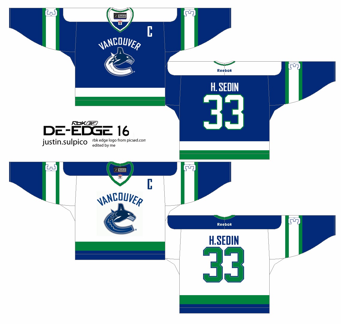
Vancouver Canucks Concept [by Justin S.]
Up points: An classic De-Edge look really fits this team nicely. The use of green on the jersey is right on.
Down Points: The "Vancouver" word mark made it busy, and there's an trademark dot beside the logo. The TV numbers is white with blue trim on a white stripes with green trim makes it unreadable.
My Suggestion: Remove the "Vancouver" word mark logo, and add green trim around the logo. Make the TV numbers green, or blue.


Well that's today's Post be here tomorrow for the Sunday post by me. Until then, I'm Alan, I'll get elbow to my head, so you don't have to.

Friday, October 18, 2013

Hey guys, it's FRIDAY!!!!!

Hey guys, Justin here back from a blogging "hiatus", I should say. Things have changed a bit on the blog. If you check the top bar, a tab has been added for Jake and I's jersey concept collections. Go check them out.

____________________________

Here are a bunch of concepts by me:


Rangers De-edge


HJC "IIHF Bottom 10" Contest Entry [South Africa]


Canucks De-edge


Some harmless self advertising here, below are some Facebook pages that I run, check them out and feel free to give them a "like":


Have a great Friday you guys. And a good weekend as well.-Justin

Sunday, September 22, 2013

Sunday With a New Writer

EDIT BY JAKE88:
For some reason Blogger will not send Justin an invite so I must post this for him. Note: All writing other than this edit is by Justin. Now to his post.


Hey guys, i’m Justin. The “mystery” guest writer that Caden mentioned
yesterday. I’ll be helping him and Jake here on HCI by posting on

Sundays and Wednesdays. I got into jersey concepts earlier this summer

after looking at HJC (hockey jersey concepts) and Icethetics. It also
got me into the actual jerseys and, therefore, I have a growing jersey
collection in my closet. In addition to jerseys and such, i’m an admin
on Hockey Memes on Facebook (facebook.com/hockeymemes101) show some
hockey love and give it a like.

BRIEF BIO: Let it be known that I am a HUGE Canucks fan, being from
the Vancouver area. I actually don’t live in Vancouver but in a suburb
called Abbotsford, yes, the home of the AHL’s Heat. I’ve just entered
the 9th grade and, because the Heat are in my town, i’m thinking of
having a volunteer “job” within their organization like stickboy,
waterboy, towelboy, music player, ice shoveler, goal horn player,
basically anything game-ops related. Anyhow, TO THE CONCEPTS.

Caden gave me specific instructions to review 3 jersey concepts. So
I’ve decided to review 2 of Jake’s jerseys and 1 of my own. (Sorry
Caden!)


Sibir Novosibirsk (KHL) by Jake88

What really catches me the first time I see this is how identical
these jerseys are to the 90s Winnipeg Jets jerseys. I managed to find
pictures of the club’s current jerseys, and Jake’s concept is nothing
but a bit of a tweak. I like the home coloured sleeves on the away
jersey and the addition of a bottom stripe on both jerseys. The
removal of the bottom stripe has butchered numerous jerseys over the
years. (i.e. Maple Leafs 07-10 unis). One suggestion I can make is
adding their primary “HC” logo to the jerseys on the front, if not, as
a shoulder patch. Their primary logo looks similar to the Lethbridge
Hurricanes logos, I must say. Final score: 9/10


CSKA Moscow (KHL) by Jake88

I have to say, what’s up with Jake and European teams? Most of his
concepts are from teams across the Atlantic. I’m thinking he dislikes
all those ads that make their jerseys cluttered and messy. Once again,
this jersey mimics the style of an NHL team, this time, the Montreal
Canadiens. Moscow’s real-life jerseys have the chest stripe move down
to the bottom of the jersey and the yokes are square. Jake moves the
chest stripe up, rounds the shoulder yokes and spaces out the thick
band between the little outer bands. My suggestion here is to add a
bottom stripe like what the Canadiens do. (Home jersey: one stripe,
half white, half blue. Away jersey: one stripe, one-third red, white
and blue) Final score: 8.5/10


2014 Heritage Classic (NHL) by ME.

This concept got a 9/10 rating and a “Concept-of-the-week” (COTW)
nomination over at HJC from the writer that reviewed it. Sadly, it
didn’t get enough votes to get onto the voting list. The jerseys are
recolored versions of jerseys worn previously by each team. The
Vancouver jersey is a blue version of their 40th Anniversary jerseys
from the 2010-11 season and the Ottawa jersey is a “heritage white”
version of their current alternates.


There it is, my first post on HCI and the 49th post overall on HCI.
Some quick “self-advertising”, don’t forget to check out my Facebook
page, Hockey Memes (facebook.com/hockeymemes101). Have a great rest of
your weekend guys, 50th post tomorrow!


-Justin

ONE MORE EDIT BY JAKE88: 
Can I just say how much easier it is to actually write the posts and not copy and paste. Yes, you heard me right. For some reason blogger wouldn't put the images in the right place so I had to go all HTML with it, and I'm not nearly as talented with that as some people. So bye and have a good rest of your day! 

Thursday, August 22, 2013

Hates and Greats: Hates

Well since I really haven't been making that many concepts of late,and you guys haven't been sending in anything, I decided to do this, make a likes and dislikes list. First the credits


Logos and some jerseys Sportslogos.net
Some jerseys NHLuniforms.com

DISLIKES: JERSEYS
5. The "Flying V" Vancouver Canucks (1979-81)
Vancouver's original jerseys had a V in the striping. Wasn't this taking it to far?

4. The "Wild Wing" Mighty Ducks of Anaheim (1996)
The logo and the font explain it all. The rest of the jersey isn't that bad.

3. "Yellow Ice" Kalamazoo K-Wings (IHL) (2009)
From Icethetics
And this isn't embarrassing how? It's sad that they still this is the ECHL.

2. St. Louis Blues Unused Jersey St. Louis Blues (1996-97
From thefulleffect.wordpress.com
I am going to use the same line that the guy from the site mentioned above said. "OH GOD, WHAT THE HELL IS THAT? SOMEBODY KILL IT WITH FIRE! Unused for a reason."

1. "Stormy Jersey" Tampa Bay Lightning (1996-99)
Sadly it can't be killed with fire... Don't worry we can find a way, Hahahaha goodbye worst jersey in Tampa Bay history. Seriously it makes the brush font look worse.


DISLIKES: LOGOS

5. Milwaukee Admirals "Skullhead" (2006-pres)
I love the color scheme, but with this comic book logo. It doesn't intimidate me at all, in fact I probably would hug it, does anyone want that.

4. "Vancouver Orcas" Vancouver Canucks (1997-pres)
Ok, ok this isn't that bad of a logo, but until I was about ten I thought a Canuck was a whale.
I know for a fact that Vancouver doesn't want that. And I'm sure I am not alone.

3. Kelowna Rockets (2000-pres)
How is this a logo today. I mean 90's. Someone make an update.

2. Kootenay Ice (1998-pres)
Another WHL logo, same comments apply.

1. Sapa Fehervar AV19 Erste Bank Hockey Liga (Austria) (2007-pres)
WHY, WHY, WHY, WHY, WHY, WHY, WHY, WHY! 

Likes will be on Saturday. Hey maybe Caden can do the same on Friday.