Hello I'm Alan, I'll get elbow to my head, so you don't have to. I had an good Christmas, only got one jersey this year, and that's the Team Canada Olympics white jersey, but I did got some goodies along the way. I got Team Canada hat, the Quebec Nordiques T-shirt, Quebec Nordiques hooded sweater, and a Winnipeg Jets shirt, and track pants.
Creighton Comp Voting ends "TONIGHT" at "11:59pm"
Yes indeed Christmas may have passed, but it ain't over yet. We got New Years to go through, but for now on to the concepts.
Creighton Comp Voting ends "TONIGHT" at "11:59pm"
Yes indeed Christmas may have passed, but it ain't over yet. We got New Years to go through, but for now on to the concepts.
Edmonton Oilers Concept [Matthew M.]
Up points: Nice design on the jerseys, using the tie collar is O.k. Lastly the stripes on both arms, and hem is well patterned.
Down points: No yoke on the white jersey looks empty to me, and orange numbers looks fine but only if it's used only on the dark, not on the white.
My Suggestion: Add the yoke on the white, and also on the white make the orange numbers blue.
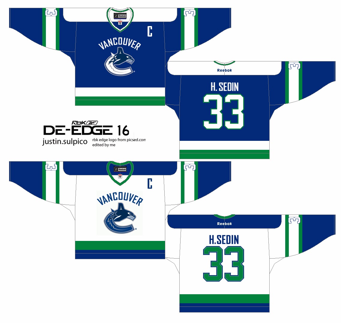
Vancouver Canucks Concept [by Justin S.]
Up points: An classic De-Edge look really fits this team nicely. The use of green on the jersey is right on.
Down Points: The "Vancouver" word mark made it busy, and there's an trademark dot beside the logo. The TV numbers is white with blue trim on a white stripes with green trim makes it unreadable.
My Suggestion: Remove the "Vancouver" word mark logo, and add green trim around the logo. Make the TV numbers green, or blue.


No comments:
Post a Comment
HCI is a site where concept artists send in their concepts to get constructive criticism. Any comment that is profane, mean spirited, racist, or has nothing to do with hockey concepts will be removed.