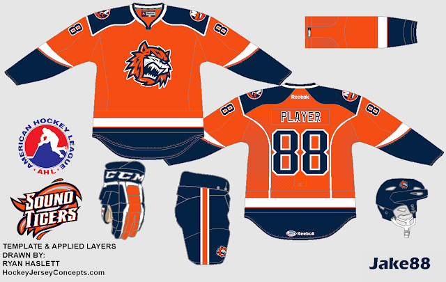
Bridgeport Sound Tigers Jake88
Jake88 made this awesome jersey for the Sound Tigers using an old Islanders template. It's perfect! there is absolutely nothing I would change about it! The striping is perfect! the colo(U)r distribution! Everything's just amazing! this would be an EPIC 3rd for Bridgeport and it's an EASY
Concept Rating 10/10!!!
San Jose Shark(nado)s Jake88
Jake88 brings us a Sharks "fix" and he fixed it! this concept is 1000 times better than what they have and if I owned a NHL team, he would be my head jersey designer! Him and Matt McElroy! I think there is too much orange and I'm not a fan of the names in the yoke! too Nikeish! Except for that a solid concept and I will give a
Concept Rating 9/10
Phoenix Coyotes Jake88
From Great, to Hate! Sorry Jake but I'm not a fan. I really don't like the striping and the way you used sand and black. I've always been a fan of the 2 color jerseys. The logo isn't my favorite either. The jersey would look better with a squared off yoke. The Execution is OFF THE CHARTS though so I will give this jersey
Concept Rating 7.5/10
If you saw my letter to the readers that I wrote yesterday, Cool! if not Go back and read it! When the HCI staff votes on a schedule I or Jake or Justin will let you guys know!!!
Just because I thought this was cool, Pageview breakdown! Also I don't have it count mine or Jake's pageveiws in the stats.
Thanks for reading!!!
Caden Patafie!


No comments:
Post a Comment
HCI is a site where concept artists send in their concepts to get constructive criticism. Any comment that is profane, mean spirited, racist, or has nothing to do with hockey concepts will be removed.