Well anyway, this post is dedicated to all the college designs that have come in of late. And speaking of college designs! We have a new competition! Click here for more info.
Blue Jays Comp entries due Saturday!
But first, our HCIHL scores.
Hamilton Stags 171.6 - Skopje Lisici 106.9
Evansville Rivermen 199.6 - Altoona Express 170.3
Louisville Lynx 198.9- London Sabreswords 136.1
I know all of you are dying to see the concepts so here they are!
_________________________________________________________________________________
Apple Cup (By Justin S.)
Justin starts us out with a nice event that he calls the Apple Cup, taking place it Washington, between two Washington teams. I like that it uses the very underused Under Armour template. Lets start out with the Huskies one. I love the colors and the logo choice was good. I like the striping but I feel that there should be some white in it, since there is some in the logo and numbers. I don't think that the shoulder patches are necessary, since the yoke striping is there. For the Cougars one, grey is an interesting choice, but I think it works. The wordmark looks good on a jersey, and it matches the striping and number outlines. I'm not sure about the name in red I'd make it white with a red outline. Concept Rating 7.9/10 (U of Wash. 8/10) (Wash State 7.8/10)
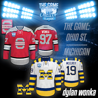
The Game (By Dylan W.)
Dylan gives us a great presentation with these, but we couldn't put it all on the blog, so check out his Sportslogos.net thread, it shows you everything from the tickets to in game mechindice. I like both logos, though I think Ohio State's should have a larger outline. The yokes are done well and so is the striping. I also like the Wonka V.S. McElroy bit that appeared on both of your concepts. I don't really have any complants so to the rating. Concept Rating 8.7/10 (Ohio State 8.9/10) (Michigan 8.5/10)
Hockey at Heinz (By Jake88/Me)
This was my entry into the competition. For Pitt, I did some yoke striping and arm striping that matches, while using a classic esque logo and font. For Syracuse I made an orange jersey (their name is the Orange could they have made it any easier?) with simple striping that doubles on the socks, a classic feature that I've always liked. For both jerseys, I lowered the numbers and put a patch in it's place.
_________________________________________________________________________________


FYI, I didn't call it the Apple Cup, that's just the name of the football game between the two schools every season.
ReplyDeleteWell if the lack of votes for me doesn't sum up my one day trip to Philly on Sunday . . .
ReplyDeleteI think it was because hardly anyone voted. I mean, the winning entry on HJC never wins with only 2 1st place votes. Which is what Alan had. I'm sure that if we would have had 40 or so people vote, That it would have been more accurate on which concept was the best. Instead of relying on a few peoples opinion.
Delete