It's been an eventful week for me so far, as my Babcia (Great Grandmother, Polish) passed away because of cancer. :( Although, she lived a very long life, as she was 100 years old! She told a story that when she was a little girl, she was in a refugee camp - and a bomb was flying her way...an opposing (I think) soldier was either trying to push her into the bomb, or probably to get her out of the way. The soldier was struck and she was able to escape.
____________________________________________________
Playoff hockey has been great so far, but it's too bad that so many good teams get eliminated in the first round. Like St.Louis, and the loser of LA vs SJ.
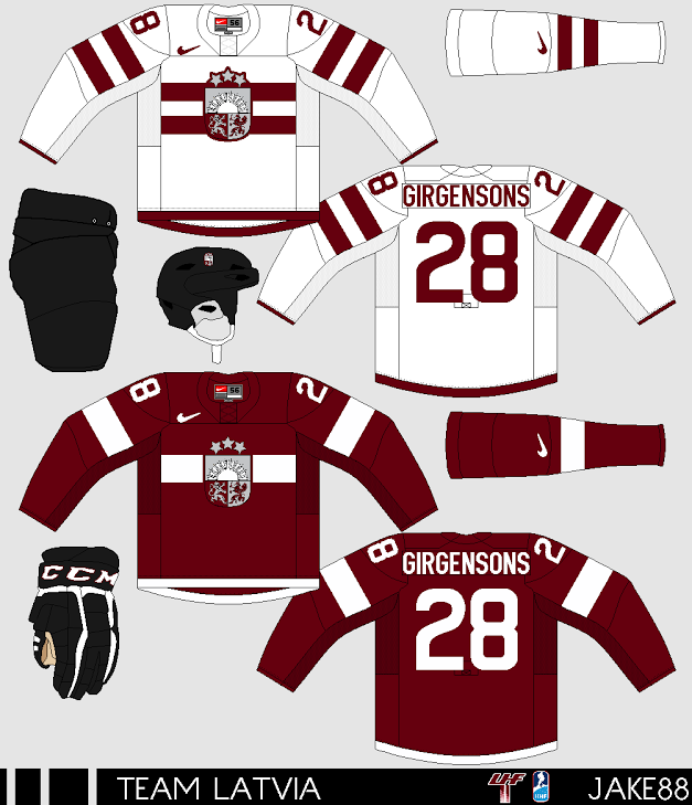
Now on to the concepts:
Justin S. - Calgary Flames

Justin is here with a Flames concept! The home and away jerseys remind me of the old flames jerseys! The colours of the striping is good, instead of using the old Calgary alt logo, you could recolour the main Flames logo. I just don't really like that alt Flames logo. The alternate has the beloved (to me anyways) arm striping, although the random red stripe just before the TV numbers, and the yellow and black caution stripes I don't like. They should be changed to maybe solid yellow or white? Pretty good concept from Justin!
I recently made a Toronto Maple Leafs logo, (in production of my Heritage Classic HABS VS LEAFS concept) so here it is! I traced a real maple leaf and I think it turned out pretty well.

That's all for this post...thanks for reading!